Neutral Sans Workhorse

Spider + Noar
Lets Spider own the focal silhouette while handling secondary copy, sizing and subheads cleanly.
Inspect Noar specimenDisclosure: MakerFileHub may earn a commission from qualifying purchases via paid links on this page. How our links work.
Web-filled red display
Spider is a rounded red display on a blurred dark ground: fat capitals filled with black spiderwebs drawn from a central point, outlined in white with a blue inner line and a wide white surround, set as one large word with a format line above and a plain note beneath.
Paid link
Get this fontProject & layout blueprintsAt-a-glance maker compatibility
Sturdy stroke walls and open counters weed cleanly on adhesive vinyl, HTV apparel film, and cut cardstock.
Visual anatomy & craft review
The plate is a single word at full width, and the fill is the product: each letter carries a web drawn from a hub, so the word reads as a themed graphic rather than as type, and the wide white surround keeps the red separate from a dark background. That construction sets a large size floor, because the web strands close first, and the plate sets the word large enough that the hubs read. The format line above and the note beneath are product copy that name the included files and the licence. Because the letters are fat and decorated, the face suits a card, a shirt and a party sign, and it is a device for a short word rather than a face for a line of text.
Decorative, spiderweb, novelty, bold
Two-font hierarchy recipes
Tested contrast partners — pairing Spider with grounded secondary typography.
Spider + Noar
Lets Spider own the focal silhouette while handling secondary copy, sizing and subheads cleanly.
Inspect Noar specimen
Spider + Mewah
Grounds bold display lettering with classic typographic authority on posters, badges and apparel.
Inspect Mewah specimenPractical applications
Concrete hierarchy, scale and production guidance tailored to Spider’s stroke geometry.
A web-filled display names the theme in the lettering, and the white surround keeps the red readable on a dark card. The webs name the theme.
Hierarchy & layout recipe
A6 card: the greeting at 30 pt, the details in a 10 pt sans, and the date at 9 pt. Keep 15 mm margins, print three colours on a dark card and leave 12 mm at the foot for the venue line.
Pre-production check
Check the 30 pt greeting at home-print resolution, where a web strand can close; keep the strands above 1 mm. Confirm the details keep a 4.5:1 contrast and that the card folds flat.
A web display prints as costume kit, and the red holds on a dark shirt where a pale face would disappear. The red holds on dark.
Hierarchy & layout recipe
Print a 250 mm chest graphic: the night at 55 mm cap height, the year at 26 mm, and three inks on a dark shirt. Keep the narrowest strand at 3 mm and place the graphic 80 mm below the collar.
Pre-production check
Check the screen at actual mesh, where a 3 mm strand can fill; thicken it to 4 mm. Wash-test one shirt and confirm the hubs stay distinct after five cycles.
A web tag finishes a bag, and the rounded letters read on a small die where a thin script would fail. It reads on a small die.
Hierarchy & layout recipe
Print 45 by 70 mm tags: the name at 11 pt, the year at 7.5 pt, and three colours on a white card. Keep 5 mm inside the die and punch the hole clear of a web.
Pre-production check
Check the 11 pt name on a tag, where a web can close into a tone; simplify there. Confirm the year reads at arm's length and that the tags tie cleanly.
Technical & licence verification
Confirm included OTF/TTF/WOFF formats, full glyph tables and licence coverage on the live store page before batch production.
Closest visual alternatives
Matched across letterform anatomy, stroke behaviour and craft applications.
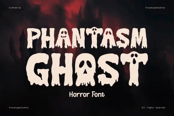
Dripping horror display with cut faces
Phantasm Ghost is a dripping horror display in cream on a dark scene: heavy rounded caps with long drips running from the baseline, faces cut into the counters of the A and the O, and rounded terminals, so the pair reads as a friendly haunted-house sign rather than a brutal metal logo.
Ideas for this font
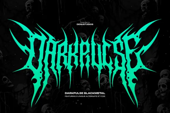
Spiked metal-style lettering with branching tips and hanging points
Darkpulse is black metal logo lettering: tall spiked strokes, mirrored symmetry, thin blade terminals that reach above and below the baseline, and five alternate versions of the wordmark.
Ideas for this font
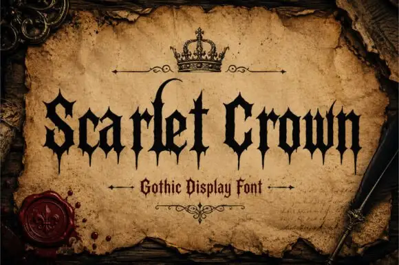
Sharp gothic display
Scarlet Crown is a sharp blackletter in black on aged parchment: narrow mixed case with spear-like feet, a high curling l and pointed terminals, framed by a drawn crown above, rules with flourishes and a wax seal at the lower left, with a plain line beneath naming the style.
Ideas for this font
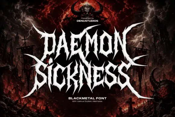
Jagged metal capitals with pointed horns and long outer blades
Daemon Sickness is death metal lettering: letters fused into a single spiked mass, blade points rising above the line and long symmetric wings sweeping out to both sides.
Ideas for this font
Allow optional Google Analytics to measure visits and catalogue actions. Your search words and notes are not included. Privacy & storage