High-Contrast Display Serif

Peachy Peach + Aureline
Pairs sculptural editorial warmth with Peachy Peach's clean modern geometry.
Inspect Aureline specimenDisclosure: MakerFileHub may earn a commission from qualifying purchases via paid links on this page. How our links work.
Playful display duo with outline variant
Peachy Peach is a playful display duo in coral on cream: a fat rounded face with swelling strokes and a bouncing baseline, plus an outline variant of the same letters, presented with peach illustrations and merchandise mockups, so the sheet reads as a small brand kit rather than a type specimen.
Paid link
Get this fontProject & layout blueprintsAt-a-glance maker compatibility
Cut solid base, outline, and shadow layers in separate vinyl colors and align on registration marks.
Visual anatomy & craft review
The two faces share one skeleton, which is the point of a duo: the main cut is solid with soft terminals and a heavy stroke, and the bonus cut traces the same letters as an outline, so the pair can be used as a headline and a secondary mark without introducing a second voice. The letters swell in the middle and tilt slightly, which gives the lockup its bounce, and the counters stay large enough that the solid version reads at label size. The specimen shows the range honestly with a tote bag, a cup, a box and a small round sticker, each using one of the cuts, and it sets the captions in a tracked sans on coloured bands. The palette is coral, pink and cream, which keeps the whole plate warm.
Duo, playful, juicy, friendly
Two-font hierarchy recipes
Tested contrast partners — pairing Peachy Peach with grounded secondary typography.
Peachy Peach + Aureline
Pairs sculptural editorial warmth with Peachy Peach's clean modern geometry.
Inspect Aureline specimen
Peachy Peach + Rebel Marks
Introduces organic movement on pull-quotes, signatures and gift tags.
Inspect Rebel Marks specimenPractical applications
Concrete hierarchy, scale and production guidance tailored to Peachy Peach’s stroke geometry.
A solid and an outline cut of one skeleton let a juice bar build a family of labels and a window sign from one purchase, and the fat strokes hold at cup size.
Hierarchy & layout recipe
Print 60 mm round cup labels: the flavour at 15 pt in the solid cut, the volume at 6 pt in a sans, and the outline cut for a decorative ring. Keep 4 mm inside the die and print two flat colours on a coated stock.
Pre-production check
Check the 15 pt flavour on a curved cup, where the outer letters distort; reduce the width. Confirm the 6 pt volume reads at arm's length and that the outline cut stays open on a coated surface.
A playful duo gives a summer card a headline and a decorative line without a second typeface, and the outline cut keeps the design from becoming a solid block of colour.
Hierarchy & layout recipe
A6 card: the greeting at 30 pt solid, the details in a 9 pt sans, and a small outline flourish at the foot. Keep 12 mm margins and print two colours on a cream card so the outline stays open.
Pre-production check
Check the 30 pt greeting, where the swelling strokes can close the counters; keep the size above 26 pt. Confirm the 9 pt details keep a 4.5:1 contrast and that the outline flourish does not crowd the trim.
A duo in one skeleton keeps a sticker range coherent, and the outline cut gives a lighter option for small stickers where the solid face would fill in.
Hierarchy & layout recipe
Die-cut 45 mm stickers: the name at 13 pt in the solid cut on large stickers, the outline cut at 13 pt on small ones, and 2 mm clear to the die. Keep the palette to three colours and test one sticker on a curved jar.
Pre-production check
Check the 13 pt outline sticker, where a thin contour can break at the die edge; thicken it below 16 pt. Confirm the sticker adheres to a curved jar and that the solid and outline versions read as the same face.
Technical & licence verification
Confirm included OTF/TTF/WOFF formats, full glyph tables and licence coverage on the live store page before batch production.
Closest visual alternatives
Matched across letterform anatomy, stroke behaviour and craft applications.
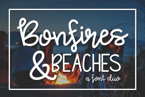
Looping brush script paired with tall narrow caps
Bonfires & Beaches is a duo: a looping brush script with a swinging tail on the first capital, paired with a tall narrow uppercase that carries the second line in even, slightly condensed letters.
Ideas for this font
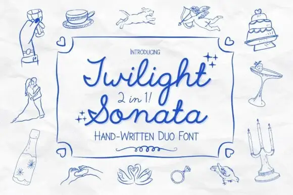
Looped script with narrow print
Twilight Sonata is a 2-in-1 duo in blue ink on a sketched page: a looping rounded script and a narrow upright print, framed by line drawings of a wedding — cake, doves, rings, glasses, a couple.
Ideas for this font
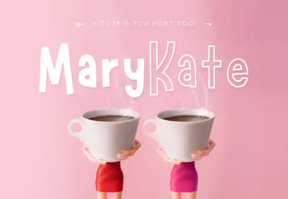
Informal solid-and-outline duo
Marykate is a two-face duo in white over a pink still life of two cups: tall informal mixed case in a solid cut for the first half of the name and a narrow outline cut for the second, with a small caption above that names the pairing.
Ideas for this font
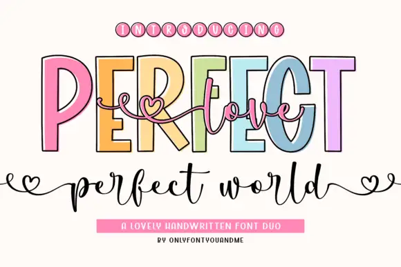
Outlined capitals and fine heart script
Perfect Love Perfect World places fine script across tall outlined capitals, where small hearts extend the script ends and the lower world line carries deep p and d strokes.
Same independent foundry
Allow optional Google Analytics to measure visits and catalogue actions. Your search words and notes are not included. Privacy & storage