Neutral Sans Workhorse

Bravox + Lemon Milk Pro FTR
Lets Bravox own the focal silhouette while handling secondary copy, sizing and subheads cleanly.
Inspect Lemon Milk Pro FTR specimenDisclosure: MakerFileHub may earn a commission from qualifying purchases via paid links on this page. How our links work.
Bold oblique display sans with clipped corners and speed
Bravox is a bold oblique display sans in which the caps lean forward, the corners are clipped and the strokes stay heavy, so a short headline reads as a piece of sports equipment branding.
Paid link
Get this fontProject & layout blueprintsAt-a-glance maker compatibility
Sturdy stroke walls and open counters weed cleanly on adhesive vinyl, HTV apparel film, and cut cardstock.
Visual anatomy & craft review
The B closes two flat bowls on a thick stem, the R cuts a straight leg, the A pinches a clipped apex, the V narrows to a flat point and the X crosses two clipped diagonals, all at a heavy weight with a strong oblique and bevelled corners. The lean is the character: the whole set tips forward, which is why the sample sets a single word at poster size with a rule of small caps beneath. It has matching caps, lowercase, numerals and symbols, so it also carries a badge or a price line. Because the counters are open, the face holds from 24 pt to a hoarding. The white field, the cap mock-up, the badge, the shirt and the feature strip along the bottom are presentation; the black oblique headline is the face.
Bold · Oblique · Sport
Two-font hierarchy recipes
Tested contrast partners — pairing Bravox with grounded secondary typography.
Bravox + Lemon Milk Pro FTR
Lets Bravox own the focal silhouette while handling secondary copy, sizing and subheads cleanly.
Inspect Lemon Milk Pro FTR specimen
Bravox + Grandeur – Elegant Classic Serif
Grounds bold display lettering with classic typographic authority on posters, badges and apparel.
Inspect Grandeur – Elegant Classic Serif specimenPractical applications
Concrete hierarchy, scale and production guidance tailored to Bravox’s stroke geometry.
The oblique gives a round badge its forward motion, and the clipped corners keep the shape crisp at 60 mm in one colour.
Hierarchy & layout recipe
Print a 70 mm round patch: set the brand name at 60 mm across the middle, set the strapline in an 8 pt caps beneath, and keep 5 mm of border so the clipped apex does not touch the embroidered edge.
Pre-production check
A clipped corner under 2 mm fills in with embroidery thread; check the digitised file and open the bevel rather than the size.
The heavy oblique reads over a full-bleed photograph, and the clipped corners give a magazine cover a modern outdoor edge at 110 pt.
Hierarchy & layout recipe
Print an A4 cover: set the headline at 110 pt across the upper third over the sky, set the issue line in a 9 pt caps sans under it, and keep 22 mm of margin so the lean has room.
Pre-production check
An oblique set flush left looks like it is falling out of the page; check the cover and align the optical top of the first letter rather than the bounding box.
The bold oblique suits a printed club team sheet, and the matching numerals hold a score line at 40 pt under a heavy header.
Hierarchy & layout recipe
Print an A4 sheet: set the club name at 40 pt across the head, set the fixture line in 14 pt numerals beneath, and keep 15 mm between the header and the first table row.
Pre-production check
Numerals set in the same heavy weight as the header compete with it; check the sheet and set the fixture line in a lighter cut of the same family.
Technical & licence verification
Confirm included OTF/TTF/WOFF formats, full glyph tables and licence coverage on the live store page before batch production.
Closest visual alternatives
Matched across letterform anatomy, stroke behaviour and craft applications.
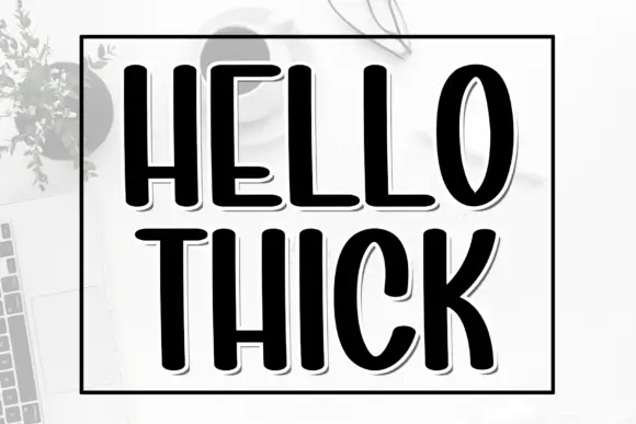
Tall heavy condensed capitals with a fine offset shadow
Hello Thick is a tall condensed capital alphabet in which the stems are fat, the width is narrow and a fine shadow sits behind each letter, so a word reads as a printed block with depth.
Ideas for this font
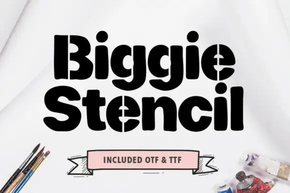
Heavy rounded mixed case with vertical stencil splits through B and e
Biggie Stencil is a heavy rounded display in which the bodies stay thick, the counters shrink to small ovals and a straight vertical split runs down the B stem and through the e forms, so a two-word sign reads as a bridge cut out of solid lettering.
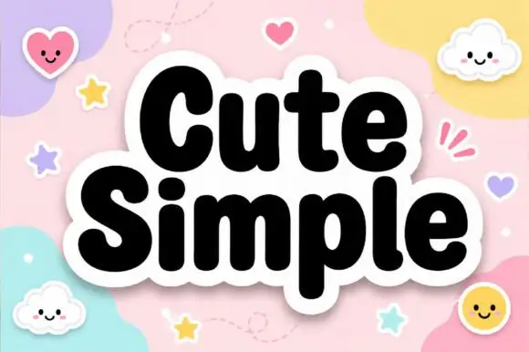
Very heavy rounded mixed-case lettering with a soft sticker outline
Cute Simple is very heavy rounded mixed-case lettering in which the bowls press against the stems and a thick soft outline wraps the whole lockup, so a word reads as one cut sticker rather than as separate letters.
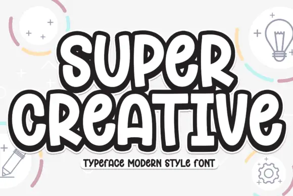
Super chunky playful caps
Super Creative is a super chunky display in near-black with a white inline and a heavy offset outline: fat caps with soft corners, a bounce across both lines, and a caption on a tape strip beneath, on a pale ground with line-drawn lightbulbs, pencils and gears.
Ideas for this font
Same independent foundry
Allow optional Google Analytics to measure visits and catalogue actions. Your search words and notes are not included. Privacy & storage