High-Contrast Display Serif

Marykate + Amor Hadena
Pairs sculptural editorial warmth with Marykate's clean modern geometry.
Inspect Amor Hadena specimenDisclosure: MakerFileHub may earn a commission from qualifying purchases via paid links on this page. How our links work.
Informal solid-and-outline duo
Marykate is a two-face duo in white over a pink still life of two cups: tall informal mixed case in a solid cut for the first half of the name and a narrow outline cut for the second, with a small caption above that names the pairing.
Paid link
Get this fontProject & layout blueprintsAt-a-glance maker compatibility
Cut solid base, outline, and shadow layers in separate vinyl colors and align on registration marks.
Visual anatomy & craft review
The plate does the obvious thing well: it sets one name in both cuts so the pair can be compared in a single glance, with the solid carrying the first word and the outline carrying the second. The drawing is a tall informal mixed case with uneven widths and a relaxed baseline, so the face reads as handwritten rather than as a geometric, and the outline cut is narrow enough to sit beside the solid without competing. That construction sets a size floor for the outline, which closes first. The cups and the pink ground are staging, and the caption above names the product. Because the pair is informal and light, it suits a brand, a party card and a shirt, and the outline cut works best at larger sizes.
Duo, informal, tall, playful
Two-font hierarchy recipes
Tested contrast partners — pairing Marykate with grounded secondary typography.
Marykate + Amor Hadena
Pairs sculptural editorial warmth with Marykate's clean modern geometry.
Inspect Amor Hadena specimen
Marykate + Simple Handwriting
Introduces organic movement on pull-quotes, signatures and gift tags.
Inspect Simple Handwriting specimenPractical applications
Concrete hierarchy, scale and production guidance tailored to Marykate’s stroke geometry.
A duo gives a studio a solid mark and a lighter sub-line from one purchase, and the informal shapes read as handmade rather than corporate.
Hierarchy & layout recipe
Set the name in the solid at 16 pt on a box, 80 mm on a wall and 12 pt on a card, with the sub-line in the outline at 9 pt. Keep one colour and clear space equal to the cap height.
Pre-production check
Check the 9 pt sub-line in the outline on a small card, where the thin stroke can close; keep it above 11 pt. Confirm the wall name reads at eight metres and that the pair stays distinct.
A solid-and-outline duo makes a name the design, and the informal shapes suit a young child's celebration without illustration.
Hierarchy & layout recipe
A6 card: the name in the solid at 26 pt, the outline cut at 26 pt, and the details in a 9.5 pt sans. Keep 15 mm margins and print one ink on a cream card.
Pre-production check
Check the 26 pt outline at home-print resolution, where a thin stroke can break; keep it above 0.4 mm. Confirm the 9.5 pt details keep a 4.5:1 contrast and that the card folds flat.
A duo gives a shop a name and a second word without a second typeface, and the heavy solid holds on a window in vinyl. The solid and the outline hold together in vinyl.
Hierarchy & layout recipe
Cut 700 by 300 mm vinyl: the solid name at 100 mm cap height, the outline line at 60 mm, and one colour. Keep 22 mm margins and keep the outline stroke above 4 mm.
Pre-production check
Check the cut at 60 mm, where a thin outline stroke can tear; keep it above 6 mm. Confirm the name reads at six metres and that the pair clears the frame.
Technical & licence verification
Confirm included OTF/TTF/WOFF formats, full glyph tables and licence coverage on the live store page before batch production.
Closest visual alternatives
Matched across letterform anatomy, stroke behaviour and craft applications.
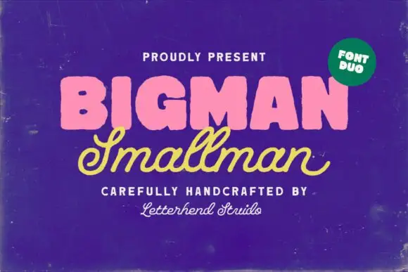
Heavy rounded block capitals paired with a slanted monoline signature script
Bigman Smallman pairs a very heavy rounded capital alphabet with a slanted monoline signature script, so the pair reads as one loud word and one quiet signed line beneath it.
Ideas for this font
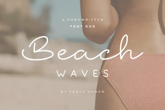
Duo pairing a brushed monoline signature with wide-tracked capitals
Beach Waves is a two-cut family in which a brushed monoline script writes one word and a wide-tracked sans sets the other, so a design gets a relaxed written line and a calm structural line from one purchase.
Ideas for this font
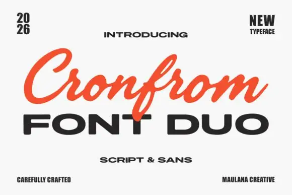
Slanted retro script paired with a wide bold sans in capitals
Cronfrom pairs a slanted retro script with a wide bold sans, so one lockup can carry a handwritten sign name and a hard-edged second line beneath it.
Ideas for this font
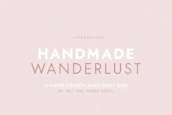
Spaced sans capitals shown in thick white and thin muted-pink lines
Handmade Wanderlust Duo shows two centred uppercase words on a soft pink background, where Handmade is white and noticeably heavier while Wanderlust beneath is thin, muted pink and more widely spaced, with slightly uneven edges and broad A and M diagonals.
Ideas for this font
Same independent foundry
Allow optional Google Analytics to measure visits and catalogue actions. Your search words and notes are not included. Privacy & storage