Neutral Sans Workhorse

Patchwork + Corven
Lets Patchwork own the focal silhouette while handling secondary copy, sizing and subheads cleanly.
Inspect Corven specimenDisclosure: MakerFileHub may earn a commission from qualifying purchases via paid links on this page. How our links work.
Ornamental display with carved pattern fills
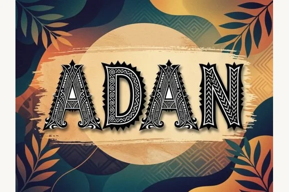
Patchwork is an ornamental display face in dark ink on wood: heavy capitals filled with carved patterns of dots, hatching and curls, outlined and set inside a drawn frame, with a condensed capital caption beneath.
Paid link
Get this fontProject & layout blueprintsAt-a-glance maker compatibility
Sturdy stroke walls and open counters weed cleanly on adhesive vinyl, HTV apparel film, and cut cardstock.
Visual anatomy & craft review
The word is set on one line and each letter is a small carving rather than a stroke: the outline is heavy and slightly irregular, the interior is filled with bands of dots, fine hatching and small spirals that follow the shape of the letter, and the serifs turn into little hooks and T-shaped marks at the top and the bottom. Because the pattern follows the contour, the letters read as carved panels rather than as type with a texture laid over them, and the counters are kept large enough that the word stays legible at a distance. A thin double frame runs around the composition, with small corner curls, and two lines of a condensed capital face sit beneath the block. The ground is a dark wood plank with visible grain. Patchwork is a decorative face for packaging, signage, apparel and editorial covers with a craft or island mood, and it needs one or two words at a large size and a warm ground.
Carved, patterned, bold
Two-font hierarchy recipes
Tested contrast partners — pairing Patchwork with grounded secondary typography.
Patchwork + Corven
Lets Patchwork own the focal silhouette while handling secondary copy, sizing and subheads cleanly.
Inspect Corven specimen
Patchwork + Grandeur – Elegant Classic Serif
Grounds bold display lettering with classic typographic authority on posters, badges and apparel.
Inspect Grandeur – Elegant Classic Serif specimenPractical applications
Concrete hierarchy, scale and production guidance tailored to Patchwork’s stroke geometry.
A carved face signals handmade work before the cover is read, and the pattern inside the letters reads as texture at thumbnail size online.
Hierarchy & layout recipe
Print a 210 by 280 mm cover: set the title at 70 pt on one line, keep 26 mm of clear ground beneath before the subtitle at 12 pt, and hold 18 mm of margin on all four sides.
Pre-production check
Fine hatching can fill in at cover size; proof one cover flat and check the interior pattern before the print.
A carved label gives a bottle a craft identity, and the heavy outline keeps the word readable on a curved surface where pattern would otherwise blur.
Hierarchy & layout recipe
Print a 60 by 90 mm label: set the brand at 16 pt on one line, keep 6 mm of clear ground beneath before the proof at 4.5 pt, and hold 4 mm of margin on all four sides.
Pre-production check
Pattern edges can merge on a curved label; print one on the real bottle and check the outline before the order.
A carved face reads as tropical without a palm tree, and the heavy letters survive salt air and a hand-painted sign board.
Hierarchy & layout recipe
Print a 700 by 400 mm board: set the name at 120 pt over two lines, keep 30 mm of clear ground beneath before the hours at 24 pt, and hold 24 mm of margin on all four sides.
Pre-production check
Hand painting a patterned face takes time; print one board as a guide and check the letters before the signwriter starts.
Technical & licence verification
Confirm included OTF/TTF/WOFF formats, full glyph tables and licence coverage on the live store page before batch production.
Closest visual alternatives
Matched across letterform anatomy, stroke behaviour and craft applications.
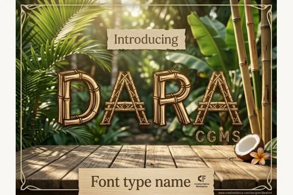
Lashed tropical bamboo-cane & tiki-bar display font
Dara is an illustrated tropical display font constructing every uppercase letter from segmented bamboo stalks lashed together at the joints!
Ideas for this font
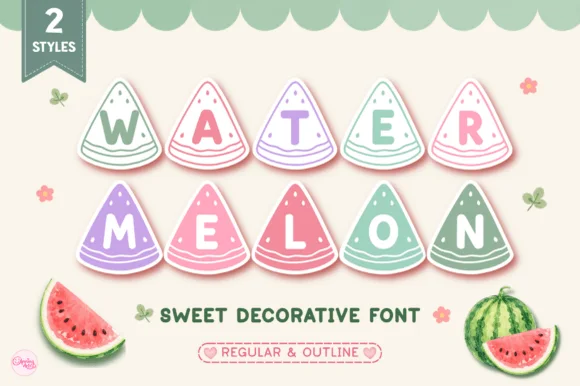
Slice-shaped lettering set
Watermelon is a decorative novelty face in which each letter sits inside a watermelon slice: pastel rinds and pink flesh with small seeds, a two-line arrangement, a ribbon tag at the top left noting two styles, and two illustrated melons at the foot with a tracked line between them.
Ideas for this font
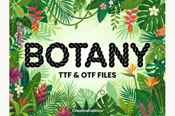
Twisted nautical-rope & macramé cord alphabet (TTF & OTF)
Botany is a crisp decorative display font twisting realistic multi-strand nautical rope into bold, clean uppercase letters (TTF & OTF).
Ideas for this font
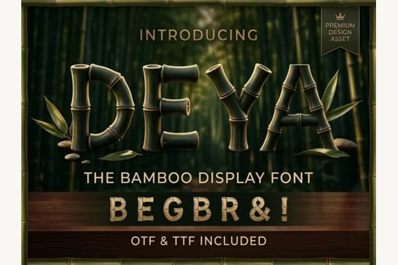
3D-ringed natural bamboo-culm alphabet + symbols (OTF & TTF)
Deya is a serene tropical decorative font forming clean geometric capitals and symbols ('&', '!') out of ringed bamboo stalks (OTF & TTF).
Ideas for this font
Same independent foundry
Allow optional Google Analytics to measure visits and catalogue actions. Your search words and notes are not included. Privacy & storage