Neutral Sans Workhorse

Pastry Bites + Prime Nordic
Lets Pastry Bites own the focal silhouette while handling secondary copy, sizing and subheads cleanly.
Inspect Prime Nordic specimenDisclosure: MakerFileHub may earn a commission from qualifying purchases via paid links on this page. How our links work.
Heavy mixed-case display
Pastry Bites is a heavy display in white on a bright orange ground: mixed case with thick strokes, small counters, stepped changes of height and a few joined pairs, set in two lines between four small credits and two shaped badges.
Paid link
Get this fontProject & layout blueprintsAt-a-glance maker compatibility
Sturdy stroke walls and open counters weed cleanly on adhesive vinyl, HTV apparel film, and cut cardstock.
Visual anatomy & craft review
The plate is a flat two-colour poster built on one name, and the drawing is a heavy mixed-case display: the strokes are thick, the counters are small, and the letters change height within the word, so the setting reads as a custom logotype rather than as typesetting. That construction sets a moderate size floor, because the small counters close first, and the plate sets the words large enough that the joins can be seen. The orange ground gives the white maximum contrast, and the badges and the four credits are product copy naming the styles and the studio. Because the letters are heavy and tight, the face suits a package, a shop sign and a screen, and a buyer should add tracking before setting a longer name.
Display, heavy, modern, bold
Two-font hierarchy recipes
Tested contrast partners — pairing Pastry Bites with grounded secondary typography.
Pastry Bites + Prime Nordic
Lets Pastry Bites own the focal silhouette while handling secondary copy, sizing and subheads cleanly.
Inspect Prime Nordic specimen
Pastry Bites + Svara
Grounds bold display lettering with classic typographic authority on posters, badges and apparel.
Inspect Svara specimenPractical applications
Concrete hierarchy, scale and production guidance tailored to Pastry Bites’s stroke geometry.
A heavy display gives a bakery a mark that reads on a shelf, and the small counters hold on a jar label. A small lid is the honest test of a heavy face.
Hierarchy & layout recipe
Print a 70 mm round label: the bakery at 15 pt, the product at 9 pt, and the weight at 7 pt. Keep 6 mm inside the die and keep the smallest counter above 1.2 mm.
Pre-production check
Check the 15 pt name on a lid, where a counter can close; keep it open. Confirm the 7 pt weight reads at arm's length and that the label survives a chilled display.
A heavy display makes a food cover appetising, and the stepped letters fill a cover with one name. A food cover has to look edible at arm's length.
Hierarchy & layout recipe
Set the title at 100 mm cap height across 195 mm, the cover lines in an 8.5 pt sans, and the issue at 7 pt. Print two colours on a matte stock and keep 22 mm margins.
Pre-production check
Check the title at 100 mm, where a small counter can fill; proof it. Confirm the 7 pt issue survives lamination and that the title clears the trim.
A heavy display sets an opening card apart, and two colours carry the date without a second typeface. An opening card should look like the shop.
Hierarchy & layout recipe
A6 card: the greeting at 24 pt, the details in a 9 pt sans, and the date at 8 pt. Keep 15 mm margins and print two colours on a light card. Leave 14 mm at the foot for the address line.
Pre-production check
Check the 24 pt greeting, where a joined pair can crowd the line above; keep 6 mm leading. Confirm the 9 pt details keep a 4.5:1 contrast and that the card folds flat.
Technical & licence verification
Confirm included OTF/TTF/WOFF formats, full glyph tables and licence coverage on the live store page before batch production.
Closest visual alternatives
Matched across letterform anatomy, stroke behaviour and craft applications.
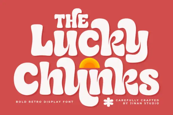
Bulging retro forms with curled joins
Lucky Chunks is a bold retro display face in cream on terracotta: very fat letters whose bowls bulge past the stems, curled joins between the letters of a word, and a half-sun arch drawn between the two lines.
Ideas for this font
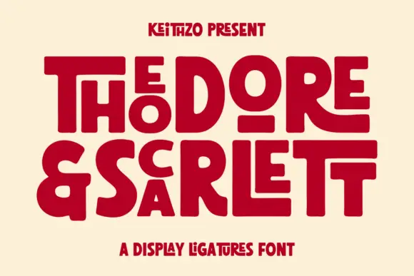
Fat geometric ligature display with nested letters
Theodore and Scarlett is a display ligature face in deep red on cream: fat geometric letters where small letters nest inside the counters of large ones, the two words interlocking so the block reads as one shape with two lines inside it.
Ideas for this font
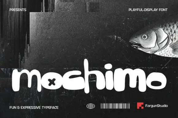
Playful fat rounded display
Mochimo is a playful fat display in white on a dark collage: lowercase letters with inflated bowls, tight spacing, an x cut into one counter and a bouncing baseline, presented with small agency marks at the corners, so the plate reads as a contemporary brand experiment.
Ideas for this font
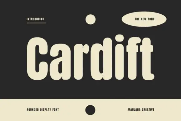
Tall heavy mixed case with deeply rounded bowls and short projecting crossbars
Cardift shows pale lettering on charcoal: a high narrow C opens beside rounded a and d bowls, the heavy stems finish softly and the f and t crossbars project only a short distance past the stroke, with a large round i dot above a compact centre.
Same independent foundry
Allow optional Google Analytics to measure visits and catalogue actions. Your search words and notes are not included. Privacy & storage