Neutral Sans Workhorse

Mochimo + Headline
Lets Mochimo own the focal silhouette while handling secondary copy, sizing and subheads cleanly.
Inspect Headline specimenDisclosure: MakerFileHub may earn a commission from qualifying purchases via paid links on this page. How our links work.
Playful fat rounded display
Mochimo is a playful fat display in white on a dark collage: lowercase letters with inflated bowls, tight spacing, an x cut into one counter and a bouncing baseline, presented with small agency marks at the corners, so the plate reads as a contemporary brand experiment.
Paid link
Get this fontProject & layout blueprintsAt-a-glance maker compatibility
Sturdy stroke walls and open counters weed cleanly on adhesive vinyl, HTV apparel film, and cut cardstock.
Visual anatomy & craft review
The word is set in lowercase only, and the drawing is a rounded display at maximum weight: the bowls are almost circular, the stems are short, and the counters are narrow slits that occasionally close into a decorative shape, which is what gives the face its playful character. The bounce keeps the baseline moving, so the word reads as a drawn mark rather than a typeface, and the tight spacing makes the letters touch at the shoulders. Because the shapes are so fat, the face works at large sizes only, and the specimen respects that by setting one word wide across the plate. The ground is a dark photographic collage with a fish and a barcode, and the small tracked notes at the corners are the only other type on the page.
Playful, fat, rounded, modern
Two-font hierarchy recipes
Tested contrast partners — pairing Mochimo with grounded secondary typography.
Mochimo + Headline
Lets Mochimo own the focal silhouette while handling secondary copy, sizing and subheads cleanly.
Inspect Headline specimen
Mochimo + Things
Grounds bold display lettering with classic typographic authority on posters, badges and apparel.
Inspect Things specimenPractical applications
Concrete hierarchy, scale and production guidance tailored to Mochimo’s stroke geometry.
A fat rounded mark reads at a glance and holds on a sticker, a tote and a website header, and the closed counters give a small studio a distinctive silhouette.
Hierarchy & layout recipe
Set the mark at 30 mm on a tote, 16 pt on a card and 60 mm on a wall, keeping the letters touching as drawn. Keep one colour and hold clear space equal to the bowl width so the mark never crowds.
Pre-production check
Check the 16 pt card mark, where the closed counters can read as blots; use the open variant below 20 pt. Confirm the tote print reads at arm's length and that the wall mark stays legible at ten metres.
A fat playful face reads as a celebration from across a room, and the rounded shapes photograph well against a plain wall.
Hierarchy & layout recipe
Print 800 by 400 mm: the name at 140 mm x-height, the age in a 45 mm rounded sans, and a 5 mm border. Keep 25 mm margins and print two colours on a pale ground so the counters stay open.
Pre-production check
Check the banner at four metres, where the touching letters can merge into one shape; open the tracking slightly. Confirm the 45 mm age reads at three metres and that the border clears the eyelets.
A fat display gives an art fair a poster that reads as a graphic object, and the single colour keeps a large run inexpensive.
Hierarchy & layout recipe
A2 portrait: the fair name at 150 mm, the dates in a 24 mm sans, and a 6 mm rule. Keep 30 mm margins, print white on a dark ground, and let the word crop on one side so the composition has an edge.
Pre-production check
Check the crop at 150 mm, where the trim can halve a letter and make it unreadable; keep two letters whole. Confirm the 24 mm dates read at three metres and that the rule aligns to the baseline.
Technical & licence verification
Confirm included OTF/TTF/WOFF formats, full glyph tables and licence coverage on the live store page before batch production.
Closest visual alternatives
Matched across letterform anatomy, stroke behaviour and craft applications.
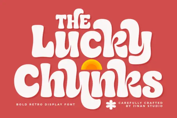
Bulging retro forms with curled joins
Lucky Chunks is a bold retro display face in cream on terracotta: very fat letters whose bowls bulge past the stems, curled joins between the letters of a word, and a half-sun arch drawn between the two lines.
Ideas for this font
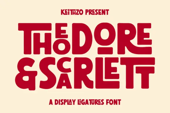
Fat geometric ligature display with nested letters
Theodore and Scarlett is a display ligature face in deep red on cream: fat geometric letters where small letters nest inside the counters of large ones, the two words interlocking so the block reads as one shape with two lines inside it.
Ideas for this font
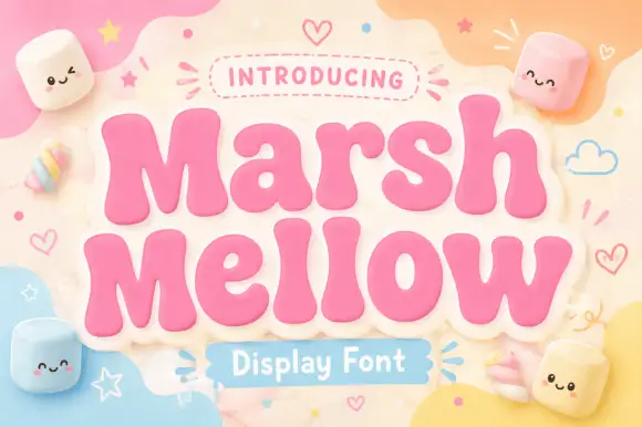
Very fat rounded display with a sticker outline
Marshmellow is a very fat rounded display face in pink with a cream sticker outline: soft inflated letters with almost no contrast, a bouncy baseline, and a pastel page scattered with marshmallow characters and hearts.
Ideas for this font
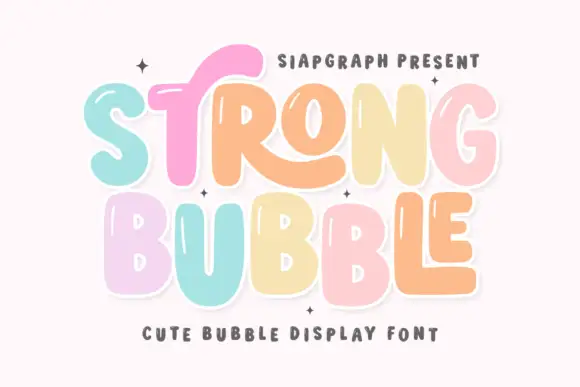
Pastel bubble display with shine
Strong Bubble is a pastel bubble display in mint, pink, peach and butter on white: fat rounded letters of uneven size, small white shine marks inside the strokes, a heavy outline and a bouncing baseline, so the pair reads as a hand-drawn sticker set rather than a typographic family.
Ideas for this font
Allow optional Google Analytics to measure visits and catalogue actions. Your search words and notes are not included. Privacy & storage