Editorial Serif Anchor

Omelia + The Avenue Editorial
Anchors Omelia's fluid strokes with crisp Roman proportions on wedding suites, headers and packaging.
Inspect The Avenue Editorial specimenDisclosure: MakerFileHub may earn a commission from qualifying purchases via paid links on this page. How our links work.
Fine monoline signature handwriting
Omelia is a fine monoline handwritten face in black on a pale ground: a thin even stroke, a strong forward lean, tall open loops on the ascenders and long flat connectors, set as one word with a wide-tracked label above and beneath.
Paid link
Get this fontProject & layout blueprintsAt-a-glance maker compatibility
Weld or Unite overlapping script joins into one continuous vector path before sending to the blade.
Visual anatomy & craft review
The word is set once, wide, and the drawing is a signature hand: the stroke is even, the lean is consistent, and the connectors run flat between letters, which keeps the word readable at speed. The loops on the ascenders are open and tall, so the face reads as written rather than drawn, and the fine weight keeps it light on a card. Because the stroke is thin, the face needs a decent size and a clean ground, and the plate keeps the page pale and empty. The wide-tracked labels above and beneath are set in a light grotesque with generous spacing, which frames the word without competing with it.
Handwritten, monoline, signature, elegant
Two-font hierarchy recipes
Tested contrast partners — pairing Omelia with grounded secondary typography.
Omelia + The Avenue Editorial
Anchors Omelia's fluid strokes with crisp Roman proportions on wedding suites, headers and packaging.
Inspect The Avenue Editorial specimen
Omelia + Mansory
Keeps small-scale dates, URLs, nutrition facts and care instructions crisp and legible below script titles.
Inspect Mansory specimenPractical applications
Concrete hierarchy, scale and production guidance tailored to Omelia’s stroke geometry.
A fine signature hand keeps a set of place cards consistent when a couple prints them at home, and the even stroke reads clearly at a small size.
Hierarchy & layout recipe
Print A4 sheets of eight: each name at 20 pt, the table in an 8 pt roman, and 8 mm between cards. Keep 10 mm inside the trim so the loops are never cut and print one ink on a cream card.
Pre-production check
Check the 20 pt names, where a tall loop can run into the trim; centre each name on its widest letter. Confirm the 8 pt table reads across the table and that the sheet cuts cleanly.
A fine hand reads as a personal signature, and the thin stroke keeps a small label elegant where a heavy script would look blunt.
Hierarchy & layout recipe
Print a 50 by 70 mm label: the name at 13 pt, the service in a 6 pt sans, and 4 mm inside the die. Keep one ink on a cream stock so the monoline stays crisp.
Pre-production check
Check the 13 pt name, where a thin stroke can fade at the die edge; keep the size above 11 pt. Confirm the 6 pt service reads at arm's length and that the label sits flat on a box.
A signature hand gives a thank-you card a personal voice, and the even thin stroke leaves room for a written message on the same sheet.
Hierarchy & layout recipe
A6 folded card: the greeting at 26 pt, the message in a 9 pt roman at 13 pt leading, and a signature line at 16 pt. Keep 14 mm margins and print one ink on a soft white card.
Pre-production check
Check the 26 pt greeting, where a loop can touch the message block; keep 10 mm clear. Confirm the 9 pt message reads comfortably and that the signature line leaves room for a pen.
Technical & licence verification
Confirm included OTF/TTF/WOFF formats, full glyph tables and licence coverage on the live store page before batch production.
Closest visual alternatives
Matched across letterform anatomy, stroke behaviour and craft applications.
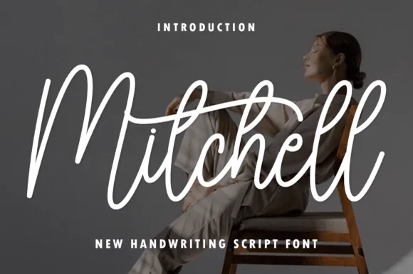
Tall upright brush-pen signature calligraphy script
Mitchell is a stylish, tall-looped brush-signature script pairing high editorial ascenders ('M', 't', 'h', 'l') with smooth, vinyl-friendly stroke weight.
Ideas for this font
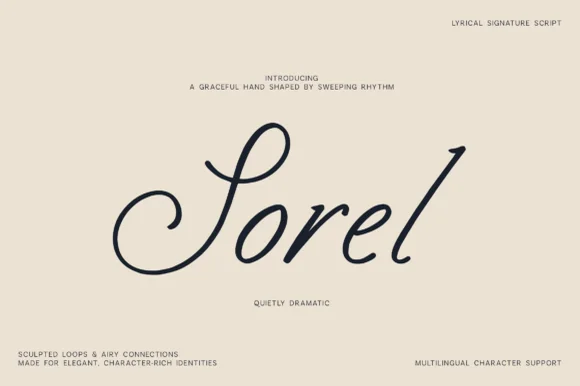
Lyrical monoline-shaded calligraphic signature script
Sorel is a poised, slanted lyrical signature script defined by an expansive double-curled S-loop and crisp high-rising ascenders.
Ideas for this font
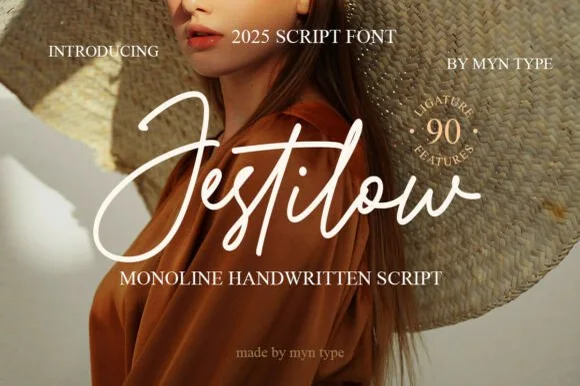
Flowing signature monoline script with 90 ligature features
Jestilow is an expressive monoline signature script packed with 90 custom ligatures, soaring t-crossbars, and sweeping initial loops.
Ideas for this font
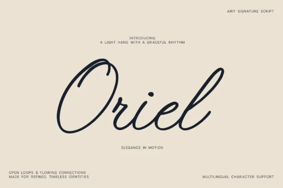
Airy open-loop minimalist monoline signature script (Multilingual)
Oriel is an airy, minimalist monoline signature script featuring wide open oval 'O' loops, unhurried rhythm, and full multilingual support.
Ideas for this font
Same independent foundry
Allow optional Google Analytics to measure visits and catalogue actions. Your search words and notes are not included. Privacy & storage