Editorial Serif Anchor

Nurse + Resquel
Anchors Nurse's fluid strokes with crisp Roman proportions on wedding suites, headers and packaging.
Inspect Resquel specimenDisclosure: MakerFileHub may earn a commission from qualifying purchases via paid links on this page. How our links work.
Clean humanist sans
Nurse is a clean humanist sans in white over a soft illustration: a tall x-height, open counters, a single-storey a and a light-to-regular weight, set as a single line with a wide-tracked subtitle beneath, so the pair reads as a calm, institutional wordmark.
Paid link
Get this fontProject & layout blueprintsAt-a-glance maker compatibility
Weld or Unite overlapping script joins into one continuous vector path before sending to the blade.
Visual anatomy & craft review
The word is set once, large, and the drawing is a humanist sans: the stroke is even, the bowls are open, the terminals are cut horizontally, and the x-height is generous, which is what makes the letters read clearly at a distance. The single-storey a and the open e are the details that give the face its friendly rather than corporate tone. Spacing is normal and the subtitle beneath is widely tracked, which separates the two levels without a change of weight. The ground is a pale illustration of soft shapes, and the type sits over the lightest area so the white holds without a shadow; the only other element is a small tracked line at the foot, which keeps the plate quiet.
Sans, humanist, clean, calm
Two-font hierarchy recipes
Tested contrast partners — pairing Nurse with grounded secondary typography.
Nurse + Resquel
Anchors Nurse's fluid strokes with crisp Roman proportions on wedding suites, headers and packaging.
Inspect Resquel specimen
Nurse + Lemon Milk Pro FTR
Keeps small-scale dates, URLs, nutrition facts and care instructions crisp and legible below script titles.
Inspect Lemon Milk Pro FTR specimenPractical applications
Concrete hierarchy, scale and production guidance tailored to Nurse’s stroke geometry.
A humanist sans reads as approachable and clear, and the open counters keep a two-word practice name legible on a door plate and a website header at once.
Hierarchy & layout recipe
Set the mark at 18 pt on a card, 90 mm on a door plate and 10 pt in a footer, with a tracked descriptor beneath. Keep one colour and reserve clear space equal to the x-height.
Pre-production check
Check the 10 pt footer on uncoated paper, where open counters can fill; keep the size above 8 pt. Confirm the door plate reads at six metres and that the mark works reversed out of a dark ground.
A clean sans reads as an official but friendly notice, and the tall x-height keeps a long line of instructions legible on a wall where a condensed face would be harder to scan.
Hierarchy & layout recipe
A4 print: the heading at 40 mm, the times in a 10 mm sans, and the instructions in 9 mm with 13 mm leading. Keep 20 mm margins and print one colour on white so the notice photocopies cleanly.
Pre-production check
Check the A4 at two metres, where a light weight can grey out; use the regular. Confirm the 9 mm instructions read at arm's length and that the heading fits on one line.
A calm sans reads as trustworthy on a small sticker, and the open letterforms stay legible at the size a counter label can afford.
Hierarchy & layout recipe
Die-cut a 50 mm sticker: the service at 12 pt, the hours in a 6 pt sans, and 3 mm clear to the die. Keep two lines maximum and print two colours on a white stock.
Pre-production check
Check the 12 pt service, where a light weight can fade at the die edge; keep the size above 11 pt. Confirm the 6 pt hours read at arm's length and that the sticker adheres to a glass door.
Technical & licence verification
Confirm included OTF/TTF/WOFF formats, full glyph tables and licence coverage on the live store page before batch production.
Closest visual alternatives
Matched across letterform anatomy, stroke behaviour and craft applications.
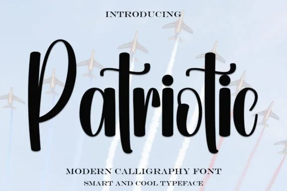
Bold upright brush-calligraphy script with connected crossbar
Patriotic is a sturdy, upright modern calligraphy brush script with bold downstrokes, rounded loops, and a sweeping t-crossbar.
Ideas for this font
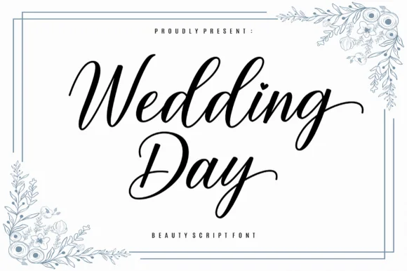
Graceful slanted calligraphy script with sweeping exit tails
Wedding Day is a smooth, romantic modern calligraphy script balancing tall looped ascenders ('d-d') with graceful horizontal exit swashes.
Ideas for this font
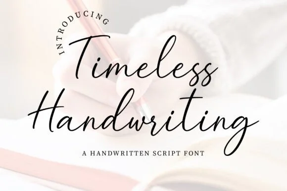
Natural fountain-pen journal & correspondence script
JIM MART's fountain-pen handwriting script pairs airy, fast-flowing ink strokes with natural baseline bounce and crisp lowercase connections.
Ideas for this font
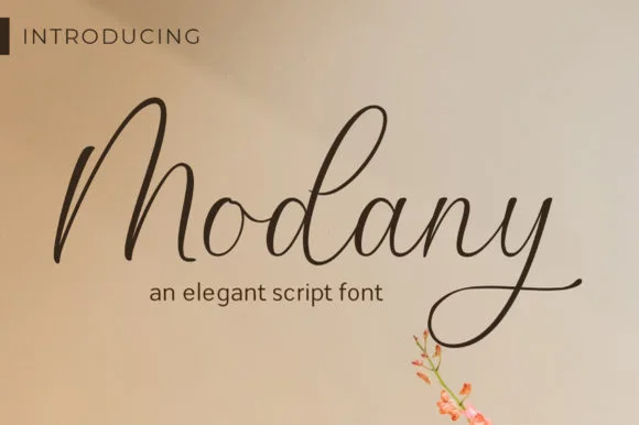
Slender upright fountain-pen cursive script
Modany is a graceful, thin-to-medium handwritten cursive script with tall peaked arches on capitals and long, airy ascenders.
Ideas for this font
Same independent foundry
Allow optional Google Analytics to measure visits and catalogue actions. Your search words and notes are not included. Privacy & storage