Neutral Sans Workhorse

Mother Sunflower + Noar
Lets Mother Sunflower own the focal silhouette while handling secondary copy, sizing and subheads cleanly.
Inspect Noar specimenDisclosure: MakerFileHub may earn a commission from qualifying purchases via paid links on this page. How our links work.
Tall rounded creative display
Mother Sunflower is a tall rounded display in brown over a sunflower photograph: narrow letters with soft terminals, an open R and a curled G, a slight bounce and generous spacing, so the pair reads as a hand-lettered family sign rather than a geometric face.
Paid link
Get this fontProject & layout blueprintsAt-a-glance maker compatibility
Sturdy stroke walls and open counters weed cleanly on adhesive vinyl, HTV apparel film, and cut cardstock.
Visual anatomy & craft review
The two words are stacked and the drawing is a tall rounded display: the strokes are even, the corners are soft, and the letters are narrow, which lets a long phrase fill the frame without a third line. A few letters carry a drawn gesture — the G hooks inward, the R opens, the S leans — and that is what keeps the face from reading as a condensed grotesque. The bounce keeps the baseline moving, so the pair feels written, and the counters stay open so the words read at a distance. The ground is a photograph of a mother and child in a sunflower field, and the type sits over the bright part so the brown holds; a tracked caption above and below completes the plate.
Tall, rounded, creative, warm
Two-font hierarchy recipes
Tested contrast partners — pairing Mother Sunflower with grounded secondary typography.
Mother Sunflower + Noar
Lets Mother Sunflower own the focal silhouette while handling secondary copy, sizing and subheads cleanly.
Inspect Noar specimen
Mother Sunflower + Kernova
Grounds bold display lettering with classic typographic authority on posters, badges and apparel.
Inspect Kernova specimenPractical applications
Concrete hierarchy, scale and production guidance tailored to Mother Sunflower’s stroke geometry.
A warm rounded display suits a family card, and the narrow letters fit a long name on one line above the details without forcing the type down a size or wrapping it onto a second line.
Hierarchy & layout recipe
A6 card: the name at 30 pt, the details in a 9 pt sans, and a small sunflower at the foot. Keep 12 mm margins and print one ink on a cream card so the soft terminals stay visible.
Pre-production check
Check the 30 pt name on a home printer, where a soft corner can blur; keep the ink dark. Confirm the 9 pt details keep a 4.5:1 contrast and that the sunflower clears the trim.
A friendly rounded face reads as a hand-lettered stall sign, and the heavy even strokes survive on a board that sits outdoors.
Hierarchy & layout recipe
Paint a 900 by 400 mm board: the stall name at 120 mm cap height, the prices in a 24 mm sans, and a 5 mm border. Keep 25 mm margins and paint two colours on a light board.
Pre-production check
Check the board at ten metres, where the bounce can make the name look crooked; align the first and last letters. Confirm the 24 mm prices read at three metres and that the border clears the eyelets.
A warm display gives a personal card a hand-lettered feel, and the open letterforms keep a short message readable at card size.
Hierarchy & layout recipe
A6 folded card: the greeting at 26 pt, the message in a 9 pt roman at 13 pt leading, and a small line-art flower. Keep 14 mm margins and print one ink on a cream card.
Pre-production check
Check the 26 pt greeting, where a curl can collide with the message block; keep 8 mm clear. Confirm the 9 pt message reads comfortably and that the card opens flat after folding.
Technical & licence verification
Confirm included OTF/TTF/WOFF formats, full glyph tables and licence coverage on the live store page before batch production.
Closest visual alternatives
Matched across letterform anatomy, stroke behaviour and craft applications.
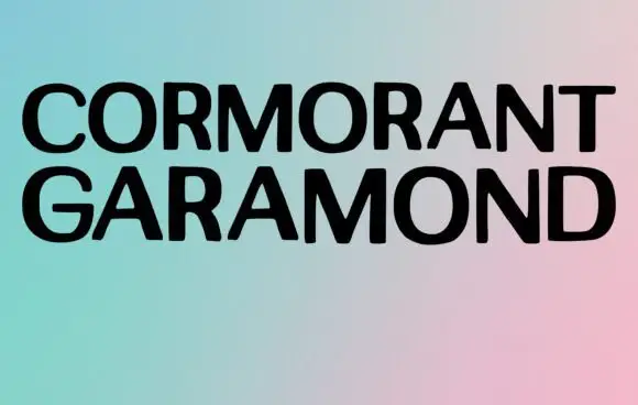
Broad plain capitals in a minimal specimen
Cormorant Garamond shows two long rows of broad black capitals over a soft gradient, where the strokes stay largely even, the joins close tightly and only faint thickenings hint at a serif at this display size rather than the fine detail the family name suggests.
Ideas for this font
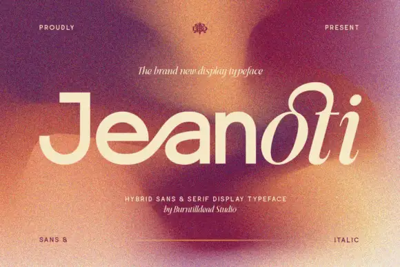
Broad plain mixed case shifting into a fine looped slanted ending
Jeanoti shows pale lettering over a warm blurred portrait, where the opening word uses broad near-even sans strokes with a squared J top and a wide e, before the ending rises into a large upper loop and closes with a detached oval dot and a curved foot.
Ideas for this font
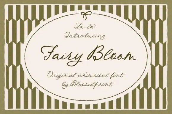
Whimsical formal script with ribbon-like loops and a light even stroke
Fairy Bloom is a whimsical formal script in which the capitals open into wide ribbon loops, the stroke stays light and even, and the joins curl into small ornate turns.
Ideas for this font

Bold sans with ligature alternates
Think Loved is a bold sans in orange on a pale ground: wide geometric caps with flat terminals, a very high waist and tight spacing, with a ligature that fuses two letters into a single drawn shape, set in two lines with a small tracked note beneath naming the alternate.
Same independent foundry
Allow optional Google Analytics to measure visits and catalogue actions. Your search words and notes are not included. Privacy & storage