Modern Grotesque Body

Melody Dreams + One More
Creates crisp high-hierarchy contrast beneath Melody Dreams headlines across menus, websites and labels.
Inspect One More specimenDisclosure: MakerFileHub may earn a commission from qualifying purchases via paid links on this page. How our links work.
Retro serif with curled alternates
Melody Dreams is a retro serif in cream over a beach photograph: moderate contrast, rounded bracketed serifs, and heavy curls on the M and the D that turn into decorative terminals, with alternate glyphs that add stars, so the pair reads as a seventies album cover.
Paid link
Get this fontProject & layout blueprintsAt-a-glance maker compatibility
Sturdy stroke walls and open counters weed cleanly on adhesive vinyl, HTV apparel film, and cut cardstock.
Visual anatomy & craft review
The two words are stacked and the drawing is a serif with soft, swollen features: the strokes are rounded, the serifs are short and bracketed, and the terminals on several letters curl back into the form, which gives the face its period warmth. The alternates matter here: the specimen uses forms with extended curls and small stars attached to the ends, which is how a designer makes the setting feel drawn rather than typeset. Spacing is loose, so the curls have room and the pair reads as a composition. The ground is a photograph of palms and sea at dusk, and the three tracked captions along the foot name the category, the feature and the studio, in a light grotesque that stays out of the way.
Retro, serif, curled, warm
Two-font hierarchy recipes
Tested contrast partners — pairing Melody Dreams with grounded secondary typography.
Melody Dreams + One More
Creates crisp high-hierarchy contrast beneath Melody Dreams headlines across menus, websites and labels.
Inspect One More specimen
Melody Dreams + Rebel Marks
Adds a warm human signature touch for 1-to-3-word callouts without competing against structured serif capitals.
Inspect Rebel Marks specimenPractical applications
Concrete hierarchy, scale and production guidance tailored to Melody Dreams’s stroke geometry.
A retro serif with curls gives a playlist cover the feel of a period sleeve, and the alternates let a short title fill the square without a second element.
Hierarchy & layout recipe
Set the title at 60 mm wide on a 140 mm square, the subtitle in a 9 pt grotesque, and the track count at 7 pt. Print cream on a photograph and keep the type in the upper half so the image reads.
Pre-production check
Check the 60 mm title over a photograph, where a curly terminal can disappear into the image; keep it on a dark area. Confirm the 9 pt subtitle reads on a phone thumbnail and that the curls clear the trim.
A warm retro serif reads as a painted welcome sign without the formality of a script, and the curls give it enough character to carry a large board.
Hierarchy & layout recipe
A1 board: the greeting at 100 mm cap height, the names in a 40 mm serif, and the date at 24 mm. Keep 40 mm margins so the curls have room, and paint one colour on a light ground.
Pre-production check
Check the board at four metres, where a curl can read as a blot; smooth the exit. Confirm the 24 mm date reads from the door and that the greeting does not crowd the frame.
A curled serif gives a small food brand a period feel, and the flat construction prints on a sticker where a gradient would cost more.
Hierarchy & layout recipe
Print a 55 mm round label: the flavour at 14 pt, the brand in a 6 pt sans, and one star alternate. Keep 4 mm inside the die and print two colours on an uncoated stock.
Pre-production check
Check the 14 pt flavour, where a star alternate can crowd the neighbouring letter; drop it below 16 pt. Confirm the label adheres to a paper cup and that the curl survives the die cut.
Technical & licence verification
Confirm included OTF/TTF/WOFF formats, full glyph tables and licence coverage on the live store page before batch production.
Closest visual alternatives
Matched across letterform anatomy, stroke behaviour and craft applications.
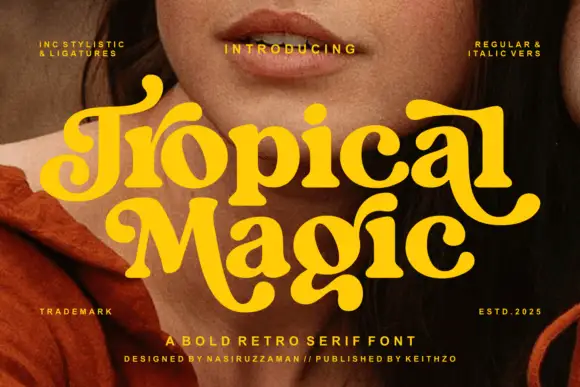
Heavy rounded retro serif
Tropical Magic is a heavy rounded retro serif in yellow over a portrait: fat stems with ball terminals, curled entries on the capitals, round bowls and a swollen waist, set on two lines with tracked notes in the corners naming the italics and the alternates, and a credit along the foot.
Ideas for this font
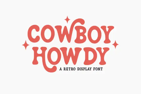
Soft retro serif with curling letter tails
Cowboy Howdy uses rounded heavy serif forms and open circular bowls in a warm coral red, where the Y of the upper word throws a tall curl high above the cap line and the H of the lower word drops a long rounded tail beneath the baseline.
Ideas for this font
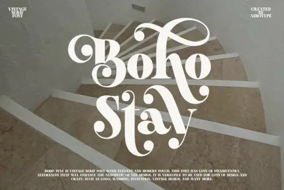
Heavy soft serifs with large ball-ended looping swashes
Boho Stay is a heavy soft serif in which the letters carry strong thick-thin contrast, the counters stay tight and large curled swashes with ball ends frame the capital, rise over the first row and sweep between the two title lines.
Ideas for this font
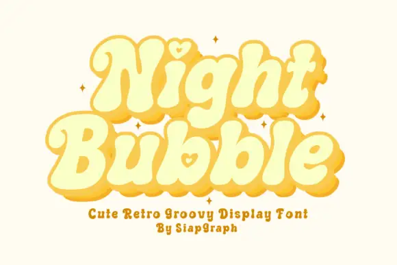
Soft retro bubble letters with hearts
Night Bubble is a soft retro display face in butter yellow: fat rounded letterforms, an offset pink shadow, and a small heart tucked into the counters of the N and the b.
Ideas for this font
Same independent foundry
Allow optional Google Analytics to measure visits and catalogue actions. Your search words and notes are not included. Privacy & storage