Neutral Sans Workhorse

Medieval Leaves + Base Edge
Lets Medieval Leaves own the focal silhouette while handling secondary copy, sizing and subheads cleanly.
Inspect Base Edge specimenDisclosure: MakerFileHub may earn a commission from qualifying purchases via paid links on this page. How our links work.
Botanical illuminated initials
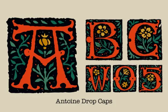
Medieval Leaves is a set of illuminated capitals in black on coloured grounds: each letter sits in a square filled with drawn leaves and tendrils, printed in orange, teal, red and olive, with a short line of the family set below in a serif with leafy serifs.
Paid link
Get this fontProject & layout blueprintsAt-a-glance maker compatibility
Weld or Unite overlapping script joins into one continuous vector path before sending to the blade.
Visual anatomy & craft review
The design is built around single letters rather than a paragraph: a large A stands inside an orange square where acanthus leaves and curling tendrils are drawn in a lighter tone behind the letter, and five smaller blocks carry B, C, D, E and F in a teal, a red, an olive and two more orange grounds, each with its own crop of foliage. The letters themselves are a sturdy serif with sharp wedge serifs and a moderate contrast, drawn to hold their own against the busy ground, and the squares are ruled with a hand-drawn border rather than a mechanical one. Below the blocks a line of the family is set in a medieval-flavoured serif with small leaves growing from the serifs, which shows how the capitals behave in text. The palette is a warm cream page with four ink colours. Medieval Leaves is a decorative set for drop caps, book covers, labels and seasonal cards, and it works best as one or two capitals rather than as a full line.
Illuminated, botanical, woodcut
Two-font hierarchy recipes
Tested contrast partners — pairing Medieval Leaves with grounded secondary typography.
Medieval Leaves + Base Edge
Lets Medieval Leaves own the focal silhouette while handling secondary copy, sizing and subheads cleanly.
Inspect Base Edge specimen
Medieval Leaves + Raffined
Grounds bold display lettering with classic typographic authority on posters, badges and apparel.
Inspect Raffined specimenPractical applications
Concrete hierarchy, scale and production guidance tailored to Medieval Leaves’s stroke geometry.
An illuminated capital gives a page the look of an old book, and a single letter can carry the decoration that a whole page of type cannot afford.
Hierarchy & layout recipe
Print a 148 by 210 mm book page: set the drop cap at 96 pt in a 24 mm square, keep 5 mm of clear ground around the block, and align the first three lines of text to its foot.
Pre-production check
A busy botanical ground can swallow the letter at text size; print one spread and check the letter against the foliage before the run.
Four capitals in different grounds let a card repeat a short word as a pattern, and the foliage inside the squares does the decorating without a photograph.
Hierarchy & layout recipe
Print a 120 by 120 mm card: set each capital at 44 pt inside a 26 mm square, keep 6 mm between the blocks, and hold 14 mm of margin on all four sides of the card.
Pre-production check
Four heavy grounds side by side can look like a colour chart; proof one card and check that the inks sit together before printing the batch.
An illuminated initial makes a small tin look like an old apothecary label, and the drawn leaves suit a product that is sold on its ingredients.
Hierarchy & layout recipe
Print a 60 by 90 mm label: set the initial at 38 pt in a 20 mm square, keep 6 mm of clear ground to the right before the word at 9 pt, and hold 5 mm of margin on all four sides.
Pre-production check
Fine tendrils can fill in on a small tin label; print one on the real stock and check the foliage before the order.
Technical & licence verification
Confirm included OTF/TTF/WOFF formats, full glyph tables and licence coverage on the live store page before batch production.
Closest visual alternatives
Matched across letterform anatomy, stroke behaviour and craft applications.
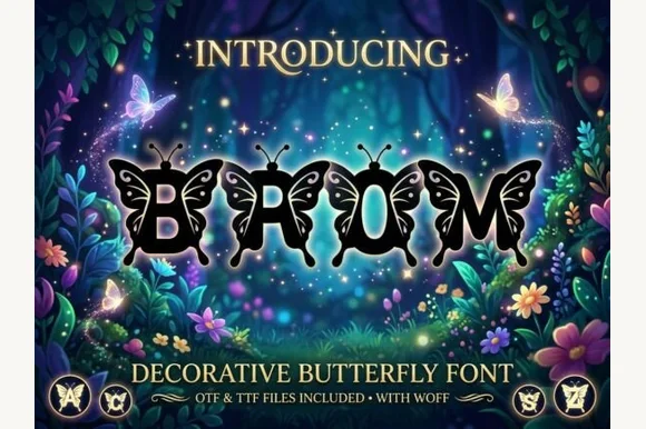
Ornate monarch-butterfly-winged fantasy alphabet (OTF, TTF & WOFF)
Brom is a magical decorative alphabet sprouting intricate monarch-style butterfly wings directly off every letterform (OTF, TTF & WOFF)!
Ideas for this font
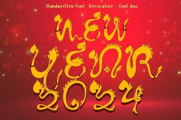
Ornate fairytale display with flame curls
New Year 2024 is a decorative display in gold on deep red: thin ornate letters with flame-shaped curls rising from the stems, teardrop terminals and small diamond details, so the words read as a fairytale title rather than as a modern alphabet.
Ideas for this font
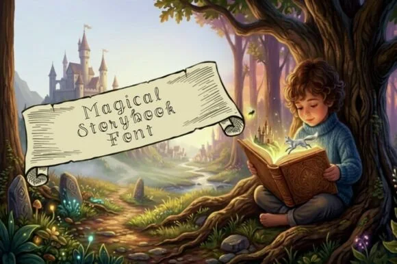
Whimsical spiral-curled hollow outline fairytale font
Magical Storybook is a delicate hollow-outline fairytale font curling storybook spirals onto open-centered uppercase and lowercase letters.
Ideas for this font
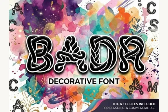
Interlaced labyrinth & ribbon-knotwork display font (OTF & TTF)
Badr is an intricate decorative display font weaving continuous white interlaced knotwork ribbons inside bold black uppercase silhouettes (OTF & TTF).
Ideas for this font
Same independent foundry
Allow optional Google Analytics to measure visits and catalogue actions. Your search words and notes are not included. Privacy & storage