Neutral Sans Workhorse

Manuscript Felice + Noar
Lets Manuscript Felice own the focal silhouette while handling secondary copy, sizing and subheads cleanly.
Inspect Noar specimenDisclosure: MakerFileHub may earn a commission from qualifying purchases via paid links on this page. How our links work.
Rough manuscript blackletter
Manuscript Felice is a rough manuscript blackletter shown on cream against faint ruled lines: a large red line of capitals with a ragged finish, a smaller dark line in a tighter cut beneath it, a tracked line that names the family, and a red date line at the foot.
Paid link
Get this fontProject & layout blueprintsAt-a-glance maker compatibility
Weld or Unite overlapping script joins into one continuous vector path before sending to the blade.
Visual anatomy & craft review
The plate is a facsimile page rather than a specimen, and the faint rules are the useful part, because they show the baseline and the x-height that a manuscript hand has to sit on. The drawing is a blackletter with a ragged edge and, in the smaller cut, fine extended pen tails, so the face reads as a printed manuscript rather than as a modern gothic, and the two cuts answer different needs: the large one is a display line and the smaller one can set a phrase. That construction sets a moderate size floor, because the fine tails close first. The red and the dark inks are a two-colour demonstration, and the copies are product copy.
Decorative, blackletter, manuscript, historic
Two-font hierarchy recipes
Tested contrast partners — pairing Manuscript Felice with grounded secondary typography.
Manuscript Felice + Noar
Lets Manuscript Felice own the focal silhouette while handling secondary copy, sizing and subheads cleanly.
Inspect Noar specimen
Manuscript Felice + Aureline
Grounds bold display lettering with classic typographic authority on posters, badges and apparel.
Inspect Aureline specimenPractical applications
Concrete hierarchy, scale and production guidance tailored to Manuscript Felice’s stroke geometry.
A manuscript blackletter opens a chapter as a facsimile page, and the two cuts cover a heading and a caption without a second face.
Hierarchy & layout recipe
Set the chapter title in the display cut at 60 mm cap height, the caption in the smaller cut at 11 pt, and the folio at 9 pt. Print two colours on a cream stock and keep 22 mm margins.
Pre-production check
Check the 60 mm title, where a ragged edge can clot; keep the counters open. Confirm the 11 pt caption holds on the stock and that the folio aligns to the text block.
A manuscript face reads as a period placard, and the rough edge suits a fair better than a clean gothic. The rough edge reads as print.
Hierarchy & layout recipe
A2 poster: the fair in the display cut at 100 mm cap height, the details in the smaller cut at 16 mm, and the date at 11 mm. Keep 32 mm margins and print two colours on a cream stock.
Pre-production check
Check the A2 at five metres, where a fine tail can vanish; keep it above 1.5 mm. Confirm the 11 mm date reads at two metres and that the title clears the borders.
A manuscript face gives a themed ceremony a printed register, and the red ink carries the formality without a second face.
Hierarchy & layout recipe
A5 invitation: the names in the display cut at 22 pt, the request in the smaller cut at 10 pt, and the date at 8.5 pt. Keep 24 mm margins and print two colours on a cream card.
Pre-production check
Check the 22 pt names, where a ragged edge can close; keep the counters open. Confirm the 10 pt request reads at arm's length and that the names clear the trim.
Technical & licence verification
Confirm included OTF/TTF/WOFF formats, full glyph tables and licence coverage on the live store page before batch production.
Closest visual alternatives
Matched across letterform anatomy, stroke behaviour and craft applications.
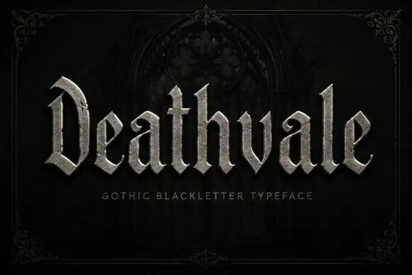
Slender blackletter with an arched D and curled a terminals
Deathvale is a narrow gothic blackletter with tall ascenders, needle-sharp spurs and a silver fill, drawn to sit inside a dark arch like a name carved over a door.
Ideas for this font
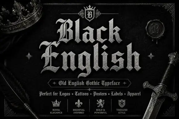
Angular blackletter with diamond-ended strokes and ornate initials
Black English shows pale Gothic mixed case on black, where angular broken bowls, pointed joins and diamond stroke endings give the lowercase a dense rhythm, the large B and E carry extra entry flourishes and a grey hatched treatment adds surface detail to the shown title.
Ideas for this font
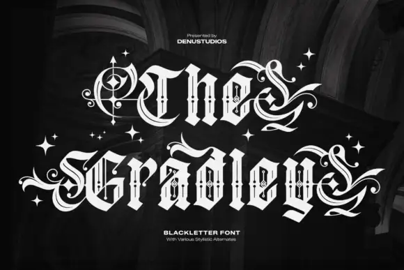
Ornate blackletter with hairline inner strokes and long curling swashes
The Gradley is an ornate blackletter display face: heavy letters with a fine inline running through the stems, long swashes on several capitals, and stars scattered between the words.
Ideas for this font
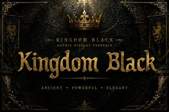
Weighty serif-like Gothic with rounded bowls and tapered sharp tips
Kingdom Black is a gothic display face filled with a textured gold, presented as a royal title plate with a crown above, lion banners at the sides and an ornamental frame.
Ideas for this font
Same independent foundry
Allow optional Google Analytics to measure visits and catalogue actions. Your search words and notes are not included. Privacy & storage