Neutral Sans Workhorse

Antoine Drop Caps + Cenura
Lets Antoine Drop Caps own the focal silhouette while handling secondary copy, sizing and subheads cleanly.
Inspect Cenura specimenDisclosure: MakerFileHub may earn a commission from qualifying purchases via paid links on this page. How our links work.
Floral square initials with red letters and irregular black grounds
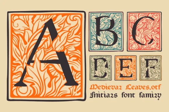
Antoine Drop Caps draws illuminated capitals on rough black blocks, with orange letter strokes, green carved foliage and a small yellow flower in the counter, in the manner of a printed manuscript initial.
Paid link
Get this fontProject & layout blueprintsAt-a-glance maker compatibility
Sturdy stroke walls and open counters weed cleanly on adhesive vinyl, HTV apparel film, and cut cardstock.
Visual anatomy & craft review
The A takes the left of the card at a large size, drawn as an orange letter on a black block with a ragged edge, filled around with green leaves, stems, berries and a yellow bud in its counter; the smaller B, C, W, O and S follow on the right in the same construction. The colour is flat and slightly misregistered, like a woodcut printed in three inks, and the ragged block edge is deliberate: it reads as a printed impression rather than a vector shape. A caption at the foot names the set in a plain serif with open spacing. The face is an initial set for chapter openers and labels, and its limitation is legibility — these are single capitals meant to be seen at a good size next to a first paragraph, not to be set as words.
Floral square initials with red letters and irregular black grounds
Two-font hierarchy recipes
Tested contrast partners — pairing Antoine Drop Caps with grounded secondary typography.
Antoine Drop Caps + Cenura
Lets Antoine Drop Caps own the focal silhouette while handling secondary copy, sizing and subheads cleanly.
Inspect Cenura specimen
Antoine Drop Caps + Auretha
Grounds bold display lettering with classic typographic authority on posters, badges and apparel.
Inspect Auretha specimenPractical applications
Concrete hierarchy, scale and production guidance tailored to Antoine Drop Caps’s stroke geometry.
An illuminated initial gives a recipe chapter the feel of a printed book, and the warm palette sits well beside food photography without competing with it.
Hierarchy & layout recipe
Print a 190 by 245 mm page: set the initial at 42 mm tall in three lines of text, keep 6 mm of clear ground between the initial and the first line at 10.5 pt, and hold 20 mm of margin at the fore-edge.
Pre-production check
The ragged edge fills in small offset; print one page on the real paper and check the flower in the counter first.
The initial gives a bottle the look of a hand-printed orchard label, and one capital is enough decoration for a small front label.
Hierarchy & layout recipe
Print a 65 by 90 mm label: set the initial at 26 mm tall centred above the name at 11 pt, keep 7 mm of clear ground between the letter and the name, and hold 6 mm from the block edge to the die line.
Pre-production check
Three flat inks on a small label need tight registration; print one label on the real stock and check the leaves before the run.
The initial ties a menu to a hand-printed aesthetic, and one letter carries the decoration that would otherwise be a drawn border on every card.
Hierarchy & layout recipe
Print a 105 by 210 mm menu: set the initial at 30 mm tall beside the first course at 10 pt, keep 6 mm of clear ground between the letter and the text, and hold 16 mm of margin at the foot of the card.
Pre-production check
Ragged blocks look like printing errors at small sizes; print one menu at the finished size and judge the edge before the suite.
Technical & licence verification
Confirm included OTF/TTF/WOFF formats, full glyph tables and licence coverage on the live store page before batch production.
Closest visual alternatives
Matched across letterform anatomy, stroke behaviour and craft applications.
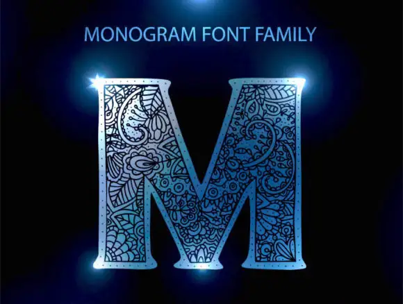
Floral-packed monogram initial
Monogram Font Family is a single ornate initial in pale blue on black: a broad serif M whose every stroke is packed with curling floral and paisley-like linework, lit with a blue flare at two corners and labelled above with the family name.
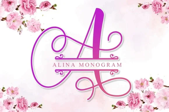
Calligraphic split-bar monogram
Alina Monogram builds ornate calligraphic capitals with an integrated centre split bar, where sweeping ribbon loops wrap each uppercase initial while a clean horizontal band runs through the middle to hold family names or a wedding date.
Ideas for this font

A looping contrast B initial with a large outlined flower, leaves and butterfly
Beauty Flower Monogram is a single ornate script initial with a long descending swash that turns into a line-drawn rose, two leaves and a butterfly, set in a warm pink-to-magenta gradient.
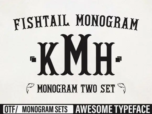
Tall monogram capitals with split fishtail ends
Fishtail Monogram shows a tall central M standing between narrower K and H, where split curved terminals flare at both ends of every upright, small square marks sit beside the outer letters and a fish outline appears at each side of a lower line.
Ideas for this font
Same independent foundry
Allow optional Google Analytics to measure visits and catalogue actions. Your search words and notes are not included. Privacy & storage