Neutral Sans Workhorse

Badr + Mansory
Lets Badr own the focal silhouette while handling secondary copy, sizing and subheads cleanly.
Inspect Mansory specimenDisclosure: MakerFileHub may earn a commission from qualifying purchases via paid links on this page. How our links work.
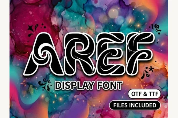
Interlaced labyrinth & ribbon-knotwork display font (OTF & TTF)
Badr is an intricate decorative display font weaving continuous white interlaced knotwork ribbons inside bold black uppercase silhouettes (OTF & TTF).
Paid link
Get this fontProject & layout blueprintsAt-a-glance maker compatibility
Sturdy stroke walls and open counters weed cleanly on adhesive vinyl, HTV apparel film, and cut cardstock.
Visual anatomy & craft review
Badr is an interlaced display in which each letter is woven from two ribbons that cross over and under one another in a knotwork lattice, so a word reads as a single braided band rather than as separate glyphs. The crossings create small gaps that must stay open, and the ribbons are narrow, so the face needs size. It needs roughly 40 mm for the over-under weave to read, and it is best in one metallic or deep ink on a plain ground, where the crossings stay unambiguous.
Ribbon-knot · Labyrinth · Artisan
Two-font hierarchy recipes
Tested contrast partners — pairing Badr with grounded secondary typography.
Badr + Mansory
Lets Badr own the focal silhouette while handling secondary copy, sizing and subheads cleanly.
Inspect Mansory specimen
Badr + Augler
Grounds bold display lettering with classic typographic authority on posters, badges and apparel.
Inspect Augler specimenPractical applications
Concrete hierarchy, scale and production guidance tailored to Badr’s stroke geometry.
Interlaced knotwork reads as an ornamental masthead rather than a modern headline, which is what a culture issue about craft or heritage wants. The braided band gives the title one continuous line at 72 pt, and the crossings hold their over-under logic in a single ink on a plain ground without shading.
Hierarchy & layout recipe
Cover 210 x 297 mm, title 80 pt with 10 mm weave clearance, cover lines 10/14 pt, 18 mm margins. Feature title 60 pt, standfirst 11/15 pt. Ornament rule 120 x 20 mm.
Pre-production check
Over a photograph the small crossing gaps fill with mid-tone and the weave reads as a solid ribbon. Keep the face on a flat panel or white box, and proof one cover at 1:1 before the run.
A braided knotwork mark reads as a heritage crest rather than a modern logo, which is what a small maker of traditional goods wants on its packaging. The single braided band holds at 30 mm on a box lid, and the crossings stay legible in one foil pass on a dark ground.
Hierarchy & layout recipe
Box lid 200 x 200 mm, mark 40 mm with 8 mm weave clearance, 20 mm margins. Leather tag 40 x 80 mm, mark 12 mm, 5 mm edge margin. Card 85 x 55 mm, mark 16 mm, 5 mm margins.
Pre-production check
Foil on the 40 mm box lid bridges the 0.6 mm crossing gap and the braid prints as a solid slab. Keep foil at 50 mm and above or print flat ink on the lid, and pull one foil proof before the run.
An interlaced monogram reads as a woven family crest, which is what a formal wedding wants above the couple's names instead of a plain initial. The braided band gives the crest weight at 30 mm, and one ink on heavy card keeps the crossings sharp on uncoated stock.
Hierarchy & layout recipe
Invitation 130 x 180 mm, crest 30 mm with 8 mm weave clearance, names 20 pt, details 9/13 pt, 15 mm margins. Menu header 18 mm, dishes 9/13 pt. Favour label 40 x 60 mm, crest 22 mm, 4 mm die margin.
Pre-production check
A 40 x 60 mm favour label at 22 mm closes the crossing gaps and the crest prints as a filled disc. Raise the label crest to 30 mm or use a simpler two-letter weave, and check one label before the set.
Technical & licence verification
Confirm included OTF/TTF/WOFF formats, full glyph tables and licence coverage on the live store page before batch production.
Closest visual alternatives
Matched across letterform anatomy, stroke behaviour and craft applications.
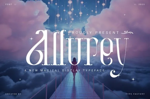
Dreamy high-contrast fairytale swash serif (Alternates & Swashes)
Allurey is a luminous, romantic fairytale display serif sweeping lush teardrop loops on 'A', 'l', and 'y' (with stylistic alternates & swashes)!
Ideas for this font
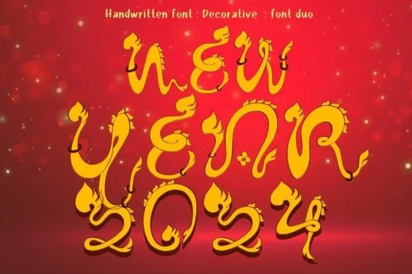
Ornate fairytale display with flame curls
New Year 2024 is a decorative display in gold on deep red: thin ornate letters with flame-shaped curls rising from the stems, teardrop terminals and small diamond details, so the words read as a fairytale title rather than as a modern alphabet.
Ideas for this font
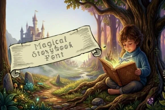
Whimsical spiral-curled hollow outline fairytale font
Magical Storybook is a delicate hollow-outline fairytale font curling storybook spirals onto open-centered uppercase and lowercase letters.
Ideas for this font
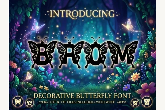
Ornate monarch-butterfly-winged fantasy alphabet (OTF, TTF & WOFF)
Brom is a magical decorative alphabet sprouting intricate monarch-style butterfly wings directly off every letterform (OTF, TTF & WOFF)!
Ideas for this font
Same independent foundry
Allow optional Google Analytics to measure visits and catalogue actions. Your search words and notes are not included. Privacy & storage