Neutral Sans Workhorse

Medieval Knots + Base Edge
Lets Medieval Knots own the focal silhouette while handling secondary copy, sizing and subheads cleanly.
Inspect Base Edge specimenDisclosure: MakerFileHub may earn a commission from qualifying purchases via paid links on this page. How our links work.
Knot-patterned medieval initials
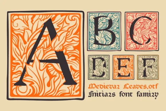
Medieval Knots is a display set on a cream ground: large patterned initials with an outlined edge, interior scrollwork and knot-like crosspieces, in red and green, with a small script note at the upper right naming the file and a plain line beneath naming the family.
Paid link
Get this fontProject & layout blueprintsAt-a-glance maker compatibility
Sturdy stroke walls and open counters weed cleanly on adhesive vinyl, HTV apparel film, and cut cardstock.
Visual anatomy & craft review
The plate is a plain specimen of initials, and that is the right way to show this kind of face: two letters at a size where the interior pattern and the knot crosspieces can be read, with the letterspacing left wide so each initial is judged on its own. The construction is a medieval initial with an outlined edge and internal scrollwork, so the letter reads as an illuminated capital rather than as a block, and the interior pattern sets a large size floor because it closes into a tone first. The script note and the family line are product copy. It suits a certificate, a bookplate and a cover, and it is best used for a handful of letters rather than a whole line.
Decorative, medieval, patterned, initial
Two-font hierarchy recipes
Tested contrast partners — pairing Medieval Knots with grounded secondary typography.
Medieval Knots + Base Edge
Lets Medieval Knots own the focal silhouette while handling secondary copy, sizing and subheads cleanly.
Inspect Base Edge specimen
Medieval Knots + Alerigue
Grounds bold display lettering with classic typographic authority on posters, badges and apparel.
Inspect Alerigue specimenPractical applications
Concrete hierarchy, scale and production guidance tailored to Medieval Knots’s stroke geometry.
A knot initial gives a wedding a crest, and the pattern reads as illuminated work without a hand-painted original. It reads as a crest.
Hierarchy & layout recipe
Set two initials at 50 mm on the invitation, 30 mm on the menu and 20 mm on a tag, in two inks. Keep the finest pattern line above 0.4 mm and hold 8 mm clear space.
Pre-production check
Check the 20 mm tag, where the pattern closes into a tone; use the outline only there. Confirm the 50 mm invitation holds in letterpress and that the knots clear the trim.
An illuminated initial frames a history cover, and the knot pattern gives the title real detail at display size. It frames a history cover.
Hierarchy & layout recipe
Set the initial at 90 mm tall on the title line, the rest of the title in a 40 pt blackletter, and the author in an 11 pt serif. Print two colours on a textured stock with 22 mm margins.
Pre-production check
Check the 90 mm initial, where the pattern can clot; keep the counters open. Confirm the 11 pt author holds on the stock and that the initial clears the trim.
A knot initial reads as a document, and the two-colour construction holds on a certificate where a plain serif would look ordinary.
Hierarchy & layout recipe
A4 certificate: the initial at 60 mm, the title at 22 pt, the name at 18 pt, and a rule border 10 mm inside the trim. Print two colours on a heavy card.
Pre-production check
Check the 60 mm initial, where a knot can fill; keep the pattern above 0.4 mm. Confirm the 18 pt name reads at arm's length and that the border stays even.
Technical & licence verification
Confirm included OTF/TTF/WOFF formats, full glyph tables and licence coverage on the live store page before batch production.
Closest visual alternatives
Matched across letterform anatomy, stroke behaviour and craft applications.
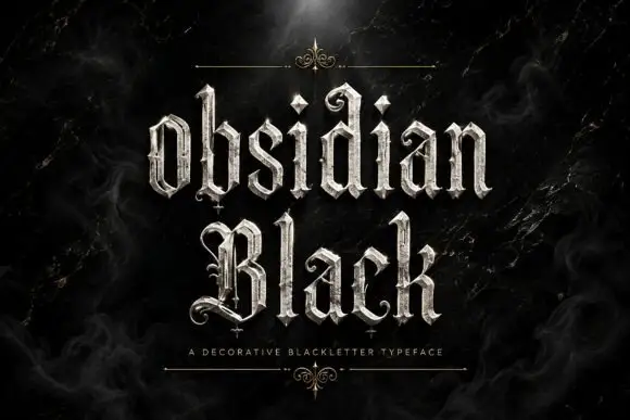
Slender outlined blackletter
Obsidian Black is a slender outlined blackletter in silver on a black marble ground: mixed case with small spirals at the terminals, long fine tips, doubled edges and a scaled texture on the fill, set in two lines with a small tracked line beneath between two hairline rules and drawn fleurons.
Ideas for this font
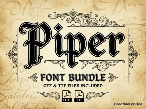
Outlined blackletter with doubled edges
Piper is an outlined blackletter in black on aged cream: a large curled P with doubled edges, narrow bodies, a diamond counter and fine inner lines, set as one large word above a scroll-flanked line that names the bundle and two format marks.
Ideas for this font
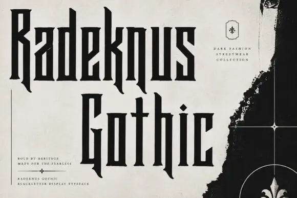
Condensed rectilinear blackletter
Radeknus Gothic is a condensed blackletter in near-black on a pale washed sheet: capitals and lowercase with rectilinear stems, hooked descending legs, sharp spurs and very narrow proportions, set in two lines beside a black fleur-de-lis panel and several small tracked lines.
Ideas for this font
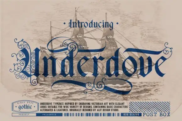
Engraved blackletter with loops
Underdove is a thin blackletter in navy on a faded sepia print of a sailing ship: narrow letters with extended loops and internal curls, a long sweeping swash under the word, and small engraved details, framed by a bottom band that lists the features and a small gothic stamp at the left.
Ideas for this font
Same independent foundry
Allow optional Google Analytics to measure visits and catalogue actions. Your search words and notes are not included. Privacy & storage