Editorial Serif Anchor

Mama + Stanza
Anchors Mama's fluid strokes with crisp Roman proportions on wedding suites, headers and packaging.
Inspect Stanza specimenDisclosure: MakerFileHub may earn a commission from qualifying purchases via paid links on this page. How our links work.
Low bold extended script
Mama is a low bold script in black on white: short wide letters, fat even strokes, and tails that run out to both margins from the first and last letter.
Paid link
Get this fontProject & layout blueprintsAt-a-glance maker compatibility
Weld or Unite overlapping script joins into one continuous vector path before sending to the blade.
Visual anatomy & craft review
mama is set in the middle of the card in lowercase, and the lettering is deliberately low and wide: the bowls are short, the stems are fat, the arches of the m are almost semicircles and the whole word reads as a compact block rather than a flowing line. The entry stroke from the first m runs out to the left margin and the exit stroke from the last a runs out to the right, both tapering, so the word sits between two long tails. A small drawn heart with wings sits above the word in red, and two tracked captions frame it. The face is a warm script for cards, labels and family gifts: the low proportions mean it reads at small sizes, the tails need a wide measure, and it works best as a single short word.
A wide low script with long tails
Two-font hierarchy recipes
Tested contrast partners — pairing Mama with grounded secondary typography.
Mama + Stanza
Anchors Mama's fluid strokes with crisp Roman proportions on wedding suites, headers and packaging.
Inspect Stanza specimen
Mama + Corven
Keeps small-scale dates, URLs, nutrition facts and care instructions crisp and legible below script titles.
Inspect Corven specimenPractical applications
Concrete hierarchy, scale and production guidance tailored to Mama’s stroke geometry.
One low wide word reads from across a table, and the tails let it fill a long narrow card or a place sign without a second element.
Hierarchy & layout recipe
Print a 300 by 100 mm place sign: set the word at 60 pt on one row, keep 14 mm of clear ground beneath before the name at 14 pt, and hold 12 mm of margin so both tails stay inside.
Pre-production check
The tapering tails can look cut off on a small sign; print one at the final size and check both ends before the set.
A low wide script with a drawn heart is a warm one-word card, and the fat strokes hold up at a small size in a home printer.
Hierarchy & layout recipe
Print a 120 by 120 mm square card: set the word at 40 pt on one row, keep 16 mm of clear ground beneath before the message, and hold 14 mm of margin on all sides.
Pre-production check
A wide word on a square card leaves little room for a message; print one card at the finished size and check the balance before the batch.
A warm word on a jar turns a recipe into an heirloom, and the low proportions fit the label without shrinking the letters.
Hierarchy & layout recipe
Print a 60 mm round label: set the word at 18 pt on one row, keep 7 mm of clear ground between the tails and the rim, and leave 8 mm beneath for the date at 5 pt.
Pre-production check
The exit tail crosses the rim on a round label; print one at the real size and check both ends before the order.
Technical & licence verification
Confirm included OTF/TTF/WOFF formats, full glyph tables and licence coverage on the live store page before batch production.
Closest visual alternatives
Matched across letterform anatomy, stroke behaviour and craft applications.
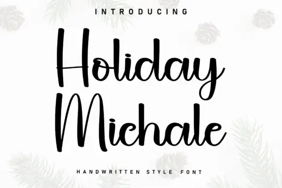
Tall rounded marker script with heavy vertical stems and a high x-height
Holiday Michale is a tall rounded script written with a marker-weight stroke, its verticals heavy and its ascenders high, so two stacked words read as tall columns of ink.
Ideas for this font
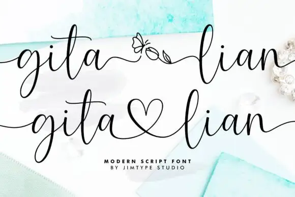
Elegant script with long entry swashes and drawn connectors
Gita Lian is an elegant script in which long swashes enter and leave the word and a drawn connector ties two names together, so a two-name lockup reads as a single written gesture rather than as two separate words.
Ideas for this font

Tall narrow letters left unjoined
Simple Alphabet is a tall narrow display face in black on a pale photograph of loose lettering blocks: monoline letters with rounded ends, open counters and wide spacing, set unjoined so each letter stands on its own.
Ideas for this font

Fine lowercase script with a heart worked into the central connector
Hello Honey is fine lowercase script in which the two words are joined by a heart drawn into the connector, with long flat tails on both sides and a small even x-height.
Same independent foundry
Allow optional Google Analytics to measure visits and catalogue actions. Your search words and notes are not included. Privacy & storage