Editorial Serif Anchor

Holiday Michale + Auretha
Anchors Holiday Michale's fluid strokes with crisp Roman proportions on wedding suites, headers and packaging.
Inspect Auretha specimenDisclosure: MakerFileHub may earn a commission from qualifying purchases via paid links on this page. How our links work.
Tall rounded marker script with heavy vertical stems and a high x-height
Holiday Michale is a tall rounded script written with a marker-weight stroke, its verticals heavy and its ascenders high, so two stacked words read as tall columns of ink.
Paid link
Get this fontProject & layout blueprintsAt-a-glance maker compatibility
Weld or Unite overlapping script joins into one continuous vector path before sending to the blade.
Visual anatomy & craft review
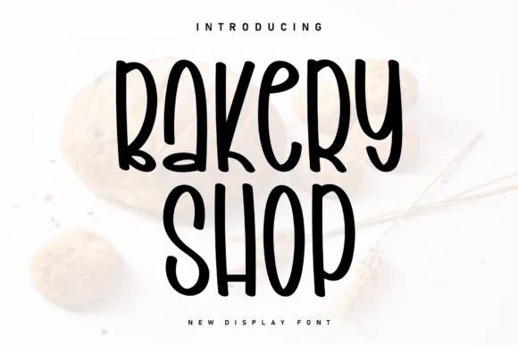
The capital H starts with a tall stem that rises above the cap line and then a rounded shoulder, and every letter after it keeps that height: the o and the a sit high in the line, the l, the d and the y all reach ascender height, and the y drops a long loop that returns to the baseline. The stroke is a consistent marker weight with rounded ends, and there is very little change between the stems and the joins, so the word holds together as a dense column. The second word repeats the construction at a slightly larger size with the same rhythm, and the two are stacked so their left edges align loosely, giving the pair a hand-set feel. The pale pine and cone background and the tracked caption are presentation; the script is the two words.
Tall · Rounded · Marker-like
Two-font hierarchy recipes
Tested contrast partners — pairing Holiday Michale with grounded secondary typography.
Holiday Michale + Auretha
Anchors Holiday Michale's fluid strokes with crisp Roman proportions on wedding suites, headers and packaging.
Inspect Auretha specimen
Holiday Michale + Montreal
Keeps small-scale dates, URLs, nutrition facts and care instructions crisp and legible below script titles.
Inspect Montreal specimenPractical applications
Concrete hierarchy, scale and production guidance tailored to Holiday Michale’s stroke geometry.
The tall marker weight reads from the aisle of a market, and the rounded ends hold up on a printed banner where a fine script would disappear.
Hierarchy & layout recipe
Set the stall name at 70 mm on a 1 m banner, keep the prices in a bold sans at 30 mm, and leave 30 mm at each end so the tall ascenders stay clear of the hem.
Pre-production check
Printed banners are read at an angle in a crowd; check the proof at final size and take the name up one size if the joins close in the distance.
The tall rounded letters fit a narrow band on a box, and the marker weight stays legible when the label is printed small on a folded carton.
Hierarchy & layout recipe
Set the product name at 14 pt on the 40 mm band of a 120 mm box, keep the weight and ingredients in a 6 pt sans, and leave 5 mm above the band fold so the ascenders are not cut.
Pre-production check
A carton band folds directly under the lettering; check the die line against the artwork and move the name up if a descender crosses the crease.
A warm marker script suits a seasonal thank-you, and the tall letters fill a narrow card without needing a second line of decoration.
Hierarchy & layout recipe
Set the greeting at 20 pt on a 90 by 130 mm card, keep the maker's name in a 6 pt sans, and hold 10 mm at the base so the y loop does not touch the card edge.
Pre-production check
Cards in a gift box rub against the contents; print on a stock with some tooth and check the heavy stems do not scuff before the set is packed.
Technical & licence verification
Confirm included OTF/TTF/WOFF formats, full glyph tables and licence coverage on the live store page before batch production.
Closest visual alternatives
Matched across letterform anatomy, stroke behaviour and craft applications.

Light lowercase script with long outer tails and a low even stroke
Abigail is a light lowercase-only script in which the word sits low on the line and both ends run out as long flat tails, so a name reads as a single signed line rather than as a set of letters.
Ideas for this font
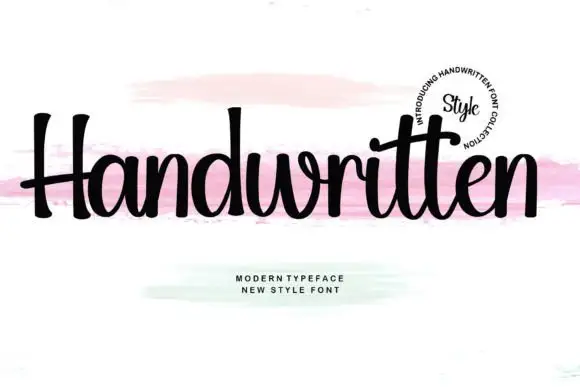
Upright compact script with flared terminals and closed tight fit
Handwritten is a compact upright script in which the letters stay close together, the strokes run heavy and even, and the terminals flare slightly where the pen lifts.
Ideas for this font
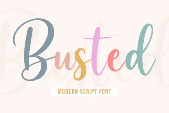
Upright monoline script with tall narrow capitals and long entry stroke
Busted is an upright monoline script in which the capital rises far above the x-height and enters from a long straight lead, while the lowercase stays narrow and evenly spaced on a level baseline.
Ideas for this font
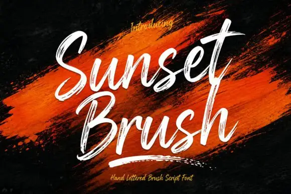
Rough brush script with a dry edge
Sunset Brush is a rough brush script in white over an orange paint smear: heavy strokes with dry, split ends, tall narrow loops and a forward slant that keeps a twelve-letter phrase moving.
Ideas for this font
Same independent foundry
Allow optional Google Analytics to measure visits and catalogue actions. Your search words and notes are not included. Privacy & storage