High-Contrast Display Serif

Majid + Majestic Letters
Pairs sculptural editorial warmth with Majid's clean modern geometry.
Inspect Majestic Letters specimenDisclosure: MakerFileHub may earn a commission from qualifying purchases via paid links on this page. How our links work.
Heavy retro sans with extrusion
Majid is a heavy sans display in orange with a deep brown extrusion and a cream highlight, on a dark retro poster ground: wide caps with flat terminals, a high waist and closed counters, surrounded by halftone dots, stars and scattered letterforms from the same alphabet.
Paid link
Get this fontProject & layout blueprintsAt-a-glance maker compatibility
Cut solid base, outline, and shadow layers in separate vinyl colors and align on registration marks.
Visual anatomy & craft review
The word is set once and the drawing is a heavy sans: the strokes are wide, the terminals are flat, and the counters are almost closed, which gives the block its poster weight. The depth comes from a solid extrusion drawn at a fixed angle plus a highlight along the top edge, and the specimen keeps both consistent across every letter, which is the decision a buyer has to hold to make a set look like one object. The scattered letters and halftone at the edges are the same alphabet dropped in at small sizes as texture, and the palette is orange, brown and cream on a dark ground. The badges at the corners state the format and the licence, and the small caps line beneath names the category.
Bold, retro, extruded, poster
Two-font hierarchy recipes
Tested contrast partners — pairing Majid with grounded secondary typography.
Majid + Majestic Letters
Pairs sculptural editorial warmth with Majid's clean modern geometry.
Inspect Majestic Letters specimen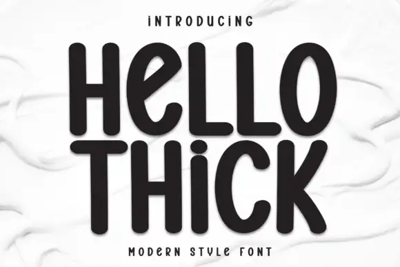
Majid + Hello Thick
Introduces organic movement on pull-quotes, signatures and gift tags.
Inspect Hello Thick specimenPractical applications
Concrete hierarchy, scale and production guidance tailored to Majid’s stroke geometry.
A heavy extruded sans reads as a period poster, and the fixed depth makes a short title look like a fabricated object rather than a headline.
Hierarchy & layout recipe
A2 portrait: the title at 130 mm cap height with a 16 mm extrusion, the date in a 22 mm sans, and a 6 mm border. Keep 30 mm margins and print three flat colours on a dark ground.
Pre-production check
Check the poster at five metres, where the extrusion can merge with the letters; keep the gap above 8 mm. Confirm the 22 mm date reads at three metres and that the halftone stays away from the small type.
A heavy sans prints as two screens with a highlight, and the wide letters read across a room where a narrower face would look thin on fabric.
Hierarchy & layout recipe
Print a 270 mm chest graphic: the name at 60 mm cap height, an 8 mm highlight, and two inks on a dark shirt. Keep the smallest counter at 4 mm and place the graphic 80 mm below the collar.
Pre-production check
Check the screen at actual mesh, where a 8 mm highlight can bleed; keep the registration tight. Wash-test one shirt and confirm the extrusion stays aligned after five cycles.
A heavy retro sans reads as a shopfront sign, and the extrusion gives the fascia depth without a second material or a light box.
Hierarchy & layout recipe
Fabricate a 1,200 by 400 mm sign: the name at 150 mm cap height with an 18 mm extrusion, the street in a 26 mm sans, and a 6 mm rule. Keep 30 mm margins and paint three colours on a dark board.
Pre-production check
Check the sign at 150 mm, where closed counters can read as blots; keep the aperture open enough to identify each letter. Confirm the 26 mm street reads at four metres and that the rule clears the fixings.
Technical & licence verification
Confirm included OTF/TTF/WOFF formats, full glyph tables and licence coverage on the live store page before batch production.
Closest visual alternatives
Matched across letterform anatomy, stroke behaviour and craft applications.
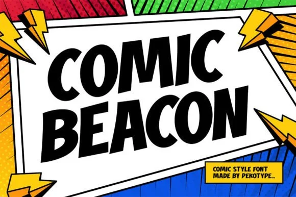
Angular graphic-novel & action-panel comic display
Comic Beacon is a crisp, flat-cut comic-book headline font with tapered wedge stems and classic graphic-novel speech-burst energy.
Ideas for this font
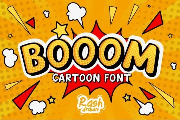
Explosive superhero sound-effect & comic-book display
Booom is a classic comic-book sound-effect display font with tilted tapered capitals engineered for dynamic superhero bursts.
Ideas for this font
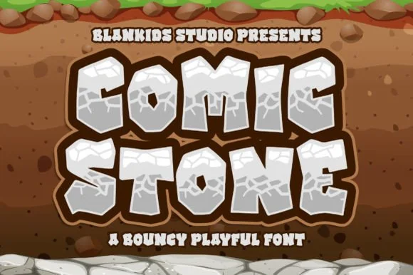
Chiseled prehistoric cracked-boulder cartoon display
Comic Stone is a chunky prehistoric cartoon font sculpted like cracked limestone boulders with surface fissure lines.
Ideas for this font
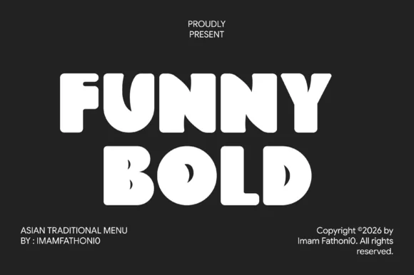
Ultra-chunky soft-cut comic block display
Funny Bold Comic is a thick, marshmallow-heavy comic block font with tiny keyhole counters and bouncy cartoon geometry.
Ideas for this font
Same independent foundry
Allow optional Google Analytics to measure visits and catalogue actions. Your search words and notes are not included. Privacy & storage