Neutral Sans Workhorse

Mahjong + Nyxar
Lets Mahjong own the focal silhouette while handling secondary copy, sizing and subheads cleanly.
Inspect Nyxar specimenDisclosure: MakerFileHub may earn a commission from qualifying purchases via paid links on this page. How our links work.
Tile monogram display
Mahjong is a tile display in pale pastel fronts with dark caps over a scatter of green playing pieces: each capital sits in its own rounded tile with a double border and three small dots at the top, and a torn-paper label beneath names the style in white.
Paid link
Get this fontProject & layout blueprintsAt-a-glance maker compatibility
Sturdy stroke walls and open counters weed cleanly on adhesive vinyl, HTV apparel film, and cut cardstock.
Visual anatomy & craft review
The word is set one letter per tile, which is the arrangement the product is sold for, and the drawing pairs a thin rounded capital with a tile frame, so the letters are quiet and the frame carries the character. That construction sets a size floor, because the dots and the double border close when the tiles shrink, and the plate sets the row large enough that each tile is legible. The green pieces behind are staging that names the game, and the torn label beneath is a product graphic rather than part of the face. Because each letter is a separate element, the face suits short words and initials; a longer line would need the tiles to shrink and the frames to simplify. It works for a party sign, a card and a name plate.
Decorative, novelty, tiles, playful
Two-font hierarchy recipes
Tested contrast partners — pairing Mahjong with grounded secondary typography.
Mahjong + Nyxar
Lets Mahjong own the focal silhouette while handling secondary copy, sizing and subheads cleanly.
Inspect Nyxar specimen
Mahjong + Amor Hadena
Grounds bold display lettering with classic typographic authority on posters, badges and apparel.
Inspect Amor Hadena specimenPractical applications
Concrete hierarchy, scale and production guidance tailored to Mahjong’s stroke geometry.
A tile display turns a name into a row of pieces, which suits a games night and photographs well on a table. The tiles catch light on a table and photograph well.
Hierarchy & layout recipe
A3 print: the name at 70 mm tile height, the date in a 18 mm sans, and the room at 10 mm. Keep 25 mm margins and print three colours on a light stock.
Pre-production check
Check the A3 at three metres, where the double border can merge; keep 2 mm between rules. Confirm the 10 mm room reads at arm's length and that the tiles align on one baseline.
A tile face gives a small venue a playful mark, and the individual tiles convert into a menu board without redrawing. It survives a shelf.
Hierarchy & layout recipe
Print a 60 by 90 mm label: the room at 12 pt, the line at 7.5 pt, and the phone at 6.5 pt. Keep 5 mm inside the die and keep the dots above 1.5 mm. Keep 6 mm at the foot.
Pre-production check
Check the 12 pt room on a small label, where the dots can close; keep the size above 13 pt. Confirm the 6.5 pt phone reads at arm's length and that the label peels cleanly.
A tile tag gives a present a handmade, game-like character, and the pastel fronts print on a home printer without a second ink.
Hierarchy & layout recipe
Print 45 by 70 mm tags: the initial at 16 pt, the name at 7 pt, and three colours on a white card. Keep 5 mm inside the die and punch the hole above the tile.
Pre-production check
Check the 16 pt initial on a 45 mm tag, where the border can touch the trim; keep 6 mm clearance. Confirm the tags take a ribbon and that the pastels stay distinct.
Technical & licence verification
Confirm included OTF/TTF/WOFF formats, full glyph tables and licence coverage on the live store page before batch production.
Closest visual alternatives
Matched across letterform anatomy, stroke behaviour and craft applications.
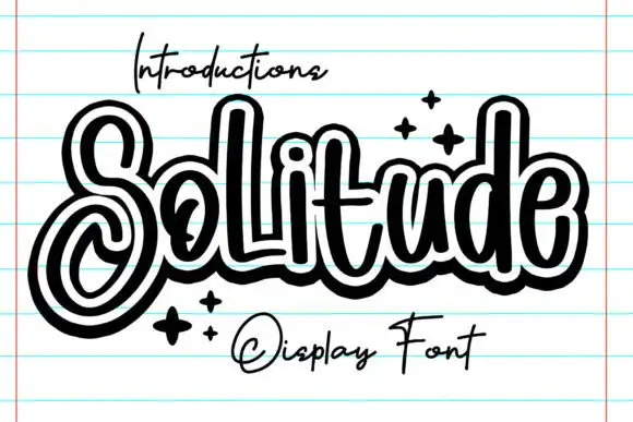
Outlined looping display script
Solitude shows connected upright script forms traced by a thick dark outer contour with a second pale inline inside it, where the S curls into a large lower loop, the tall l and d rise over a compact rounded body and four spark marks sit at the right.
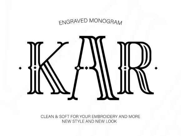
Tall outlined monogram capitals with diamond-shaped interruptions
Engraved shows three capitals drawn as several narrow parallel contours: tall flared serif ends frame open white interiors and small diamond-shaped breaks sit around the midline of each letter.
Ideas for this font
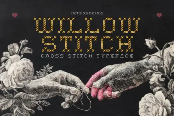
Cross-stitch constructed display
Willow Stitch is a cross-stitch display in gold on a dark ground: narrow angular capitals assembled from small stitched X marks, so each stroke is a column of crosses, set in two lines above a tracked line, with a drawn etching of two hands and roses around the words.
Ideas for this font
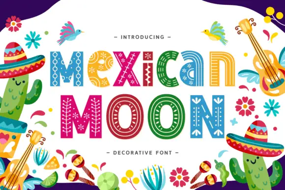
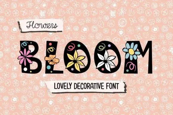
Heavy mixed case carrying fine dots, parallel curves and small geometric flower marks
Mexican Moon shows multicoloured lettering inside a busy illustrated border, where narrow pale patterns follow the broad strokes, dots and chains sit inside the M, small star-like flowers appear in the e and parallel curves travel along the counters.
Ideas for this font
Same independent foundry
Allow optional Google Analytics to measure visits and catalogue actions. Your search words and notes are not included. Privacy & storage