Editorial Serif Anchor

Magic Planner + Marquis - Elegant Modern Serif
Anchors Magic Planner's fluid strokes with crisp Roman proportions on wedding suites, headers and packaging.
Inspect Marquis - Elegant Modern Serif specimenDisclosure: MakerFileHub may earn a commission from qualifying purchases via paid links on this page. How our links work.
Playful rounded planning sans
Magic Planner is a playful rounded sans in black on a pale stationery scene: fat rounded letters with a high x-height, slightly uneven widths, a bouncy baseline and small four-point sparkles, with a small label beneath in the same construction.
Paid link
Get this fontProject & layout blueprintsAt-a-glance maker compatibility
Weld or Unite overlapping script joins into one continuous vector path before sending to the blade.
Visual anatomy & craft review
The two words are stacked and the drawing is a rounded sans at a chunky weight: the terminals are round, the strokes are even, and the widths vary slightly, which keeps the face friendly without turning it into a novelty. The bounce keeps the pair lively, and the label beneath is set in the same construction at a fraction of the size, which shows that the family can handle a small line. Because the strokes are thick and the counters open, the face works at sticker size as well as at heading size, which is what a planner or a label needs. The plate places the type on a paper mockup with sticky notes and clips, which is the honest context for a face sold for planning and organising.
Playful, rounded, friendly, practical
Two-font hierarchy recipes
Tested contrast partners — pairing Magic Planner with grounded secondary typography.
Magic Planner + Marquis - Elegant Modern Serif
Anchors Magic Planner's fluid strokes with crisp Roman proportions on wedding suites, headers and packaging.
Inspect Marquis - Elegant Modern Serif specimen
Magic Planner + Corven
Keeps small-scale dates, URLs, nutrition facts and care instructions crisp and legible below script titles.
Inspect Corven specimenPractical applications
Concrete hierarchy, scale and production guidance tailored to Magic Planner’s stroke geometry.
A playful rounded face reads as friendly stationery, and the open counters keep a product name legible at the small size a sticker or a spine allows.
Hierarchy & layout recipe
Print a 60 by 40 mm label: the product at 12 pt, the size in a 6 pt sans, and a sparkle. Keep 3 mm inside the die and print one ink on a matte stock so the rounded terminals stay clean.
Pre-production check
Check the 12 pt product, where a rounded terminal can merge with the die edge; keep 4 mm clear. Confirm the 6 pt size reads on a shelf and that the label survives a thumb through a planner.
A rounded sans sets a friendly tone for a workbook, and the chunky letters hold at cover size where a light face would look like a form.
Hierarchy & layout recipe
A4 cover: the title at 60 mm cap height, the subject in a 12 mm sans, and the year at 10 mm. Keep 20 mm margins and print two colours on a light stock so the rounded forms stay crisp.
Pre-production check
Check the 60 mm title, where a bounce can make the line look crooked; align the first and last letters. Confirm the 12 mm subject reads at arm's length and that the year clears the trim.
A playful face suits a milestone card without a script, and the rounded letters read at A6 where a detailed display would clot.
Hierarchy & layout recipe
A6 card: the greeting at 30 pt, the details in a 9 pt sans, and two sparkles. Keep 12 mm margins and print one ink on a pale card so the rounded terminals read cleanly.
Pre-production check
Check the 30 pt greeting at home-print resolution, where a small counter can fill; keep it above 2 mm. Confirm the 9 pt details keep a 4.5:1 contrast and that the sparkles clear the trim.
Technical & licence verification
Confirm included OTF/TTF/WOFF formats, full glyph tables and licence coverage on the live store page before batch production.
Closest visual alternatives
Matched across letterform anatomy, stroke behaviour and craft applications.
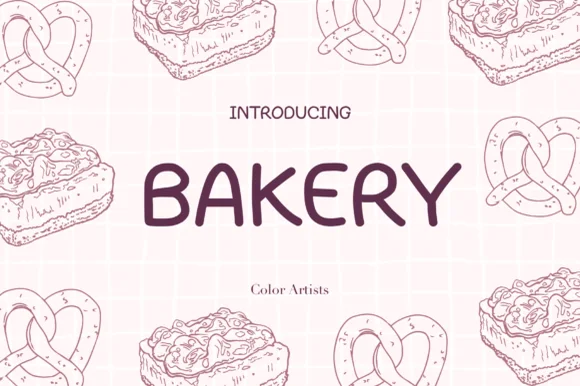
Clean wide-stance casual felt-pen uppercase sans
Bakery (by MyFontsShop) is a clean, wide-stance hand-printed sans serif (disconnected, NOT a cursive script!) with open counters and calm clarity.
Ideas for this font
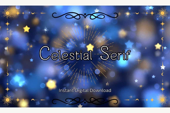
Clean rounded monoline print sans (ZERO serifs despite 'Serif' in the title!)
Heads-up: despite its title, Celestial Serif has ZERO serifs—it is actually a neat, rounded monoline print sans!
Ideas for this font
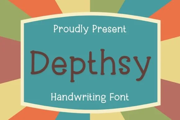
Neat rounded monoline classroom & journal print sans (NOT a serif!)
Depthsy is actually a clean, friendly monoline handwritten print sans (zero typewriter serifs despite seller copy!) built for everyday legibility.
Ideas for this font
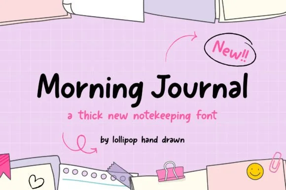
Thick casual notekeeping handwriting
Morning Journal is a thick casual handwriting face in black on a pink grid: rounded strokes of even weight, open bowls, a straight-tailed y and a small bounce, presented with pencil arrows and sticky-note illustrations, so the phrase reads as notes written quickly in a journal.
Ideas for this font
Same independent foundry
Allow optional Google Analytics to measure visits and catalogue actions. Your search words and notes are not included. Privacy & storage