High-Contrast Display Serif

Little Stories + Grandeur – Elegant Classic Serif
Pairs sculptural editorial warmth with Little Stories's clean modern geometry.
Inspect Grandeur – Elegant Classic Serif specimenDisclosure: MakerFileHub may earn a commission from qualifying purchases via paid links on this page. How our links work.
Loopy script with a heart-accented display
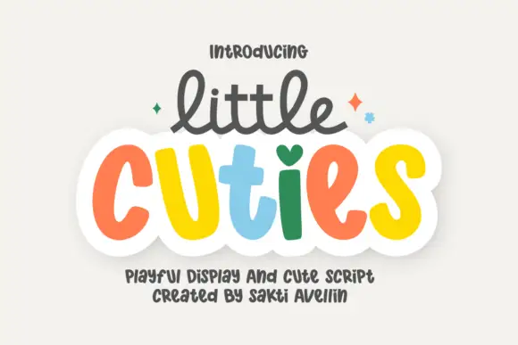
Little Stories is a duo in green on cream: a monoline looped script for the first word, and a fat rounded display for the second whose O and i carry heart shapes, sold together as one pair.
Paid link
Get this fontProject & layout blueprintsAt-a-glance maker compatibility
Weld or Unite overlapping script joins into one continuous vector path before sending to the blade.
Visual anatomy & craft review
The page sets the script smaller and above the display, and the two hands are deliberately different: little is a monoline script with open loops, a tall l and a curled e that swings up at the end, drawn with even hairlines so it reads as writing, while STORIES is a fat rounded display whose caps carry hearts, one heart in the bowl of the O, another in the upper bowl of the i, and a third squeezing into the counter of the E, all drawn at a weight several times heavier than the script. The words are printed in the same green, and the pair works because the weights are so far apart that the two lines do not compete. Below the block a line of the display face in lowercase names the product, with the studio name beneath it in the same hand. The ground is a plain cream. Little Stories is a duo for children's books, cards, packaging and party goods, and it wants short words, the heart capitals kept for the display line and a size big enough for the hearts to read.
Loopy, chunky, sweet
Two-font hierarchy recipes
Tested contrast partners — pairing Little Stories with grounded secondary typography.
Little Stories + Grandeur – Elegant Classic Serif
Pairs sculptural editorial warmth with Little Stories's clean modern geometry.
Inspect Grandeur – Elegant Classic Serif specimen
Little Stories + Thick Black
Introduces organic movement on pull-quotes, signatures and gift tags.
Inspect Thick Black specimenPractical applications
Concrete hierarchy, scale and production guidance tailored to Little Stories’s stroke geometry.
A looped script over a chunky display gives a small book a title and a subtitle in one family, and the hearts signal the audience before the book is opened.
Hierarchy & layout recipe
Print a 210 by 210 mm cover: set the title at 48 pt in the display, set the series line at 20 pt in the script with 16 mm of clear ground, and hold 18 mm of margin on all four sides.
Pre-production check
Hearts drawn in a capital can close at small sizes; keep the display above thirty-six points and proof the cover.
A friendly duo marks a children's area on a wall, and the two weights let the sign carry a name and a short rule without a second design.
Hierarchy & layout recipe
Print an A4 sign at 210 by 297 mm: set the name at 54 pt in the display, set the rule at 16 pt in the script with 20 mm of clear ground, and hold 18 mm of margin on all four sides.
Pre-production check
A chunky display beside a hairline script can look unbalanced; proof one sign and check the pair reads as one design.
Two weights on one small label cover a name and a greeting, and the hearts do the decorating on a surface too small for artwork.
Hierarchy & layout recipe
Print a 60 by 40 mm label: set the name at 16 pt in the display, set the greeting at 10 pt in the script with 6 mm of clear ground, and hold 5 mm of margin on all four sides.
Pre-production check
A hairline script on a small label can break in print; run one sheet and check the script before ordering the batch.
Technical & licence verification
Confirm included OTF/TTF/WOFF formats, full glyph tables and licence coverage on the live store page before batch production.
Closest visual alternatives
Matched across letterform anatomy, stroke behaviour and craft applications.
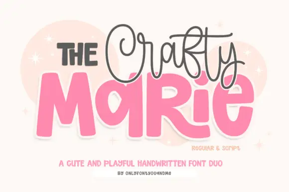
Oversized rounded blocks paired with a fine looping script above them
The Crafty Marie sets fat rounded blocks at poster scale and a fine looping script above them, so a maker's name reads as a bold shape with a delicate signature riding over it.
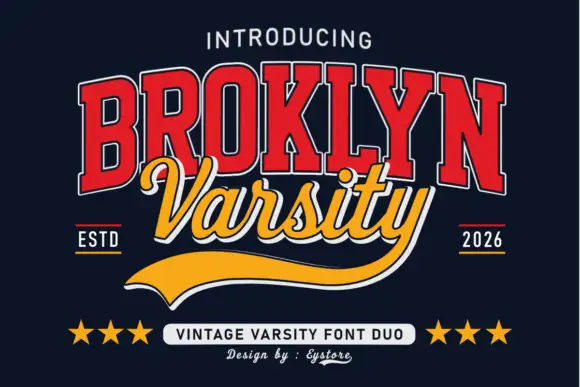
Tall varsity slabs with an inline outline, paired with a sweeping script and a tail
Broklyn Varsity pairs tall collegiate slab capitals drawn with an inline outline against a sweeping script that sits between them and drops a heavy sport tail below the baseline.
Ideas for this font
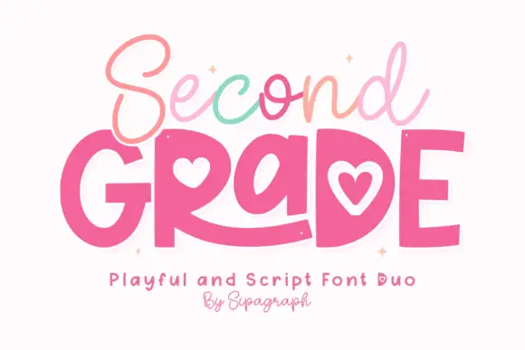
Fine script over playful heart-counter blocks
Second Grade Duo is a pair on white: a thin cursive script in pastel colours for the upper word and fat rounded capitals with heart counters for the lower, each with a soft white outline.
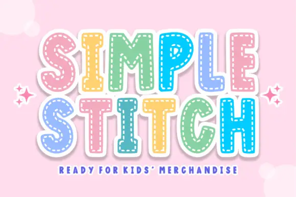
Stitched youth colour display
Simple Stitch is a colour display on pale pink: broad rounded capitals in pastel pink, yellow, green, blue and lilac, each with a dashed stitch line following the inner contour, white outline and soft shadow, set in two lines with sparkles at the sides and a plain caption along the foot.
Ideas for this font
Same independent foundry
Allow optional Google Analytics to measure visits and catalogue actions. Your search words and notes are not included. Privacy & storage