Editorial Serif Anchor

Oh Rose + Augler
Anchors Oh Rose's fluid strokes with crisp Roman proportions on wedding suites, headers and packaging.
Inspect Augler specimenDisclosure: MakerFileHub may earn a commission from qualifying purchases via paid links on this page. How our links work.
Rough open brush handwriting
Oh Rose is a dry-brush script drawn in carbon grey on blush pink: the letters are unjoined, the strokes break into streaks at the ends and the whole line looks written with a brush that is running out of paint.
Paid link
Get this fontProject & layout blueprintsAt-a-glance maker compatibility
Weld or Unite overlapping script joins into one continuous vector path before sending to the blade.
Visual anatomy & craft review
Oh Rose sits across the middle of the card as two words with a clear gap between them, and the letters are individually written rather than connected: the O rises from a heavy base, the h lifts in two strokes, the R carries a long leg and the e and s finish with dry, feathered edges. The stroke weight changes within a single letter, dark where the brush pressed and broken where it lifted, and a few fibres of the brush are visible as fine streaks at the entry points. The ground is a flat blush pink with no other element except a small letter-spaced caption at the foot. The face is a brush display for stationery, packaging and short headlines: the dry texture is its whole character, so it should be printed at a size where that texture is visible and never used for long lines.
A dry brush hand with unjoined letters
Two-font hierarchy recipes
Tested contrast partners — pairing Oh Rose with grounded secondary typography.
Oh Rose + Augler
Anchors Oh Rose's fluid strokes with crisp Roman proportions on wedding suites, headers and packaging.
Inspect Augler specimen
Oh Rose + Monure
Keeps small-scale dates, URLs, nutrition facts and care instructions crisp and legible below script titles.
Inspect Monure specimenPractical applications
Concrete hierarchy, scale and production guidance tailored to Oh Rose’s stroke geometry.
An unjoined brush hand looks written on the day rather than printed, which suits a wedding that avoids formal calligraphy.
Hierarchy & layout recipe
Print a 90 by 50 mm place card: set the guest name at 18 pt on one row, keep 8 mm of clear ground beneath before the table number at 7 pt, and hold 6 mm of margin on both sides.
Pre-production check
Dry edges fill in on smooth card; print one place card on the actual stock and check the feathering before the set.
A brush line carries warmth without the solemnity of a script, and two words with a gap read as a spoken phrase rather than a title.
Hierarchy & layout recipe
Print a 105 by 148 mm card: set the greeting at 32 pt on one row, keep 14 mm of clear ground beneath before the message inside, and hold 12 mm of margin at the card edge.
Pre-production check
The broken stroke ends can look like a printing fault; print one card and check the feathering reads as brush texture before the batch.
A grey brush hand matches the glaze palette of handmade pottery, and the label does not compete with the object it sits on.
Hierarchy & layout recipe
Print a 50 by 35 mm label: set the studio name at 12 pt on one row, keep 4 mm of clear ground beneath before the maker line at 4 pt, and hold 3 mm from the dry edge to the die line.
Pre-production check
On a small label the texture turns to noise; print one at the real size and check the letters still read before the order.
Technical & licence verification
Confirm included OTF/TTF/WOFF formats, full glyph tables and licence coverage on the live store page before batch production.
Closest visual alternatives
Matched across letterform anatomy, stroke behaviour and craft applications.

Tall connected script with a long y descender and open round bowls
Hello Honey is a tall connected script in which the ascenders rise high, the bowls stay round and the y drops a descender that runs far below the line before curling away.
Tall narrow looped script
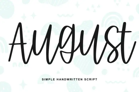
August is drawn tall and narrow with even monoline strokes, so every letter becomes a loop and the word stacks up as a column of verticals rather than a horizontal band.
Ideas for this font
Playful rounded script with a heavy bounce and curled ascenders
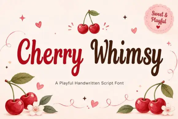
Cherry Whimsy is a playful rounded script in a medium weight, with ascenders that curl over at the top, deep bounces in the baseline and terminals that finish in small hooks.
Ideas for this font
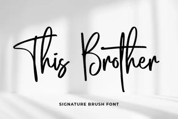
Tall crossed brush signature
This Brother is a signature brush script in black on a pale photograph: tall narrow letters, a long crossed stroke on the T and the B, and a fast forward lean.
Ideas for this font
Same independent foundry
Allow optional Google Analytics to measure visits and catalogue actions. Your search words and notes are not included. Privacy & storage