High-Contrast Display Serif

Urbano + Aureline
Pairs sculptural editorial warmth with Urbano's clean modern geometry.
Inspect Aureline specimenDisclosure: MakerFileHub may earn a commission from qualifying purchases via paid links on this page. How our links work.
Hand-drawn chunky uppercase
Urbano is a hand-drawn uppercase display in white on a dark street photograph: fat irregular letters with uneven widths, a wobbling baseline and blunt terminals, set in one line across the plate with two tracked captions beneath naming the face and the studio.
Paid link
Get this fontProject & layout blueprintsAt-a-glance maker compatibility
Sturdy stroke walls and open counters weed cleanly on adhesive vinyl, HTV apparel film, and cut cardstock.
Visual anatomy & craft review
The word is set once, wide, and the drawing is hand lettering at heavy weight: the strokes vary, the widths differ from letter to letter, and the baseline drifts, which keeps the block feeling drawn on a wall rather than set. Because the forms are fat and irregular, the face reads at a distance and on fabric, and the counters stay open enough for the word to survive at a small size. The plate sets it over a dark street photograph with a single silhouetted figure, which gives the type a context without competing, and the two tracked captions beneath are set in a small grotesque. The palette is one colour on a photograph, which is the honest test for a face intended for posters and apparel.
Hand-drawn, chunky, urban, bold
Two-font hierarchy recipes
Tested contrast partners — pairing Urbano with grounded secondary typography.
Urbano + Aureline
Pairs sculptural editorial warmth with Urbano's clean modern geometry.
Inspect Aureline specimen
Urbano + Thick Black
Introduces organic movement on pull-quotes, signatures and gift tags.
Inspect Thick Black specimenPractical applications
Concrete hierarchy, scale and production guidance tailored to Urbano’s stroke geometry.
A hand-drawn chunky face prints as one screen and looks painted on fabric, and the irregular widths keep a word from reading as a stock logo.
Hierarchy & layout recipe
Print a 280 mm chest graphic: the word at 70 mm cap height, one ink on a light shirt, and the year at 14 mm. Keep the thinnest stroke at 4 mm and place the graphic 80 mm below the collar.
Pre-production check
Check the screen at actual mesh, where a 4 mm stroke fills; thicken it. Wash-test one shirt and confirm the year stays legible after five cycles.
A hand-drawn display reads as a painted sign, and the fat letters hold on a poster seen at a distance where a thin hand would disappear.
Hierarchy & layout recipe
A2 portrait: the market at 130 mm cap height, the days in a 22 mm sans, and a 6 mm rule. Keep 30 mm margins and print two colours on a light ground so the wobble reads as brushwork.
Pre-production check
Check the poster at five metres, where the uneven baseline can look like an error; align the first and last letters. Confirm the 22 mm days read at three metres and that the rule clears the type block.
A chunky hand face suits a casual celebration, and the simple silhouette reads at A6 where a detailed display would clot.
Hierarchy & layout recipe
A6 card: the greeting at 30 pt, the details in a 9 pt sans, and a 3 mm border. Keep 12 mm margins and print one ink on a pale card so the irregular edges read as pen.
Pre-production check
Check the 30 pt greeting at home-print resolution, where a wobbling edge can look like a smudge; keep the stroke even. Confirm the 9 pt details keep a 4.5:1 contrast and that the border clears the descenders.
Technical & licence verification
Confirm included OTF/TTF/WOFF formats, full glyph tables and licence coverage on the live store page before batch production.
Closest visual alternatives
Matched across letterform anatomy, stroke behaviour and craft applications.

Open rounded mixed case with a tall t and broad circular bowls
Cultivo shows a large black title-case name across the lower part of a pale beige cover, where light to moderate nearly even strokes form an open C, a broad u and near-circular bowls, the t finishes with a rounded lower turn and the v opens a clean diagonal.
Ideas for this font
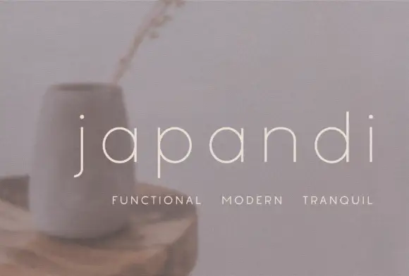
Widely spaced thin lowercase with circular bowls and a hooked j descender
Japandi draws its lowercase in a hairline geometric line, keeps the bowls almost circular and sets the words far apart on a soft photographic ground so the type feels like a room rather than a label.
Ideas for this font
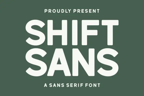
Bold high-x-height grotesque
Shift Sans is a bold grotesque in cream on green: very tall x-height, short ascenders, flat terminals and slightly narrow counters, with two stacked lines filling the plate and a tracked caption above and below, so the pair reads as a contemporary poster headline.
Ideas for this font
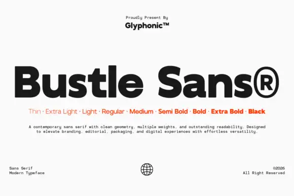
Dense rounded mixed case with open e bowls and a compact high t shoulder
Bustle shows black mixed-case lettering on white in a heavy treatment, where broad nearly even strokes surround compact bowls, the e opens horizontally, the u stays rounded and the t carries a compact shoulder high above the baseline.
Ideas for this font
Same independent foundry
Allow optional Google Analytics to measure visits and catalogue actions. Your search words and notes are not included. Privacy & storage