Modern Grotesque Body

Liberty + Clyne Sans
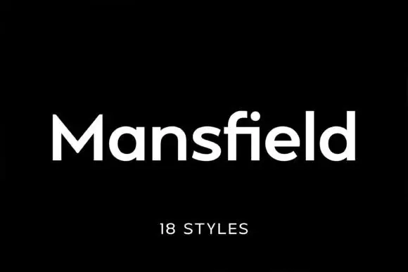
Creates crisp high-hierarchy contrast beneath Liberty headlines across menus, websites and labels.
Inspect Clyne Sans specimenDisclosure: MakerFileHub may earn a commission from qualifying purchases via paid links on this page. How our links work.
Heavy compact slab
Liberty is a very heavy compact slab in black on a pale ground: wide block serifs, tight spacing and rounded inner bowls, set as one word that runs across the statue of Liberty in the centre of the plate, with a short tracked line above and a small caption beneath.
Paid link
Get this fontProject & layout blueprintsAt-a-glance maker compatibility
Sturdy stroke walls and open counters weed cleanly on adhesive vinyl, HTV apparel film, and cut cardstock.
Visual anatomy & craft review
The word fills the width and the drawing is a slab at maximum weight: the serifs are blocks as thick as the stems, the inner counters are rounded, and the letters are set almost touching, so the block reads as a single mass rather than as seven shapes. That construction is why the face works at banner size and on a sign but needs air at small sizes, and the plate sets it large enough to make the point. The statue behind the word is a visual pun rather than a typographic argument, but it does show the face holding over a busy image because the black is solid. The tracked line above and the caption beneath are set in a plain grotesque, which keeps the slab as the only heavy element on the sheet.
Slab, heavy, compact, bold
Two-font hierarchy recipes
Tested contrast partners — pairing Liberty with grounded secondary typography.
Liberty + Clyne Sans
Creates crisp high-hierarchy contrast beneath Liberty headlines across menus, websites and labels.
Inspect Clyne Sans specimen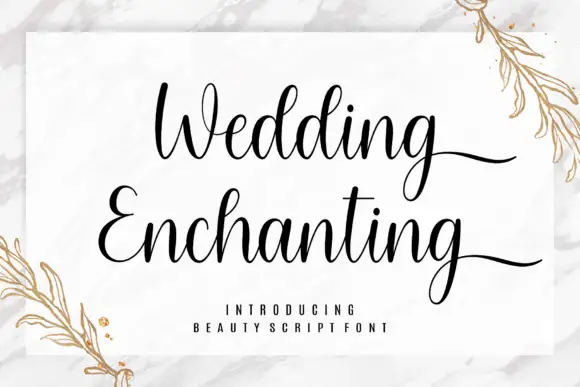
Liberty + Wedding Enchanting
Adds a warm human signature touch for 1-to-3-word callouts without competing against structured serif capitals.
Inspect Wedding Enchanting specimenPractical applications
Concrete hierarchy, scale and production guidance tailored to Liberty’s stroke geometry.
A compact heavy slab reads at speed from the street, and the block serifs hold up in cut vinyl where a lighter serif would disappear against a dark shopfront.
Hierarchy & layout recipe
Cut 1,000 by 330 mm vinyl: the name at 130 mm cap height, the hours in a 22 mm sans, and a 4 mm rule beneath. Keep 25 mm margins and apply to a matte panel with a 3 mm shadow line.
Pre-production check
Check the 130 mm cut, where tight counters can close in weeding; keep them above 8 mm. Confirm the 22 mm hours read at four metres and that the shadow line stays even.
A heavy slab sets a two-word title with authority, and the compact width keeps a long date on one line below it instead of stacking three rows.
Hierarchy & layout recipe
A2 poster: the title at 100 mm cap height, the date in a 22 mm slab, and the venue at 10 mm. Keep 28 mm margins, print one colour on a light stock, and hold the title in the top half.
Pre-production check
Check the poster at five metres, where the tight spacing can merge the letters; add 2 percent tracking. Confirm the 10 mm venue reads at three metres and that the title clears the trim.
A compact slab prints as one screen and looks like an official shirt, which suits a civic celebration better than a decorated display face.
Hierarchy & layout recipe
Print a 250 mm chest graphic: the word at 70 mm cap height, the year at 34 mm, and one ink on a light shirt. Keep the tightest counter at 4 mm and place the graphic 80 mm below the collar.
Pre-production check
Check the screen at actual mesh, where a 4 mm counter can fill; open the spacing. Wash-test one shirt and confirm the year stays legible after five cycles.
Technical & licence verification
Confirm included OTF/TTF/WOFF formats, full glyph tables and licence coverage on the live store page before batch production.
Closest visual alternatives
Matched across letterform anatomy, stroke behaviour and craft applications.
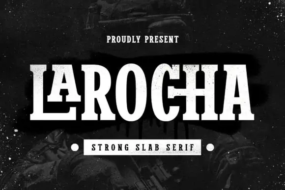
Tall contrast slab with extended foot
Larocha is a tall contrasting slab in white on a dark grainy ground: capitals with narrow oval bowls, heavy stems, thin horizontals and an extended foot on the L, set as one large word with a small tracked line above and a boxed line beneath that names the style.
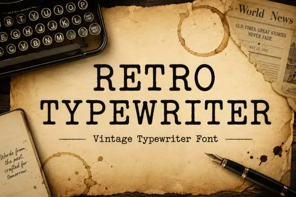
Typewriter serif with a soft worn edge
Retro Typewriter is a vintage typewriter serif in black on aged parchment: slab serifs, a moderate even stroke and a slightly uneven edge, set between two rules with a caption line beneath.
Ideas for this font
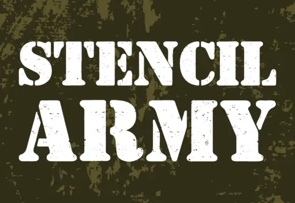
Heavy footed stencil capitals with broad breaks and scattered worn marks
Stencil Army shows white uppercase words on an olive camouflage field, where heavy stems and broad curved slab feet are interrupted by stencil breaks, and the C and S curves split vertically while E arms separate from parts of the main stem.
Ideas for this font
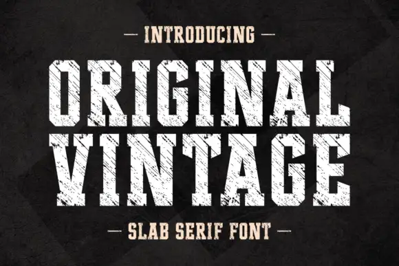
Tall angular slabs covered by diagonal scratches
Original Vintage uses tall white slab capitals with clipped corners and dense diagonal cuts. The scratch direction crosses both rows with a consistent angle, producing a striated surface rather than scattered chip damage, while the black charcoal background stays separate from the letter texture.
Same independent foundry
Allow optional Google Analytics to measure visits and catalogue actions. Your search words and notes are not included. Privacy & storage