High-Contrast Display Serif

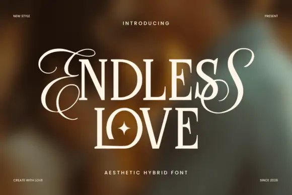
Mansfield + The Lumina Awesome
Pairs sculptural editorial warmth with Mansfield's clean modern geometry.
Inspect The Lumina Awesome specimenDisclosure: MakerFileHub may earn a commission from qualifying purchases via paid links on this page. How our links work.
Substantial neutral sans
Mansfield is a substantial mixed case sans in white on black: plain forms with a deep M centre, an open e, straight terminals and a firm even stroke, set as one word with a small tracked count of styles beneath.
Paid link
Get this fontProject & layout blueprintsAt-a-glance maker compatibility
Sturdy stroke walls and open counters weed cleanly on adhesive vinyl, HTV apparel film, and cut cardstock.
Visual anatomy & craft review
The word sits centred on a black sheet with nothing else but a line of tracked caps below, which is a confident way to sell a family: the face has to carry the sheet on its own proportions. The drawing is a plain grotesque-adjacent sans with a deep M centre and an open e, and the letter shapes are deliberately unremarkable, which is what a workhorse needs. The count beneath matters more than it looks, because eighteen styles means the buyer is choosing a system rather than a title face, and the plate shows one weight of that system honestly. Because the forms are neutral and substantial, the face works in a heading, a caption and a short block of copy, and the plate sets it large enough to judge the terminals and the spacing.
Sans serif, neutral, substantial, versatile
Two-font hierarchy recipes
Tested contrast partners — pairing Mansfield with grounded secondary typography.
Mansfield + The Lumina Awesome
Pairs sculptural editorial warmth with Mansfield's clean modern geometry.
Inspect The Lumina Awesome specimen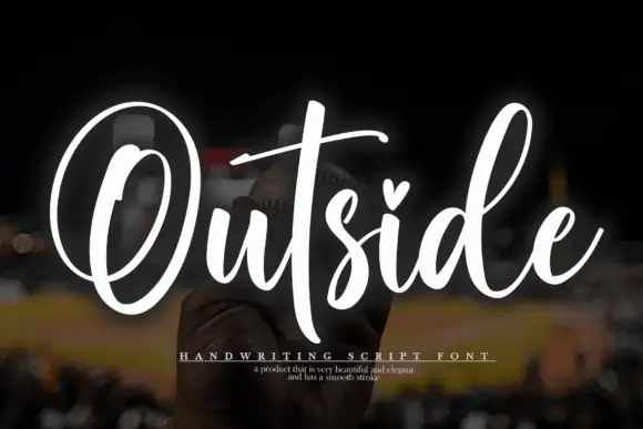
Mansfield + Outside
Introduces organic movement on pull-quotes, signatures and gift tags.
Inspect Outside specimenPractical applications
Concrete hierarchy, scale and production guidance tailored to Mansfield’s stroke geometry.
A neutral sans gives a workshop an identity that survives on a sign, an invoice and a van without a second face. It travels well.
Hierarchy & layout recipe
Set the name at 16 pt on a card, 100 mm on a wall and 10 pt in a footer, in one weight. Keep one colour and clear space equal to the cap height on all four sides.
Pre-production check
Check the 10 pt footer on uncoated paper, where a straight terminal can fill; keep the size above 11 pt. Confirm the wall name reads at ten metres and that the van lettering kerbs cleanly.
A substantial sans holds a long heading without tight tracking, and the open e keeps small captions readable. That is the point of a workhorse.
Hierarchy & layout recipe
Set the heading at 28 pt, the subheading at 12 pt and the caption at 8.5 pt on a 120 mm measure. Keep the leading at 1.35 and leave 6 mm above each heading.
Pre-production check
Check the 8.5 pt caption in a printed proof, where a straight terminal can drop out; keep the contrast above 4.5:1. Confirm the 28 pt heading breaks to two lines cleanly and that the rag stays even.
A plain sans reads at distance without ornament, which is what wayfinding needs on a building that must last. It reads in daylight and under a porch light.
Hierarchy & layout recipe
Fabricate a 900 by 300 mm panel: the building name at 110 mm cap height, the room range in a 26 mm sans, and a 4 mm rule. Keep 25 mm margins and specify a matte finish.
Pre-production check
Check the panel at 110 mm, where an even stroke can look thin in daylight; keep the weight up. Confirm the 26 mm range reads at three metres and that the rule clears the fixings.
Technical & licence verification
Confirm included OTF/TTF/WOFF formats, full glyph tables and licence coverage on the live store page before batch production.
Closest visual alternatives
Matched across letterform anatomy, stroke behaviour and craft applications.

Light geometric lowercase with circular bowls and single-storey a and g
Mango Dream sets a black lowercase name on a pale paper-like ground, where thin nearly even strokes form wide circular bowls, the a stays single storey, the m arches stay low and the g opens its lower curve into a short rounded descender while the d rises above the word.
Ideas for this font

Bold modern geometric sans
Olline is a bold geometric sans in red on black: circular counters, a heavy even stroke, a lowercase with a straight-sided o and a dot that floats away from the i, presented at extreme size with small tracked captions in the corners, so the plate reads as a contemporary identity study.
Ideas for this font

Open rounded mixed case with a tall t and broad circular bowls
Cultivo shows a large black title-case name across the lower part of a pale beige cover, where light to moderate nearly even strokes form an open C, a broad u and near-circular bowls, the t finishes with a rounded lower turn and the v opens a clean diagonal.
Ideas for this font
Plain rounded neutral sans
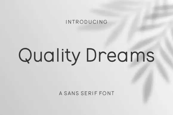
Quality Dreams is a plain rounded sans in charcoal on a pale ground with a soft leaf shadow: mixed case with a short diagonal Q tail, an open e, even strokes and rounded terminals, set as one line with a small tracked line above and a plain line beneath.
Ideas for this font
Same independent foundry
Allow optional Google Analytics to measure visits and catalogue actions. Your search words and notes are not included. Privacy & storage