Modern Grotesque Body

Liberty Nation + Montreal
Creates crisp high-hierarchy contrast beneath Liberty Nation headlines across menus, websites and labels.
Inspect Montreal specimenDisclosure: MakerFileHub may earn a commission from qualifying purchases via paid links on this page. How our links work.
Vintage patriotic slab
Liberty Nation is a vintage slab in black on a cream plate with red stripes: heavy caps with bracketed serifs, a swollen waist and closed counters, set on two lines inside a double rule with stars, a ribbon beneath naming the category and a second ribbon under that.
Paid link
Get this fontProject & layout blueprintsAt-a-glance maker compatibility
Cut solid base, outline, and shadow layers in separate vinyl colors and align on registration marks.
Visual anatomy & craft review
The two words are stacked and the drawing is a heavy slab: the bracketed serifs widen the letters, the waist swells, and the counters close up, which gives the block the weight of a printed placard. The plate does the rest with period furniture — a double rule frame, a row of stars, red stripes at the sides and two ribbons with tracked caps — which is exactly how a mid-century notice would have been assembled. Because the letters are heavy, the face works at sign scale and on apparel, and the specimen sets it large enough that the serifs read as shapes rather than as detail. The palette is two inks on cream, which keeps the composition controlled.
Western, slab, bold, vintage
Two-font hierarchy recipes
Tested contrast partners — pairing Liberty Nation with grounded secondary typography.
Liberty Nation + Montreal
Creates crisp high-hierarchy contrast beneath Liberty Nation headlines across menus, websites and labels.
Inspect Montreal specimen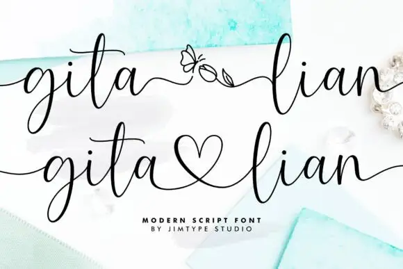
Liberty Nation + Gita Lian
Adds a warm human signature touch for 1-to-3-word callouts without competing against structured serif capitals.
Inspect Gita Lian specimenPractical applications
Concrete hierarchy, scale and production guidance tailored to Liberty Nation’s stroke geometry.
A heavy slab reads as a painted placard, and the closed counters hold at fascia scale where a lighter serif would soften into the background.
Hierarchy & layout recipe
Paint a 1,400 by 400 mm fascia: the name at 130 mm cap height, the menu line in a 26 mm slab, and a 6 mm rule. Keep 30 mm margins and paint two colours on a light board.
Pre-production check
Check the fascia at 130 mm, where a closed counter can fill with paint; keep them above 6 mm. Confirm the 26 mm menu line reads at four metres and that the rule clears the fixings.
A patriotic slab sets a fair poster in one line, and the frame furniture from the family lets it read as a printed bill rather than a flyer.
Hierarchy & layout recipe
A2 portrait: the fair at 120 mm cap height, the dates in a 26 mm slab, and the venue at 12 mm. Keep 30 mm margins and print two colours on a cream ground with the stars above.
Pre-production check
Check the poster at five metres, where the stars can crowd the letters; keep a clear zone above the block. Confirm the 12 mm venue reads at three metres and that the ribbons clear the trim.
A heavy slab frames a period history as a printed placard, and the two-colour print keeps a cover affordable while the frame supplies the ornament.
Hierarchy & layout recipe
Set the title at 90 mm cap height across 210 mm, the subtitle in a 12 pt slab, and the author at 9 pt. Print two colours on a cream stock and keep the stars as the only decoration.
Pre-production check
Check the title at thumbnail size, where the closed counters can clot; open the spacing slightly. Confirm the 9 pt author survives lamination and that the title clears the trim by 12 mm.
Technical & licence verification
Confirm included OTF/TTF/WOFF formats, full glyph tables and licence coverage on the live store page before batch production.
Closest visual alternatives
Matched across letterform anatomy, stroke behaviour and craft applications.
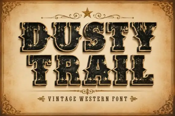
Notched western capitals with worn faces and a separate edge layer
Dusty Trail is a western slab capital alphabet with notched stems, a worn fill and a separate edge layer, so a word reads as a painted saloon sign with the paint coming off.
Ideas for this font
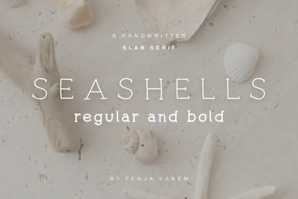
Light drawn slab capital
Seashells is a light drawn slab in white over a beach scattered with shells and a starfish: widely spaced capitals with fine even strokes, small irregular slab ends and slightly uneven curves, with a bold lowercase line beneath and two tracked notes at the foot.
Ideas for this font
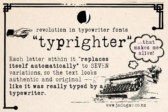
Typewriter face with alternates
Typrighter is a typewriter face in black on aged newsprint, shown inside a period advertisement: a monospaced slab with light uniform strokes and blunt serifs, surrounded by hand-lettered display copy and a printed illustration of a machine.
Ideas for this font
Narrow soft slab
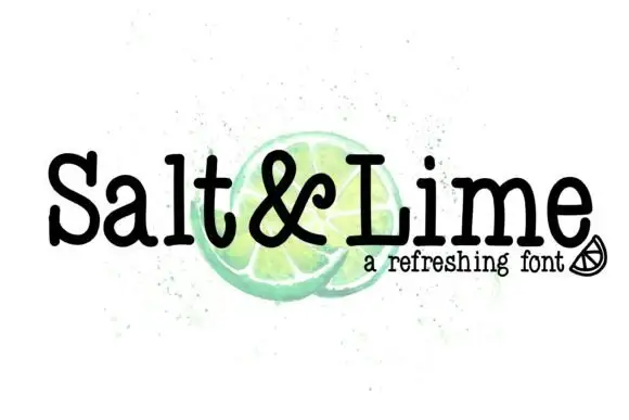
Salt & Lime is a narrow soft slab in black over a watercolour lime on white: mixed case with rounded slab endings, a tight rhythm and a large x-height, with the ampersand drawn at the same weight and a small line beneath in a tracked sans.
Ideas for this font
Same independent foundry
Allow optional Google Analytics to measure visits and catalogue actions. Your search words and notes are not included. Privacy & storage



