Neutral Sans Workhorse

Broadway Flower + Saltriver Grotesk
Lets Broadway Flower own the focal silhouette while handling secondary copy, sizing and subheads cleanly.
Inspect Saltriver Grotesk specimenDisclosure: MakerFileHub may earn a commission from qualifying purchases via paid links on this page. How our links work.
Contrast capitals with sweeping R and L tails and looped W centres
Broadway Flower is a slender sans in capitals where the ligatures do the decorating: an O grows a ribbon loop, a W folds into a wave, and adjacent letters share a stroke that curls away.
Paid link
Get this fontProject & layout blueprintsAt-a-glance maker compatibility
Weld or Unite overlapping script joins into one continuous vector path before sending to the blade.
Visual anatomy & craft review
BROADWAY over FLOWER is set in deep red on a pale pink ground, and the letters are modest in weight but full of movement: the W is built from a double curve, the O carries a small ribbon in its lower right, the A ends in a hooked tail, and the R of the second row closes into a loop that meets the neighbouring O. The widths vary within a word, which is unusual for a sans and is what gives the face its art-deco flavour. Under the composition a caption in a small italic-free face names the style and the feature that defines it, and a credit line sits above. The face is a titling cut with capitals only in the preview, so it belongs on a poster, a menu, a shopfront or a wedding suite where a long line can be set in caps without strain.
Contrast capitals with sweeping R and L tails and looped W centres
Two-font hierarchy recipes
Tested contrast partners — pairing Broadway Flower with grounded secondary typography.
Broadway Flower + Saltriver Grotesk
Lets Broadway Flower own the focal silhouette while handling secondary copy, sizing and subheads cleanly.
Inspect Saltriver Grotesk specimen
Broadway Flower + The Lumina Awesome
Grounds bold display lettering with classic typographic authority on posters, badges and apparel.
Inspect The Lumina Awesome specimenPractical applications
Concrete hierarchy, scale and production guidance tailored to Broadway Flower’s stroke geometry.
The ribbon ligatures give a formal invitation the period detail without a separate ornament, and the light strokes keep a long pair of names from looking heavy.
Hierarchy & layout recipe
Print a 148 by 210 mm invitation: set the names at 34 pt on one row, keep 24 mm of clear ground beneath before the venue at 9 pt, and hold 18 mm of margin from the widest curl to the card edge.
Pre-production check
The shared strokes can collide with tracking; print one invitation with the exact spacing and check the joins before the run.
The decorated caps read as a marquee without a bulb or a rule, and the light weight holds up in the small trim of a programme cover at arm's length.
Hierarchy & layout recipe
Print a 148 by 210 mm programme: set the masthead at 44 pt across one row, keep 16 mm of clear ground beneath before the season line at 9 pt, and hold 12 mm from the tallest loop to the top trim.
Pre-production check
Ribbon loops are thin and can break on uncoated stock; print one cover on the actual paper and inspect the thinnest stroke.
One word in these caps suggests a period interior, and the decorated O gives a narrow fascia a focal point without a separate logo mark.
Hierarchy & layout recipe
Print a 900 by 300 mm fascia: set the bar name at 130 pt on one row, keep 28 mm of clear ground beneath before the hours at 16 pt, and hold 30 mm at each end so the curls stay clear of the panel edge.
Pre-production check
Thin strokes disappear on a backlit panel; print one test panel and check the light behind the word before the install.
Technical & licence verification
Confirm included OTF/TTF/WOFF formats, full glyph tables and licence coverage on the live store page before batch production.
Closest visual alternatives
Matched across letterform anatomy, stroke behaviour and craft applications.

Bold sans with ligature alternates
Think Loved is a bold sans in orange on a pale ground: wide geometric caps with flat terminals, a very high waist and tight spacing, with a ligature that fuses two letters into a single drawn shape, set in two lines with a small tracked note beneath naming the alternate.
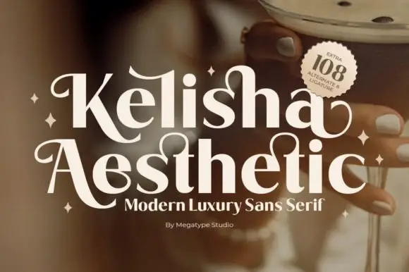
Heavy contrast mixed case with looped entry strokes and long curling capital legs
Kelisha Aesthetic is a modern luxury sans with high stroke contrast, tall narrow letters and a set of alternates in which an arm or an ascender curls into a loop.
Ideas for this font
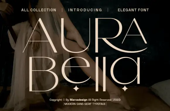
Fine contrast capitals and rounded lowercase with an extended sweeping R leg
Aura Bella draws an extremely light display sans, its strokes reduced to hairlines with a few heavy flares, its capitals tall, wide-spaced and set over a dark photograph.
Ideas for this font
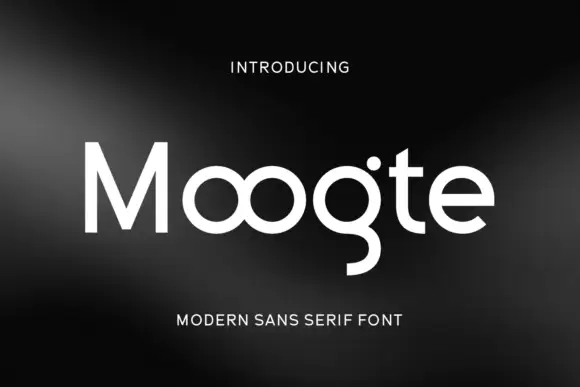
Joined circular display
Moogte is a joined circular display in white on a black ground: mixed case built from near-perfect circles, with the two o bowls fused into a single loop, a curling g descender and a cut on the t, set as one word with a small tracked line above and beneath.
Ideas for this font
Same independent foundry
Allow optional Google Analytics to measure visits and catalogue actions. Your search words and notes are not included. Privacy & storage