Neutral Sans Workhorse

Lemon Honey + Nyxar
Lets Lemon Honey own the focal silhouette while handling secondary copy, sizing and subheads cleanly.
Inspect Nyxar specimenDisclosure: MakerFileHub may earn a commission from qualifying purchases via paid links on this page. How our links work.
Organic hand-drawn fat display
Lemon Honey is a hand-drawn organic display in orange on off-white: fat lowercase letters with soft irregular outlines, a bouncing baseline, an open e and a curved y, with navy accents and a small round seal, so the pair reads as a hand-lettered juice label.
Paid link
Get this fontProject & layout blueprintsAt-a-glance maker compatibility
Sturdy stroke walls and open counters weed cleanly on adhesive vinyl, HTV apparel film, and cut cardstock.
Visual anatomy & craft review
The two words are stacked and the drawing is hand lettering rather than a drawn alphabet: the strokes are thick, the outlines bow, and the joins between letters vary, which keeps the lockup friendly and slightly uneven. The bounce keeps the baseline moving and the letters vary in width, so the pair looks cut with a brush rather than set from a font. The navy accents — a lemon slice, a small seal and the caption block — sit on top of the orange, and that two-colour contrast is what keeps the plate from becoming a single flat mass. Because the shapes are fat and irregular, the face works at label size and at poster size, which the specimen shows by setting both words large and keeping the supporting copy small.
Organic, hand-drawn, fat, friendly
Two-font hierarchy recipes
Tested contrast partners — pairing Lemon Honey with grounded secondary typography.
Lemon Honey + Nyxar
Lets Lemon Honey own the focal silhouette while handling secondary copy, sizing and subheads cleanly.
Inspect Nyxar specimen
Lemon Honey + Wolles Elegant Modern Serif
Grounds bold display lettering with classic typographic authority on posters, badges and apparel.
Inspect Wolles Elegant Modern Serif specimenPractical applications
Concrete hierarchy, scale and production guidance tailored to Lemon Honey’s stroke geometry.
An organic display reads as a hand-lettered label, and the fat irregular shapes stay legible on a small cup where a thin face would disappear against the drink.
Hierarchy & layout recipe
Print a 60 mm round label: the flavour at 14 pt, the volume in a 6 pt sans, and a small seal. Keep 4 mm inside the die and print two colours on a coated stock so the outlines stay clean.
Pre-production check
Check the 14 pt flavour on a curved cup, where the outer letters distort; reduce the width. Confirm the 6 pt volume reads at arm's length and that the seal does not crowd the flavour name.
A hand-drawn display gives a stand a friendly, made-today feel, and the heavy shapes read from across a market where a light face would be lost.
Hierarchy & layout recipe
A2 board: the stand name at 120 mm x-height, the prices in a 20 mm sans, and a 5 mm border. Keep 25 mm margins and paint two colours on a light board so the irregular outlines read as brushwork.
Pre-production check
Check the board at four metres, where the bounce can make the words look crooked; align the first and last letters. Confirm the 20 mm prices read at two metres and that the border clears the edge.
A fat hand display suits a summer card, and the irregular shapes keep the design from looking like a template when it is printed at home.
Hierarchy & layout recipe
A6 card: the name at 30 pt, the details in a 9 pt sans, and a small lemon at the foot. Keep 12 mm margins and print two colours on a white card so the thin parts of the outlines stay visible.
Pre-production check
Check the 30 pt name on a home printer, where a thin outline can break; keep the weight even in the export. Confirm the 9 pt details keep a 4.5:1 contrast and that the lemon clears the trim.
Technical & licence verification
Confirm included OTF/TTF/WOFF formats, full glyph tables and licence coverage on the live store page before batch production.
Closest visual alternatives
Matched across letterform anatomy, stroke behaviour and craft applications.
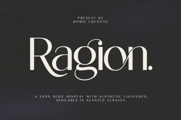
High-contrast display with ligatures
Ragion is a high-contrast display in cream on a dark ground: mixed case with a sweeping R leg that curls under the following letters, a looped g, a crossing join between o and n, hairline arms and rounded terminals, set as one large word with a full stop and two small tracked lines beneath.
Ideas for this font
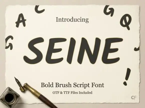
Slanted rounded brush capitals
Seine is a slanted rounded brush capital set in dark grey on a deckled cream sheet: very heavy strokes with rounded ends, a strong forward lean, and small capital letters scattered around the sheet as a specimen.
Ideas for this font
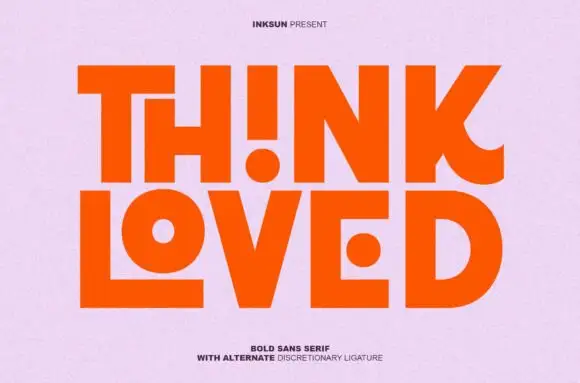
Bold sans with ligature alternates
Think Loved is a bold sans in orange on a pale ground: wide geometric caps with flat terminals, a very high waist and tight spacing, with a ligature that fuses two letters into a single drawn shape, set in two lines with a small tracked note beneath naming the alternate.
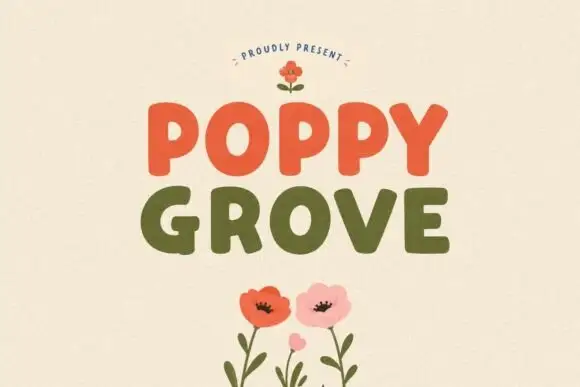
Simple rounded block capitals
Poppy Grove is a rounded block capital display in two warm inks: Poppy in vermilion and Grove in olive on a cream ground, with flat-sided letters, soft corners and a small drawn poppy above and below.
Same independent foundry
Allow optional Google Analytics to measure visits and catalogue actions. Your search words and notes are not included. Privacy & storage