High-Contrast Display Serif

Banana Milk Duo + Augler
Pairs sculptural editorial warmth with Banana Milk Duo's clean modern geometry.
Inspect Augler specimenDisclosure: MakerFileHub may earn a commission from qualifying purchases via paid links on this page. How our links work.
Casual marker handwriting with a bouncing baseline
Banana Milk is casual handwriting drawn with a rounded marker weight, its baseline bouncing up and down between letters, the ascenders short and the joins broken, so a word looks written quickly on a note rather than set on a line.
Paid link
Get this fontProject & layout blueprintsAt-a-glance maker compatibility
Weld or Unite overlapping script joins into one continuous vector path before sending to the blade.
Visual anatomy & craft review
The capital B is drawn as a narrow double lobe with a blunt top, and the following letters sit at visibly different heights: the a drops, the n rises, the second a drops again, and the pattern repeats across the word. That bounce is the defining feature and it never resolves into a level baseline. Strokes carry a marker's rounded ends and a constant weight, with no swelling at the turns, and the joins are mostly broken so the letters stand apart at irregular intervals. The i keeps a small solid dot, the l a short flat-topped ascender, and the final k ends in a small outward flick that lifts the word off the line. Nothing tapers and nothing is sharpened. The pale pink ground, the oversized ghosted letter and the tracked caps label are presentation; the handwriting is the two words.
Casual · Bouncy · Marker-like
Two-font hierarchy recipes
Tested contrast partners — pairing Banana Milk Duo with grounded secondary typography.
Banana Milk Duo + Augler
Pairs sculptural editorial warmth with Banana Milk Duo's clean modern geometry.
Inspect Augler specimen
Banana Milk Duo + Autography
Introduces organic movement on pull-quotes, signatures and gift tags.
Inspect Autography specimenPractical applications
Concrete hierarchy, scale and production guidance tailored to Banana Milk Duo’s stroke geometry.
A casual marker weight reads as a chalkboard note at the counter, which suits a shop that changes flavours daily, and the bouncing baseline keeps a printed label from looking like a corporate brand sheet.
Hierarchy & layout recipe
Set the shop name at 16 pt on a 60 by 40 mm label, keep the flavour and price in a bold grotesque at 8 pt, and leave 4 mm of margin so the final flick of the k clears the label edge.
Pre-production check
Chalk markers on a board smear when the board is wiped; print the permanent lettering on the frame and leave the daily list to handwriting rather than repeating the script.
The marker weight and uneven baseline read as something written by hand the week before the party, which is the tone a child's invitation actually needs, and the letters stay legible at a small size.
Hierarchy & layout recipe
Set the party name at 22 pt at the head of a 105 by 148 mm invitation, keep the time and address in a plain 9 pt sans, and leave the lower third empty for a hand-drawn map.
Pre-production check
Home-printed invitations on thin paper let the reverse show through; check a duplex proof and keep the marker weight off the area where the map will be drawn.
Round marker letters with a bounce are the shapes children recognise from their own writing, and the constant weight survives being printed small on a name label that gets handled all term.
Hierarchy & layout recipe
Set the child's name at 20 pt on a 60 by 30 mm label, keep the class and term at 7 pt, and leave 5 mm around the name so the tall l does not touch the label border.
Pre-production check
A label printed at 20 pt on a laser printer holds up better than inkjet for a term of handling; print a test sheet and check the fine joints on the k before the class set is produced.
Technical & licence verification
Confirm included OTF/TTF/WOFF formats, full glyph tables and licence coverage on the live store page before batch production.
Closest visual alternatives
Matched across letterform anatomy, stroke behaviour and craft applications.
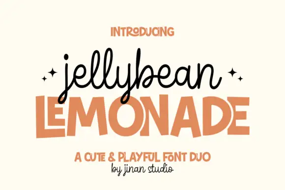
Looped monoline script stacked over a squared playful sans in flat capitals
Jellybean Lemonade pairs a looped monoline script with a squared playful sans, so one lockup carries a light handwritten first line and a flat block second line in the same colour.
Ideas for this font
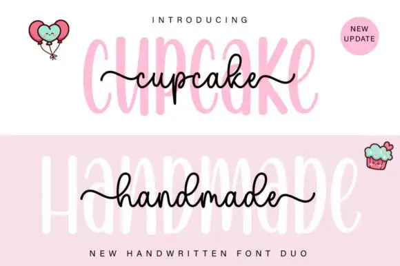
Tall rounded sans with fine extended script
Cupcake Handmade Duo places tall narrow rounded letters in pale pink behind a smaller connected script line in black, twice on one cover, where the script carries long outer tails and looped k and h forms while a balloon pair, a cupcake drawing and an update badge sit in the corners.
Ideas for this font
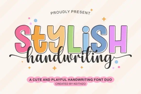
Colourful outlined capitals above a thin script
Stylish Handwriting is a duo on cream: fat outlined capitals with a black contour, each in a different pastel, and a thin joined script that runs beneath them with long tails.
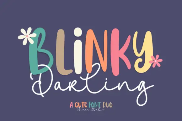
Duo
Blinky Darling Duo shows tall uneven printed forms with rounded ends, each capital in a different pastel tone across a plum ground, above a fine white script line whose D and g carry large open loops and whose tails extend well past the caps.
Ideas for this font
Same independent foundry
Allow optional Google Analytics to measure visits and catalogue actions. Your search words and notes are not included. Privacy & storage