Neutral Sans Workhorse

Issid + Clyne Sans
Lets Issid own the focal silhouette while handling secondary copy, sizing and subheads cleanly.
Inspect Clyne Sans specimenDisclosure: MakerFileHub may earn a commission from qualifying purchases via paid links on this page. How our links work.
Heavy rounded sans forms ending in short bulbous downward drips
Issid shows thick black capitals with softly rounded corners on a white panel, where unequal drips descend from the I, S and D, a small droplet hangs inside the D counter and the letters keep a broad even weight across the word.
Paid link
Get this fontProject & layout blueprintsAt-a-glance maker compatibility
Sturdy stroke walls and open counters weed cleanly on adhesive vinyl, HTV apparel film, and cut cardstock.
Visual anatomy & craft review
The bodies stay thick and round, the corners soften, the drips hang at different lengths and one drop floats inside a counter. That uneven dripping is the character: the word reads as fresh paint rather than a distressed texture, which is why the sample keeps a plain white field. The marbled border is presentation art, so plan baseline clearance for the drops, keep 40 pt before the small drop disappears and check the D opening at your size. The drips are the detail that fails: the shortest drop disappears at about 30 pt and the others read as printing faults, so keep 40 pt and allow 8 mm below the baseline.
Heavy rounded sans forms ending in short bulbous downward drips
Two-font hierarchy recipes
Tested contrast partners — pairing Issid with grounded secondary typography.
Issid + Clyne Sans
Lets Issid own the focal silhouette while handling secondary copy, sizing and subheads cleanly.
Inspect Clyne Sans specimen
Issid + Things
Grounds bold display lettering with classic typographic authority on posters, badges and apparel.
Inspect Things specimenPractical applications
Concrete hierarchy, scale and production guidance tailored to Issid’s stroke geometry.
The dripping caps set a playful poster, and the heavy bodies hold a two-word title at 56 pt on an A2 sheet, where the uneven drops read at a distance.
Hierarchy & layout recipe
Print an A2 poster: set the title at 56 pt on one row, keep 26 mm of clear ground beneath for the longest drip, and keep 24 mm of border so no drop is trimmed by the sheet edge.
Pre-production check
Drips cut by the trim look accidental; check the artwork and keep 26 mm of clear ground below the type.
The rounded mass suits a children's card, and the thick strokes hold a name at 34 pt on an A6 sheet, where the hanging drops give the row its energy.
Hierarchy & layout recipe
Print an A6 card: set the name at 34 pt on one row, keep 20 mm of clear ground beneath for the drips, and keep the details at 11 pt in a plain sans so the display word leads the card.
Pre-production check
The inner droplet closes under 20 pt; check the card proof and hold the name at 28 pt or above.
The thick rounds read across a forecourt, and the heavy forms hold a short name at 50 mm on a painted panel, where the drips suggest melting without an illustration.
Hierarchy & layout recipe
Paint a 500 by 250 mm panel: set the van name at 50 mm on one row, keep 24 mm of clear ground beneath for the drops, and keep 24 mm of border so the panel frame does not cut them.
Pre-production check
Painted drops blur below 4 mm; check the mask artwork, keep the sign at 44 mm or above and pull one proof panel before the run.
Technical & licence verification
Confirm included OTF/TTF/WOFF formats, full glyph tables and licence coverage on the live store page before batch production.
Closest visual alternatives
Matched across letterform anatomy, stroke behaviour and craft applications.
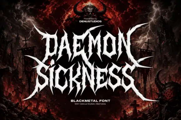
Jagged metal capitals with pointed horns and long outer blades
Daemon Sickness is death metal lettering: letters fused into a single spiked mass, blade points rising above the line and long symmetric wings sweeping out to both sides.
Ideas for this font
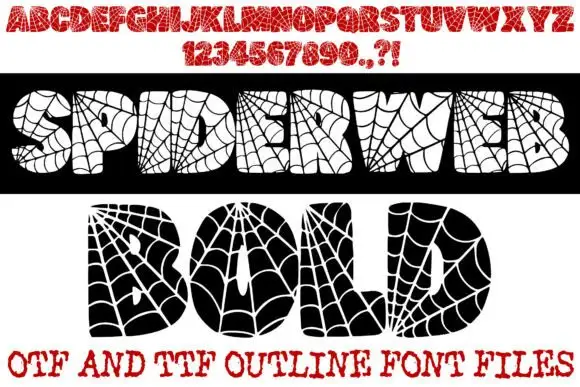
Spiderweb-filled display
Spiderweb Bold is a novelty display shown in two opposite treatments on white: a black bar carrying cream letters and a white panel carrying black letters, both filled with radial spiderweb lines and small spiders, with a red alphabet row and numeral row above and a format line at the foot.
Ideas for this font
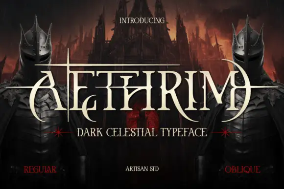
Fantasy capitals with needle-like extensions
Aethrim has high-contrast upright capitals with fine pointed cross-strokes and sweeping crescent-like curves, and long horizontal extensions cut across the title near cap height while armoured figures and a dark castle frame the word.
Ideas for this font
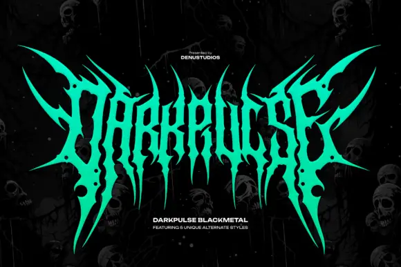
Spiked metal-style lettering with branching tips and hanging points
Darkpulse is black metal logo lettering: tall spiked strokes, mirrored symmetry, thin blade terminals that reach above and below the baseline, and five alternate versions of the wordmark.
Ideas for this font
Same independent foundry
Allow optional Google Analytics to measure visits and catalogue actions. Your search words and notes are not included. Privacy & storage