Neutral Sans Workhorse

Battlesbridge + Bareum
Lets Battlesbridge own the focal silhouette while handling secondary copy, sizing and subheads cleanly.
Inspect Bareum specimenDisclosure: MakerFileHub may earn a commission from qualifying purchases via paid links on this page. How our links work.
Contrasting display serifs with curled capitals and extended legs
Battlesbridge pairs dark BATTLES with orange BRIDGE in a compact two-row composition, where large curled B forms, pointed serif ends and a long sweeping R leg make the title ornamental without becoming a connected script, while fine lines cross parts of the letters and add a second detail scale.
Paid link
Get this fontProject & layout blueprintsAt-a-glance maker compatibility
Sturdy stroke walls and open counters weed cleanly on adhesive vinyl, HTV apparel film, and cut cardstock.
Visual anatomy & craft review
The strokes contrast, the serifs point, the caps curl and one leg runs long beneath the row. That extended leg is the character: the second word is carried by a single sweeping stroke, which is why the sample stacks two rows in two colours. The faint background alphabet and the colour split belong to the cover, so test the letters alone, confirm whether the leg is a separate swash, keep 34 pt and leave 22 mm beneath the sweep for whatever sits next.
Contrasting display serifs with curled capitals and extended legs
Two-font hierarchy recipes
Tested contrast partners — pairing Battlesbridge with grounded secondary typography.
Battlesbridge + Bareum
Lets Battlesbridge own the focal silhouette while handling secondary copy, sizing and subheads cleanly.
Inspect Bareum specimen
Battlesbridge + Askinо
Grounds bold display lettering with classic typographic authority on posters, badges and apparel.
Inspect Askinо specimenPractical applications
Concrete hierarchy, scale and production guidance tailored to Battlesbridge’s stroke geometry.
The ornamental serif gives a property a period mark, and the curled capitals hold a two-word name at 26 pt on a folder, where the split of weight between the words does the work of a rule.
Hierarchy & layout recipe
Print a 210 by 100 mm folder: set the first word in the dark weight at 26 pt and the second at 26 pt in the lighter tone beneath, keep 22 mm of clear ground for the R leg, and keep 14 mm of margin at each end.
Pre-production check
The long leg collides with a strapline set close; check the folder and keep 16 mm below the sweep.
The contrast serifs give a feature gravity, and the two-row composition holds a four-word title at 46 pt on a page, where the pointed terminals keep the row formal.
Hierarchy & layout recipe
Print a 210 mm page: set the title over two rows at 46 pt with 14 mm between baselines, keep 20 mm of clear ground beneath before the standfirst at 10 pt, and keep any background rules away from the fine lines crossing the letters.
Pre-production check
Cover rules drawn behind the letters in your own layout compete with the fine marks; keep the field plain.
The ornamental caps suit a reception menu, and the curled capitals hold a venue name at 30 pt on a tall card, where the long R leg finishes the heading above the courses.
Hierarchy & layout recipe
Print a 105 by 210 mm menu: set the venue name at 30 pt on one row, keep 20 mm of clear ground beneath for the R leg, and keep the course list at 11 pt in a roman face so the heading stays the only ornament.
Pre-production check
An extended leg over the first course line looks like an error; check the layout and keep 18 mm of air.
Technical & licence verification
Confirm included OTF/TTF/WOFF formats, full glyph tables and licence coverage on the live store page before batch production.
Closest visual alternatives
Matched across letterform anatomy, stroke behaviour and craft applications.
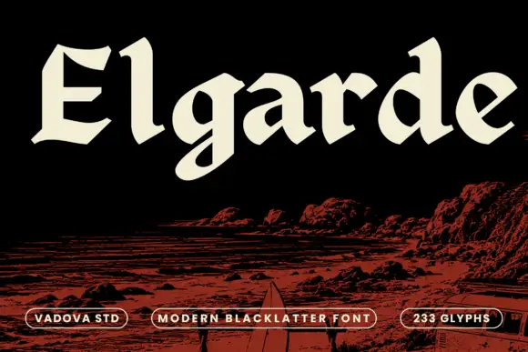
Heavy open blackletter with sloping cuts and a rounded g tail
Elgarde uses broad cream letters above a red coastal scene, where the E has sharply clipped horizontal ends, the lowercase a and d enclose large sloping counters and a rounded low g tail interrupts an otherwise firm baseline, with relatively open interiors for such heavy strokes.
Ideas for this font
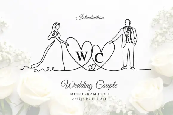
Bride-and-groom heart monogram
Wedding Couple Monogram is a mark on a white ground: two serif initials inside overlapping hearts, flanked by fine continuous line drawings of a bride in a long dress and a groom in a suit, each holding the outer edge of a heart, with a script title and two small credit lines beneath.
Ideas for this font
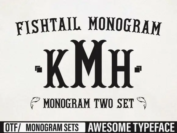
Tall monogram capitals with split fishtail ends
Fishtail Monogram shows a tall central M standing between narrower K and H, where split curved terminals flare at both ends of every upright, small square marks sit beside the outer letters and a fish outline appears at each side of a lower line.
Ideas for this font
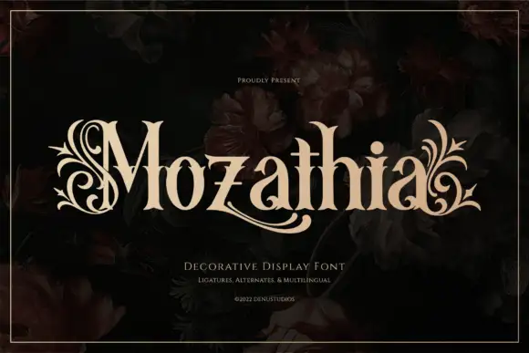
High-contrast serif with botanical flourishes
Mozathia is a high-contrast serif display in cream over a dark floral still life: mixed case with curling botanical flourishes that spring from the first and last letters, fine joins, a swollen stroke through the middle and short serifs, set as one word with a line above and two lines beneath.
Ideas for this font
Same independent foundry
Allow optional Google Analytics to measure visits and catalogue actions. Your search words and notes are not included. Privacy & storage