High-Contrast Display Serif

Homestead + Lumera Editorial
Pairs sculptural editorial warmth with Homestead's clean modern geometry.
Inspect Lumera Editorial specimenDisclosure: MakerFileHub may earn a commission from qualifying purchases via paid links on this page. How our links work.
Arched rustic caps paired with a heavy farmhouse script
Homestead is a duo of an arched rustic capital alphabet and a heavy farmhouse script with curled terminals, drawn so a stacked sign reads as a hand-painted barn board.
Paid link
Get this fontProject & layout blueprintsAt-a-glance maker compatibility
Fine grain and micro-texture excel in 300 DPI print, sublimation, and screen print rather than small vinyl weeding.
Visual anatomy & craft review
The caps half is a condensed slab with rough edges, designed to be set on an arch: the letters vary slightly in weight, the serifs are chunky and the terminals are uneven, which is what makes a word look brushed onto timber. The script half is a heavy connected hand with curled exits on the e and the d, a tall loop on the H and a low, wide body, and it is set on a flat baseline beneath the arch. The two halves share a rustic weight even though their constructions differ, which is what lets a cap arch and a script line sit on the same board. The small barn illustration, the wheat flourishes and the ribbon labels are presentation; the duo is the lettering of the sign.
Rustic · Arched · Paired
Two-font hierarchy recipes
Tested contrast partners — pairing Homestead with grounded secondary typography.
Homestead + Lumera Editorial
Pairs sculptural editorial warmth with Homestead's clean modern geometry.
Inspect Lumera Editorial specimen
Homestead + Thick Black
Introduces organic movement on pull-quotes, signatures and gift tags.
Inspect Thick Black specimenPractical applications
Concrete hierarchy, scale and production guidance tailored to Homestead’s stroke geometry.
The arched caps and the heavy script together produce a sign that looks painted on site, which is exactly the register a farm shop wants, and the arch fits a gable end.
Hierarchy & layout recipe
Set the arch at 30 cm cap height on a 2 m board, set the script line at 22 cm beneath, and keep 20 cm of margin at the ends so the arched letters do not run off the panel.
Pre-production check
Arch lettering needs each letter rotated individually; cut a full-size paper template and check the curve against the board before painting.
The rustic pair suits a venue built from timber, and the arch gives a welcome sign a deliberate shape without needing a frame or a printed border.
Hierarchy & layout recipe
Set the greeting in the caps at 14 cm on a 700 by 900 mm board, set the names in the script at 9 cm beneath, and leave 15 cm at the base so the descenders clear the stand.
Pre-production check
Painted boards in a barn are read in low light; check the finished sign at the venue's lighting and give the script stems a second coat.
The pair lets a box carry a rustic cap line and a handwritten product line, and both remain readable at the small size a produce box allows.
Hierarchy & layout recipe
Set the farm name in the caps at 16 pt on the 90 mm side panel, set the contents in the script at 11 pt, and hold 6 mm between them so the curled exits do not touch the caps.
Pre-production check
Kraft boxes fold and print unevenly; check one printed box on the actual board and confirm the script reads at 11 pt after folding.
Technical & licence verification
Confirm included OTF/TTF/WOFF formats, full glyph tables and licence coverage on the live store page before batch production.
Closest visual alternatives
Matched across letterform anatomy, stroke behaviour and craft applications.
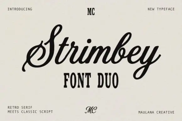
Retro serif with a classic script
Strimbey is a duo on warm cream: a retro condensed serif in small capitals with tall flat-topped letters, and a classic script with fine contrast that flows above it, with small monogram marks at the top and foot of the sheet.
Ideas for this font
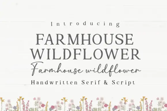
Soft upright serif caps with uneven edges paired with a loose connected script
Farmhouse Wildflower is a two-cut pair in which soft upright serif capitals carry slightly uneven edges and a lighter connected script runs low rounded joins with long strokes leaving the first and last letters.
Ideas for this font
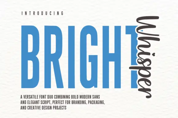
Very tall condensed bold sans paired with a loose script set vertically
Bright Whisper Duo pairs an extremely tall condensed sans in heavy weight with a loose upright script, and the sample sets the script sideways against the sans so the two voices sit at right angles.
Ideas for this font
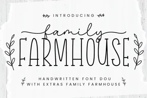
Thin tall serif capitals with a fine script duo
Family Farmhouse pairs very tall condensed serif capitals with a fine connected script, long side tails and a set of leaf-sprig ornaments sold as extras.
Ideas for this font
Same independent foundry
Allow optional Google Analytics to measure visits and catalogue actions. Your search words and notes are not included. Privacy & storage