High-Contrast Display Serif

Farmhouse Wildflower + Amor Hadena
Pairs sculptural editorial warmth with Farmhouse Wildflower's clean modern geometry.
Inspect Amor Hadena specimenDisclosure: MakerFileHub may earn a commission from qualifying purchases via paid links on this page. How our links work.
Soft upright serif caps with uneven edges paired with a loose connected script
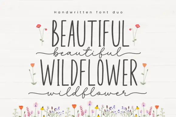
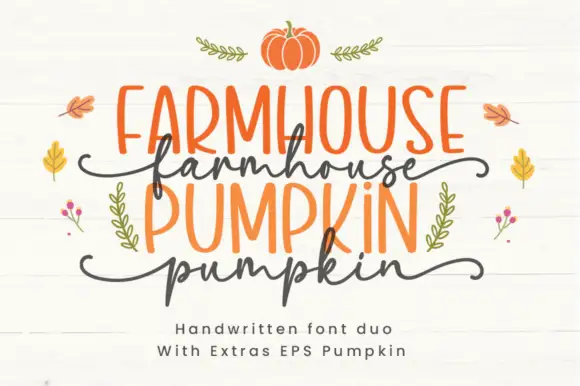
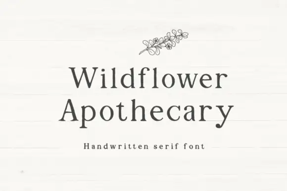
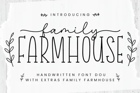
Farmhouse Wildflower is a two-cut pair in which soft upright serif capitals carry slightly uneven edges and a lighter connected script runs low rounded joins with long strokes leaving the first and last letters.
Paid link
Get this fontProject & layout blueprintsAt-a-glance maker compatibility
Weld or Unite overlapping script joins into one continuous vector path before sending to the blade.
Visual anatomy & craft review
The capital cut stands upright with soft slab-like feet and edges that wander by a fraction; the script cut keeps a light weight, rounds its joins near the baseline and extends a long entry before the first letter and a long exit after the last. The contrast between a settled serif and a loose hand is the character: one member anchors the line, the other softens it, which is why the sample stacks the caps over the script. Set the caps at 34 pt and the script at 30 pt, and keep 18 mm between rows so the long strokes do not collide. The illustrated wildflowers along the lower edge are separate artwork; the grey caps and lighter script are the duo.
Organic · Serif caps · Loose script
Two-font hierarchy recipes
Tested contrast partners — pairing Farmhouse Wildflower with grounded secondary typography.
Farmhouse Wildflower + Amor Hadena
Pairs sculptural editorial warmth with Farmhouse Wildflower's clean modern geometry.
Inspect Amor Hadena specimen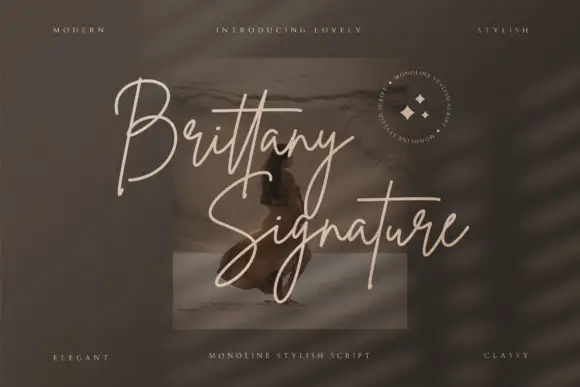
Farmhouse Wildflower + Brittany Signature Script
Introduces organic movement on pull-quotes, signatures and gift tags.
Inspect Brittany Signature Script specimenPractical applications
Concrete hierarchy, scale and production guidance tailored to Farmhouse Wildflower’s stroke geometry.
The soft caps read at a market distance while the script adds a handwritten line, and the pair holds at 54 mm and 40 mm on an A3 board.
Hierarchy & layout recipe
Print an A3 board: set the caps at 54 mm at the head, set the script at 40 mm beneath with 22 mm of clear ground, and keep 28 mm of border so the long exit stroke stays inside.
Pre-production check
A long exit stroke printed to the edge of the board is cut off; check the mounted sign and keep 24 mm of clear margin at the right.
The uneven serif suits an outdoor ceremony, and the light script keeps a pair of names readable at 24 pt on cream card stock.
Hierarchy & layout recipe
Print a 130 by 180 mm card: set the caps at 28 pt, set the script at 24 pt beneath with 16 mm of clear ground, and set the venue at 9 pt in a neutral serif at the foot.
Pre-production check
A loose script line printed over a venue line crowds it; check the proof and keep 14 mm of clear space under the script.
The pair suits a kraft tag, and the soft caps stay legible at 18 pt above a short script word on a 40 mm tag tied to a bouquet.
Hierarchy & layout recipe
Print a 40 by 80 mm tag: set the caps at 18 pt at the head, set the script at 20 pt beneath, and punch a 4 mm hole 10 mm from the top clear of every loop.
Pre-production check
A hole punched near the script entry stroke tears the card; check the die and move the hole 5 mm clear.
Technical & licence verification
Confirm included OTF/TTF/WOFF formats, full glyph tables and licence coverage on the live store page before batch production.
Closest visual alternatives
Matched across letterform anatomy, stroke behaviour and craft applications.
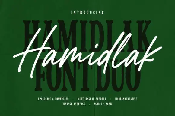
Brush signature script layered over a heavy vintage serif
Hamidlak layers a loose brush signature over a heavy vintage serif, so the same word appears twice in the sample — once as a signature and once as a stamped plate.
Ideas for this font
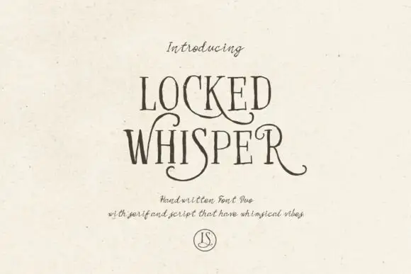
Ornate serif capitals with a whiskered script
Locked Whisper is a duo on speckled cream: ornate display capitals with thin strokes, curled serifs and long whiskers, and a fine script beneath whose letters carry the same curls at a smaller scale.
Ideas for this font
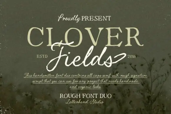
Rough caps serif paired with a ragged signature script
Clover Fields is a duo pairing a rough all-caps serif with a ragged signature script, so one block carries the noun in uneven capitals and the other carries it in a loose, broken hand.
Ideas for this font
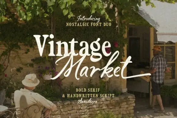
Bold serif paired with a hand-brushed script
Vintage Market is a nostalgic duo in cream over a market photograph: a bold serif for the first word and a hand-brushed script with long tails for the second, sold together as a pair with a small credit line beneath.
Ideas for this font
Same independent foundry
Allow optional Google Analytics to measure visits and catalogue actions. Your search words and notes are not included. Privacy & storage