Editorial Serif Anchor

Hello Amsterdam + Svara
Anchors Hello Amsterdam's fluid strokes with crisp Roman proportions on wedding suites, headers and packaging.
Inspect Svara specimenDisclosure: MakerFileHub may earn a commission from qualifying purchases via paid links on this page. How our links work.
Tall narrow bouncy travel-postcard signature script
Hello Amsterdam is a tall, narrow signature script with dramatic soaring 'h/l/d' loops and lively vertical bounce.
Paid link
Get this fontProject & layout blueprintsAt-a-glance maker compatibility
Weld or Unite overlapping script joins into one continuous vector path before sending to the blade.
Visual anatomy & craft review
Hello Amsterdam is a tall narrow signature script with soaring h, l and d loops, a pronounced vertical bounce and a deep descender on the m and d, drawn at a light-to-medium weight that keeps the ascenders airy. The narrow proportions let a long city name stack in a column without hyphenation, and the bounce gives a postcard the look of something written on a train. It needs roughly 16 mm for the loops to resolve, and it is at its best as a city name or a short greeting rather than a sentence.
Cosmopolitan · Tall-looped · Lively
Two-font hierarchy recipes
Tested contrast partners — pairing Hello Amsterdam with grounded secondary typography.
Hello Amsterdam + Svara
Anchors Hello Amsterdam's fluid strokes with crisp Roman proportions on wedding suites, headers and packaging.
Inspect Svara specimen
Hello Amsterdam + Modern Heritage
Keeps small-scale dates, URLs, nutrition facts and care instructions crisp and legible below script titles.
Inspect Modern Heritage specimenPractical applications
Concrete hierarchy, scale and production guidance tailored to Hello Amsterdam’s stroke geometry.
Tall loops read as handwriting done on the move, which is the tone of a travel postcard series. Narrow proportions stack a two-word city name in a narrow banner area without shrinking the type.
Hierarchy & layout recipe
Blog header 1600 x 400 px, city 180 px cap-height, 60 px margins. Postcard 148 x 105 mm, city 22 mm, message 6/9 pt, 12 mm margins. Title card 1920 x 1080, city 300 px, safe margin 5 percent.
Pre-production check
Postcards are handled and posted, and a glossy front scuffs a light script at the corners. Use a matt laminate or an uncoated 350 gsm card, and check one card after a week in a bag.
A signature script reads as a personal note from the hosts rather than a printed announcement, which is what a destination wedding save-the-date should feel like. The deep descender gives the city name a settled baseline.
Hierarchy & layout recipe
Save-the-date 120 x 180 mm, city 28 mm, details 9/13 pt, 15 mm margins. Tote panel 280 x 280 mm, city 50 mm. Card 105 x 148 mm, greeting 16 mm, message 7/10 pt.
Pre-production check
Save-the-dates are mailed in envelopes with a printed liner and a narrow script at 28 mm can clash with a bold postal stamp. Check one assembled envelope against the stamp placement before printing the run.
Airy loops suit a summer postcard where the writing is as much the souvenir as the picture. Tall narrow letters fit a vertical format that a wide script would have to break across two lines.
Hierarchy & layout recipe
Postcard 105 x 148 mm portrait, city 20 mm, message 6/9 pt on 8 mm leading, 12 mm margins. Sign 600 x 400 mm, word 80 mm, 40 mm margins. Print 210 x 297 mm, city 60 mm, 30 mm margins.
Pre-production check
Postcards printed at 105 x 148 mm portrait need a 15 mm strip at the foot for postal barcodes, and a descender there will be overprinted. Keep the message block 20 mm clear of the bottom edge.
Technical & licence verification
Confirm included OTF/TTF/WOFF formats, full glyph tables and licence coverage on the live store page before batch production.
Closest visual alternatives
Matched across letterform anatomy, stroke behaviour and craft applications.
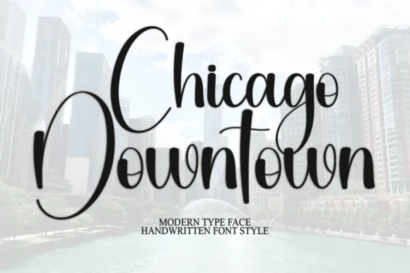
Tall narrow bouncy urban calligraphy script
Chicago Downtown is a tall, compressed modern calligraphy script featuring towering C/D/t/h stems and brisk year-round urban polish.
Ideas for this font
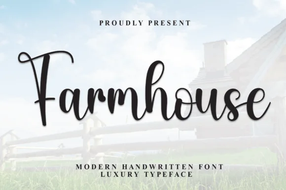
Bold bouncy shaded brush-calligraphy farmhouse script
Farmhouse Font (by andikastudio) is a thick, welcoming brush-calligraphy script with shaded downstrokes and lively baseline bounce.
Ideas for this font
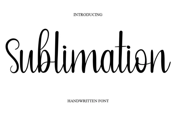
Thin handwritten script with heart detail
Sublimation is a thin handwritten script in black on white: a monoline stroke that swells slightly on the downstrokes, tall loose ascenders, a bouncy baseline, and a small heart replacing the dot on the i, so the phrase reads as a friendly handwritten note.
Ideas for this font
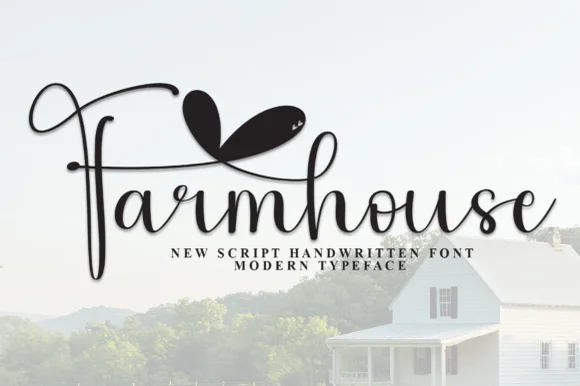
Fine romantic farmhouse calligraphy with double-heart canopy swash
Farmhouse (by Strongkeng Old) is an airy calligraphy script featuring dramatic sweeping F-stems and solid twin-heart overhead flourishes.
Ideas for this font
Same independent foundry
Allow optional Google Analytics to measure visits and catalogue actions. Your search words and notes are not included. Privacy & storage