Editorial Serif Anchor

Moonshine Brush Script + Grandeur – Elegant Classic Serif
Anchors Moonshine Brush Script's fluid strokes with crisp Roman proportions on wedding suites, headers and packaging.
Inspect Grandeur – Elegant Classic Serif specimenDisclosure: MakerFileHub may earn a commission from qualifying purchases via paid links on this page. How our links work.
Rough brush script with deep opening tail
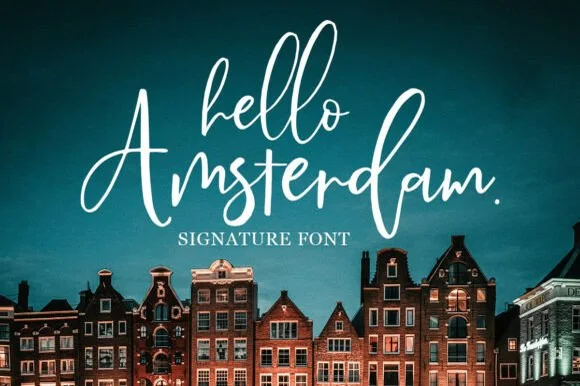
Moonshine Brush Script is a casual brush script in white on a dark blue scene: a deep opening tail on the M, dry edges on the fast strokes and a loose, quick rhythm.
Paid link
Get this fontProject & layout blueprintsAt-a-glance maker compatibility
Weld or Unite overlapping script joins into one continuous vector path before sending to the blade.
Visual anatomy & craft review
Moonshine fills the card in one word, and the lettering is written with a brush rather than a pen: the M opens with a deep descending tail that drops below the baseline and lifts back up, the o and the n are broad and round, the s finishes with a dry flick and the e is compressed. The stroke varies from a heavy downstroke to a fine exit, and the edges are ragged where the brush lifted, which gives the word its speed. The ground is a dark scene with a figure in silhouette and teal smoke behind, so the white script has the only bright element on the card, and a boxed caption beneath names the style. The face is a casual script for apparel, packaging and posters: the opening tail adds depth below the baseline, and the dry edges need a size where they read as texture.
A casual brush script on dark
Two-font hierarchy recipes
Tested contrast partners — pairing Moonshine Brush Script with grounded secondary typography.
Moonshine Brush Script + Grandeur – Elegant Classic Serif
Anchors Moonshine Brush Script's fluid strokes with crisp Roman proportions on wedding suites, headers and packaging.
Inspect Grandeur – Elegant Classic Serif specimen
Moonshine Brush Script + Cultivo
Keeps small-scale dates, URLs, nutrition facts and care instructions crisp and legible below script titles.
Inspect Cultivo specimenPractical applications
Concrete hierarchy, scale and production guidance tailored to Moonshine Brush Script’s stroke geometry.
A rough brush word on a bottle reads as a small-batch spirit, and one white on a dark label is the simplest possible print.
Hierarchy & layout recipe
Print a 50 by 80 mm bottle label: set the name at 18 pt on one row, keep 8 mm of clear ground beneath so the opening tail is clear of the volume line, and hold 4 mm of margin.
Pre-production check
The opening tail drops below the baseline and can cross a rule; print one at the real size and check the layout before the order.
A loose brush script reads in low light on a dark board, and the dry edges keep a plain sign from looking machine-printed.
Hierarchy & layout recipe
Print a 500 by 350 mm board: set the greeting at 100 pt on one row, keep 26 mm of clear ground beneath before the times at 22 pt, and hold 22 mm of border on all sides.
Pre-production check
Dry brush edges look like a worn plate when painted; print one at the final size and check the finish before the set.
A quick brush word gives a cover movement, and the white on dark reads from a shelf where a small serif would disappear.
Hierarchy & layout recipe
Print a 230 by 300 mm cover: set the cover word at 110 pt on one row, keep 30 mm of clear ground beneath before the cover lines at 12 pt, and hold 22 mm of margin on all sides.
Pre-production check
Fine dry edges disappear on newsprint; print one cover on the actual stock and check the stroke before the run.
Technical & licence verification
Confirm included OTF/TTF/WOFF formats, full glyph tables and licence coverage on the live store page before batch production.
Closest visual alternatives
Matched across letterform anatomy, stroke behaviour and craft applications.
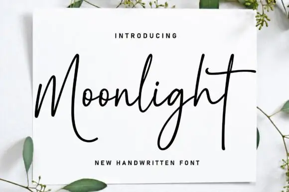
Monoline handwriting with long open loops
Moonlight is a monoline handwriting script in black on a white card propped against a pale surface: a thin even stroke, a tall M that opens into a big loop, an extended crossbar on the t and a long descending tail, with eucalyptus sprigs around the card.
Ideas for this font
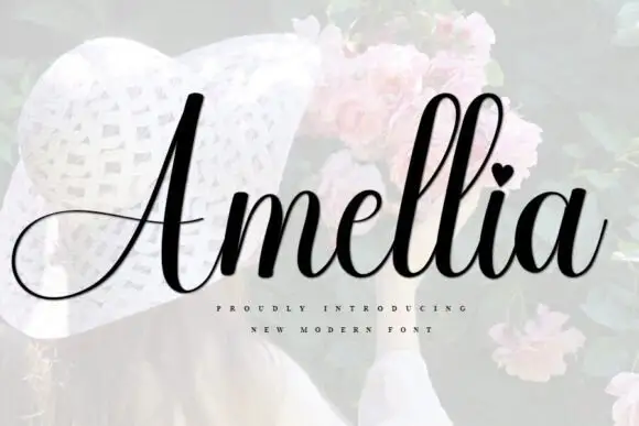
Slanted bridal script with heart tittle and long entry strokes
Amellia is a slanted cursive whose ascenders climb far above a small lowercase body, with a heart in place of the dot on the i and a capital that throws a long thin swash out to the left of the word.
Ideas for this font
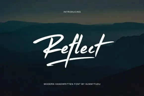
Modern brush signature with an underline
Reflect Handwritten Font is a modern brush signature in white: a single slanted word with a long underline stroke, set over a dark photograph of hills at dusk.
Ideas for this font
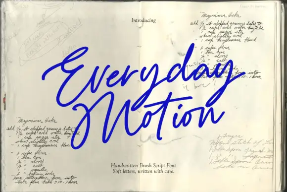
Sloping brush signature with long crossbars and a heavy loaded stroke
Everyday Motion is a sloping brush signature in a heavy loaded weight, with long crossbars that extend past the letters and strokes that swell through the middle of each word.
Ideas for this font
Same independent foundry
Allow optional Google Analytics to measure visits and catalogue actions. Your search words and notes are not included. Privacy & storage