Neutral Sans Workhorse

Happy Sporty + Inkora
Lets Happy Sporty own the focal silhouette while handling secondary copy, sizing and subheads cleanly.
Inspect Inkora specimenDisclosure: MakerFileHub may earn a commission from qualifying purchases via paid links on this page. How our links work.
Bouncy rounded slabs with irregular widths and a heavy dark edging
Happy Sporty is a playful slab display in which the letters bounce on uneven heights, the widths shift, the ends round off into soft slabs and a heavy dark edge wraps the whole title.
Paid link
Get this fontProject & layout blueprintsAt-a-glance maker compatibility
Sturdy stroke walls and open counters weed cleanly on adhesive vinyl, HTV apparel film, and cut cardstock.
Visual anatomy & craft review
The P bulges its bowl, the S turns a wide spine, the Y curls both tails and the letter widths shift so a word never sits on a straight line, while the edging runs at one weight around every stroke. The bounce is the character: it keeps an athletic word from looking rigid, which is why the sample sets a sports phrase with a bold outline. Because the outline is heavy, the face reads from 26 pt and layers as two colours; a filled single-colour version loses the effect. The pink fill and black depth in the sample are treatments rather than extra files, so confirm which cut arrives. The pale ground and the caption are presentation.
Playful slab · Bouncy · Outlined
Two-font hierarchy recipes
Tested contrast partners — pairing Happy Sporty with grounded secondary typography.
Happy Sporty + Inkora
Lets Happy Sporty own the focal silhouette while handling secondary copy, sizing and subheads cleanly.
Inspect Inkora specimen
Happy Sporty + Svara
Grounds bold display lettering with classic typographic authority on posters, badges and apparel.
Inspect Svara specimenPractical applications
Concrete hierarchy, scale and production guidance tailored to Happy Sporty’s stroke geometry.
The bouncy slabs suit a young team, and the heavy outline keeps the phrase clear at 80 mm on a printed banner in two inks.
Hierarchy & layout recipe
Print a two-metre banner: set the phrase at 80 mm, keep the outline at 2 mm wide, and keep 45 mm of border on every side so the eyelets clear the letters.
Pre-production check
A bounce printed against a straight rule looks crooked; check the finished banner and keep any rule out of the block.
The rounded slabs hold on fabric, and the heavy fill stays solid at 60 mm across a printed cotton chest in one flat colour.
Hierarchy & layout recipe
Print a 280 mm chest print: set the name at 60 mm, keep the dark edge at 3 mm of ink minimum, and leave 45 mm of clear fabric beneath the name for the date line.
Pre-production check
A heavy edge under 2 mm fills in on a screen print; check the film at full size and thicken the edge.
The bouncy forms cut into simple stickers, and the rounded ends stay whole at 30 mm on a shaped die printed over white backing.
Hierarchy & layout recipe
Print an A4 sticker sheet: set the words at 30 mm, keep 4 mm of clear vinyl around each letter, and leave 6 mm of gap between the motifs for the die cuts.
Pre-production check
Two motifs printed closer than 5 mm share a cut line; check the sheet and open the spacing by 2 mm.
Technical & licence verification
Confirm included OTF/TTF/WOFF formats, full glyph tables and licence coverage on the live store page before batch production.
Closest visual alternatives
Matched across letterform anatomy, stroke behaviour and craft applications.
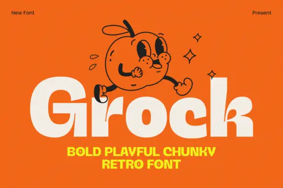
Chunky mixed case with tiny counters and a small branching k junction
Grock is a chunky mixed-case display in which the letter faces stay broad, the o and c openings shrink, the capital stands much taller than the lowercase and the k carries a small branching split, so a name reads as a friendly cartoon wordmark.
Ideas for this font
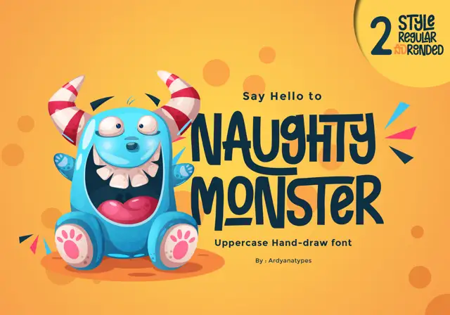
Tall eccentric cartoon capitals
Naughty Monster stretches cartoon letterforms into tall narrow capitals whose cross-strokes run out past their neighbouring letters and whose tops refuse to line up.
Ideas for this font
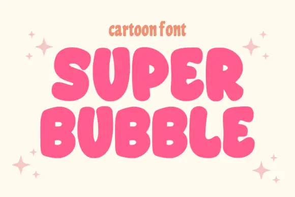
Heavy rounded cartoon capitals with small counters and uneven widths
Super Bubble is a heavy rounded cartoon display in which the capitals inflate, the counters shrink to small openings and the widths vary, so two stacked words read as gently over-full balloons.
Ideas for this font
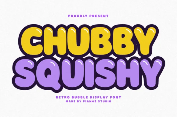
Retro bubble display with glossy highlights and a thick dark outline
Chubby Squishy is a retro bubble display alphabet in which the strokes swell into round cushions, the counters shrink to dots and a thick outline wraps every letter, so a word reads as a rubber sticker.
Ideas for this font
Same independent foundry
Allow optional Google Analytics to measure visits and catalogue actions. Your search words and notes are not included. Privacy & storage