Neutral Sans Workhorse

Grock + Bareum
Lets Grock own the focal silhouette while handling secondary copy, sizing and subheads cleanly.
Inspect Bareum specimenDisclosure: MakerFileHub may earn a commission from qualifying purchases via paid links on this page. How our links work.
Chunky mixed case with tiny counters and a small branching k junction
Grock is a chunky mixed-case display in which the letter faces stay broad, the o and c openings shrink, the capital stands much taller than the lowercase and the k carries a small branching split, so a name reads as a friendly cartoon wordmark.
Paid link
Get this fontProject & layout blueprintsAt-a-glance maker compatibility
Sturdy stroke walls and open counters weed cleanly on adhesive vinyl, HTV apparel film, and cut cardstock.
Visual anatomy & craft review
The G rises well above the lowercase line, the o closes a small round counter, the r keeps a short projecting shoulder and the k splits its junction into a tiny curve, all at a heavy weight with soft contours. The stepped silhouette is the character: one tall capital over a compact lowercase row, which is why the sample sets a short name on a plain ground. Because the counters are small, the face wants 32 pt before they stay open, and the k is the letter worth testing first in a new word. The fruit character and the stars in the sample are artwork; the cream lettering is the face.
Chunky · Playful · Stepped
Two-font hierarchy recipes
Tested contrast partners — pairing Grock with grounded secondary typography.
Grock + Bareum
Lets Grock own the focal silhouette while handling secondary copy, sizing and subheads cleanly.
Inspect Bareum specimen
Grock + Majestic Letters
Grounds bold display lettering with classic typographic authority on posters, badges and apparel.
Inspect Majestic Letters specimenPractical applications
Concrete hierarchy, scale and production guidance tailored to Grock’s stroke geometry.
The stepped silhouette suits a carton label, and the small counters stay open at 24 pt on a 55 mm panel in two inks. The tall capital needs its own 6 mm above the lowercase row.
Hierarchy & layout recipe
Print a 55 by 80 mm carton: set the brand at 24 pt, set the flavour in a 9 pt rounded sans beneath, and keep 6 mm from the die so the tall capital stays whole. Centre both rows on the front panel.
Pre-production check
A capital printed at 16 pt next to small lowercase looks broken; check the label proof and keep the brand at 22 pt or above.
The chunky forms suit a friendly card, and the broad faces keep a two-word greeting readable at 34 pt on an A6 sheet. The comma and apostrophe keep the same soft corners.
Hierarchy & layout recipe
Print an A6 card: set the greeting at 34 pt, keep 14 mm of clear ground beneath for the name and time, and keep 14 mm of margin all round the card. Print on a smooth card so the small counters stay open.
Pre-production check
A heavy display face set at 18 pt closes its small counters; check the proof and keep the greeting at 30 pt or above.
The simple masses cut cleanly, and the rounded forms stay whole at 30 mm on a shaped die with a pale ground. The k junction is the letter to check on any new word before cutting.
Hierarchy & layout recipe
Print a 55 mm shaped sticker: set the word at 30 mm, keep every small counter at 2 mm wide, and keep 4 mm of clear vinyl around the outermost curve. Trim inside the shape, not across a counter.
Pre-production check
A counter under 1.5 mm closes in a laminated sticker; check the sheet and keep the word at 28 mm or above. Lamination adds about 0.1 mm of fill.
Technical & licence verification
Confirm included OTF/TTF/WOFF formats, full glyph tables and licence coverage on the live store page before batch production.
Closest visual alternatives
Matched across letterform anatomy, stroke behaviour and craft applications.
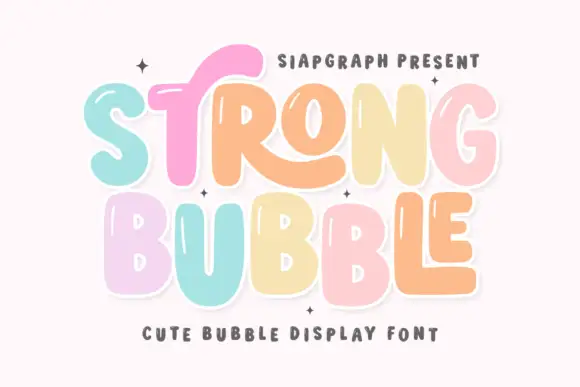
Pastel bubble display with shine
Strong Bubble is a pastel bubble display in mint, pink, peach and butter on white: fat rounded letters of uneven size, small white shine marks inside the strokes, a heavy outline and a bouncing baseline, so the pair reads as a hand-drawn sticker set rather than a typographic family.
Ideas for this font
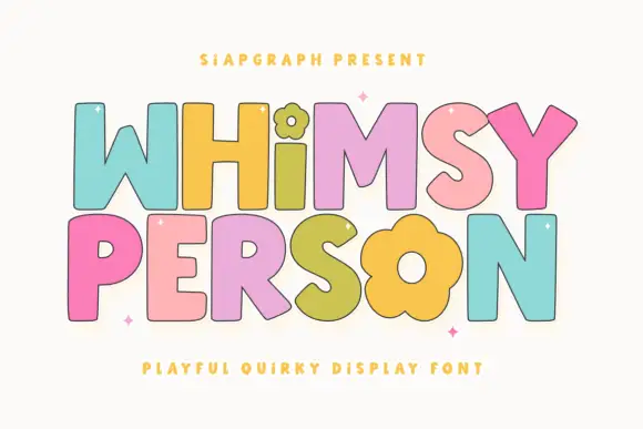
Simple broad letters with flower-shaped details
Whimsy Person is a playful capital display: fat rounded letters with a black contour, each in a different pastel colour, with the i and the o of the second word drawn as flower heads.
Ideas for this font
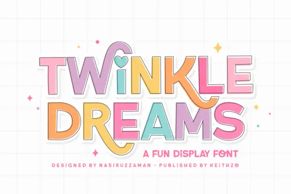
Block display with heart and swash accents
Twinkle Dreams combines firm block capitals with a heart-shaped dot above the i and curling extensions on selected letters, where the R and K tails swing below the main rows, each letter takes a pastel fill with a fine dark edge and the whole block sits on a faint grid.
Ideas for this font
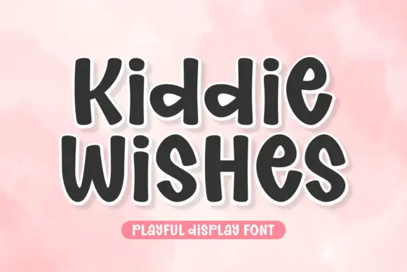
Chubby rounded sans with a warm wobble and open counters
Kiddie Wishes is a chubby rounded sans in which the strokes swell at the joints, the terminals round off and every letter leans a little, so a word reads as something drawn on a card with a fat marker.
Ideas for this font
Same independent foundry
Allow optional Google Analytics to measure visits and catalogue actions. Your search words and notes are not included. Privacy & storage