Neutral Sans Workhorse

Halftone Project + Memoir Slang
Lets Halftone Project own the focal silhouette while handling secondary copy, sizing and subheads cleanly.
Inspect Memoir Slang specimenDisclosure: MakerFileHub may earn a commission from qualifying purchases via paid links on this page. How our links work.
Heavy athletic slabs with fine diagonal halftone-like shading
Halftone Project shows pale block capitals with dense fine diagonal marks concentrated along parts of the strokes, where squared slabs and clipped O corners stay bold while the shading builds a directional textured edge.
Paid link
Get this fontProject & layout blueprintsAt-a-glance maker compatibility
Sturdy stroke walls and open counters weed cleanly on adhesive vinyl, HTV apparel film, and cut cardstock.
Visual anatomy & craft review
The weight stays heavy, the slabs square off, the O corners clip and the diagonal marks crowd one side of each stroke rather than covering it evenly. That directional texture is the character: the word looks printed through a screen with a moving angle, which is why the cover keeps the type pale on a dark city scene. The texture is an appearance in the preview and not an adjustable control, so check it at the real reproduction size and keep 44 pt before the marks disappear.
Athletic slabs · Diagonal shading · Directional
Two-font hierarchy recipes
Tested contrast partners — pairing Halftone Project with grounded secondary typography.
Halftone Project + Memoir Slang
Lets Halftone Project own the focal silhouette while handling secondary copy, sizing and subheads cleanly.
Inspect Memoir Slang specimen
Halftone Project + Marquis - Elegant Modern Serif
Grounds bold display lettering with classic typographic authority on posters, badges and apparel.
Inspect Marquis - Elegant Modern Serif specimenPractical applications
Concrete hierarchy, scale and production guidance tailored to Halftone Project’s stroke geometry.
The athletic slabs suit a team graphic, and the diagonal texture survives at 90 mm on a printed transfer in two colours.
Hierarchy & layout recipe
Print a 260 mm transfer: set the team name at 90 mm on one row, keep 14 mm between the letters so the shading reads on each stroke, and keep 18 mm of clear edge around the outermost slab.
Pre-production check
Fine shading marks fill in when printed small; check the transfer proof at half size before approving.
The textured slabs set a hard feature heading, and the clipped corners hold a two-word title at 52 pt across a page, where the shading still reads as texture.
Hierarchy & layout recipe
Print a 210 mm page: set the heading at 52 pt on one row, keep 18 mm beneath before the standfirst at 10 pt, and keep the block inside the column so the texture is not cut by the gutter.
Pre-production check
A dot or line screen under the shading creates moire; check the page and print the texture flat.
The heavy blocks give a party banner weight, and the diagonal shading reads at 56 pt across an A3 sheet, where the directional edge keeps the blocks from looking flat.
Hierarchy & layout recipe
Print an A3 banner: set the heading at 56 pt on one row, keep 22 mm of clear ground beneath before the details at 13 pt, and keep 18 mm of margin all round so the outer slabs stay whole.
Pre-production check
Shading at low resolution prints as noise; check the artwork at 100 percent before sending it out.
Technical & licence verification
Confirm included OTF/TTF/WOFF formats, full glyph tables and licence coverage on the live store page before batch production.
Closest visual alternatives
Matched across letterform anatomy, stroke behaviour and craft applications.
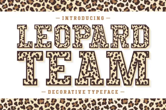
Leopard-filled varsity slab
Leopard Team is an outlined varsity slab in dark brown on cream: heavy caps drawn with a contour and filled with irregular leopard rosettes, on a light keyline with a dark offset shadow, with a tracked line above and beneath and a leopard band across the top and bottom of the sheet.
Ideas for this font
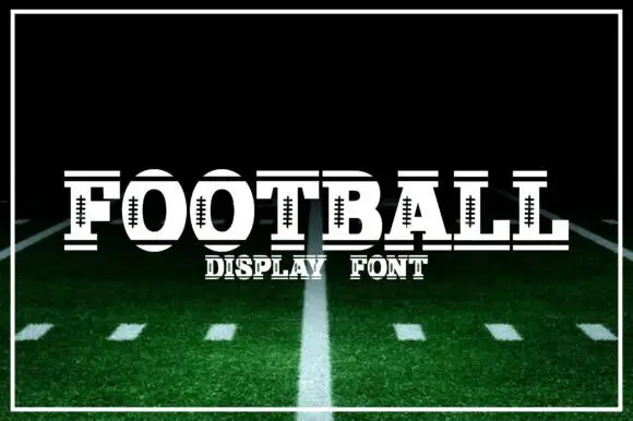
Slab capitals with football lace details across the middle
Football is a slab capital alphabet in which the round letters carry a laced seam across their middle, so a word reads as a printed ball rather than as plain athletic lettering.
Ideas for this font
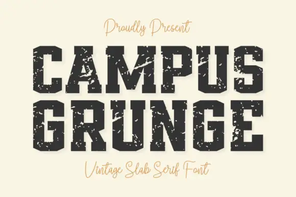
Heavy angular slabs with broad diagonal scars
Campus Grunge shows black athletic blocks on pale cream: large pale chips and diagonal scars interrupt the squared stems while clipped bowl corners and broad feet remain visible beneath the wear.
Ideas for this font
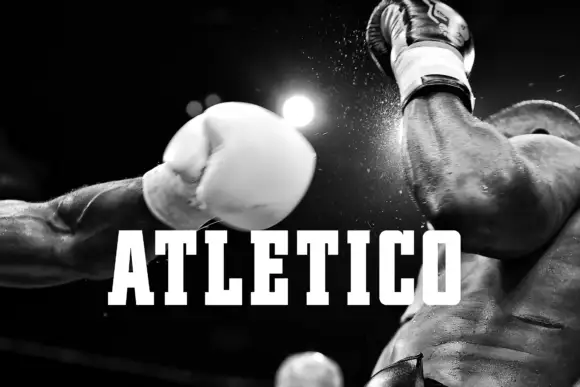
Tall narrow athletic blocks with sharp square feet
Atletico sets white condensed capitals over a close monochrome boxing photograph: long upright strokes end in firm square slabs, the E arms and T top run wide against narrow counters and the title stays solid with no inset contour or chipped texture.
Ideas for this font
Same independent foundry
Allow optional Google Analytics to measure visits and catalogue actions. Your search words and notes are not included. Privacy & storage