Neutral Sans Workhorse

Football + Mansory
Lets Football own the focal silhouette while handling secondary copy, sizing and subheads cleanly.
Inspect Mansory specimenDisclosure: MakerFileHub may earn a commission from qualifying purchases via paid links on this page. How our links work.
Slab capitals with football lace details across the middle
Football is a slab capital alphabet in which the round letters carry a laced seam across their middle, so a word reads as a printed ball rather than as plain athletic lettering.
Paid link
Get this fontProject & layout blueprintsAt-a-glance maker compatibility
Weld or Unite overlapping script joins into one continuous vector path before sending to the blade.
Visual anatomy & craft review
The F keeps two arms and a short middle bar, the O closes a rectangular counter with a lace of cross-stitches running across it, the T holds a wide arm and the B carries a full lower bowl with the same lace detail, all at a heavy even weight with unbracketed slabs. The lace is the character: it runs through every round letter at the same height, which keeps the word consistent when set as a single line. Because the lace is a fine drawn detail, the face needs 30 pt minimum on print and works best on a jersey or a poster where it can be read at a distance. Counters stay open at display sizes. The dark ground, the white line, the pitch photograph, the rule frame and the small caption are presentation; the typeface is the word.
Athletic · Laced · Slabbed
Two-font hierarchy recipes
Tested contrast partners — pairing Football with grounded secondary typography.
Football + Mansory
Lets Football own the focal silhouette while handling secondary copy, sizing and subheads cleanly.
Inspect Mansory specimen
Football + Resquel
Grounds bold display lettering with classic typographic authority on posters, badges and apparel.
Inspect Resquel specimenPractical applications
Concrete hierarchy, scale and production guidance tailored to Football’s stroke geometry.
The laced letters read as a printed ball on a jersey, and the heavy slabs survive a screen print at 60 mm where a lighter face would lose the stitch detail.
Hierarchy & layout recipe
Screen a 280 mm front print: lay the name at 60 mm through a 140-thread mesh, keep the lace lines at 1.5 mm minimum, and stay 50 mm below the collar so the print sits on the flat of the chest.
Pre-production check
Lace lines under 1 mm close on a coarse mesh; check a pull on the actual shirt and simplify the stitching rather than thickening the slabs.
The athletic slabs carry a fixture poster at 100 pt, and the lace detail gives the title a subject-specific character without an illustration.
Hierarchy & layout recipe
Print an A2 poster: set the fixture at 100 pt across the upper half, set the kick-off time in a 20 pt slab beneath, and keep 25 mm of margin so the slabs do not run into the trim on a narrow sheet.
Pre-production check
A heavy slab at 100 pt printed on newsprint can fill its counters; check a press proof and open the smallest bowls before the run.
The laced slabs read at 12 pt on a small sticker and give a bar a mark tied to the sport it shows on its screens every weekend.
Hierarchy & layout recipe
Print a 65 mm round sticker: set the bar name at 12 pt, keep the lace detail on the round letters only, and leave 6 mm inside the die so the slabs are not clipped at the corners.
Pre-production check
Fine stitching under 0.3 mm disappears on a matte laminate; check the finished sticker and drop the lace below 14 pt.
Technical & licence verification
Confirm included OTF/TTF/WOFF formats, full glyph tables and licence coverage on the live store page before batch production.
Closest visual alternatives
Matched across letterform anatomy, stroke behaviour and craft applications.
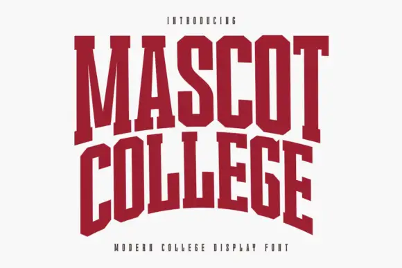
Very condensed collegiate slabs with tall stems and flat feet
Mascot College is a very condensed collegiate slab in which the stems run tall, the slabs are flat and thin and the counters close to slits, so a long name fits one line on a narrow format.
Ideas for this font
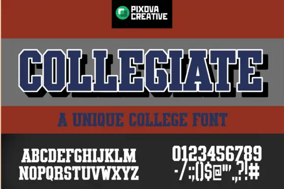
Condensed athletic capitals with clipped corners and slab feet
Collegiate shows narrow block capitals with heavy upright strokes, broad slab feet and clipped outer corners: the main title carries a white outline and a black offset shadow, with smaller alphabet, numeral and punctuation samples printed beneath.
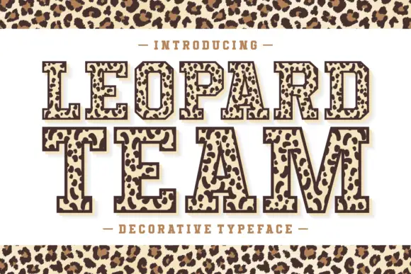
Leopard-filled varsity slab
Leopard Team is an outlined varsity slab in dark brown on cream: heavy caps drawn with a contour and filled with irregular leopard rosettes, on a light keyline with a dark offset shadow, with a tracked line above and beneath and a leopard band across the top and bottom of the sheet.
Ideas for this font
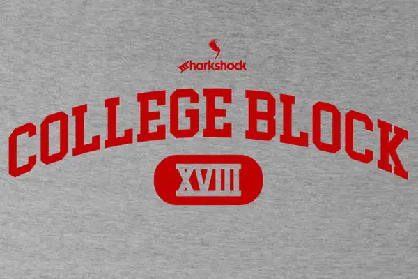
Clean narrow collegiate slab capitals with angled cuts and no lowercase
College Block is a condensed collegiate slab in capitals only, with heavy rectangular serifs, angled cuts and tight counters, built to be set on an arc across a garment.
Ideas for this font
Same independent foundry
Allow optional Google Analytics to measure visits and catalogue actions. Your search words and notes are not included. Privacy & storage