Modern Grotesque Body

Grunge Baseball + Modern Heritage
Creates crisp high-hierarchy contrast beneath Grunge Baseball headlines across menus, websites and labels.
Inspect Modern Heritage specimenDisclosure: MakerFileHub may earn a commission from qualifying purchases via paid links on this page. How our links work.
Worn stamp-textured collegiate varsity slab serif
Grunge Baseball is a stout vintage collegiate slab serif distressed with subtle scuffed-ink pores and softened worn corners.
Paid link
Get this fontProject & layout blueprintsAt-a-glance maker compatibility
Fine grain and micro-texture excel in 300 DPI print, sublimation, and screen print rather than small vinyl weeding.
Visual anatomy & craft review
A worn stamp-textured varsity slab shown inside a weathered navy-and-tan stadium card with three orange stars: thick octagonal capitals with bracketed serifs are peppered lightly with screen-print wear, so the word reads as a printed team stamp rather than a distressed novelty. The distress is even and light, which is what keeps the letters readable at a distance, and the octagonal construction gives the face the proportions of a college athlete block. The stadium card and the stars are staging. The wear is drawn into the glyphs, so it does not depend on a filter and it repeats consistently.
Vintage-dugout · Textured-slab · Rugged
Two-font hierarchy recipes
Tested contrast partners — pairing Grunge Baseball with grounded secondary typography.
Grunge Baseball + Modern Heritage
Creates crisp high-hierarchy contrast beneath Grunge Baseball headlines across menus, websites and labels.
Inspect Modern Heritage specimen
Grunge Baseball + Abigail
Adds a warm human signature touch for 1-to-3-word callouts without competing against structured serif capitals.
Inspect Abigail specimenPractical applications
Concrete hierarchy, scale and production guidance tailored to Grunge Baseball’s stroke geometry.
Light, balanced distress gives a new print the broken-in feel of a championship shirt, so a reunion or an Est. line reads as archive kit rather than as a fresh order, and the octagonal block holds at chest size where a thin varsity face would look weak.
Hierarchy & layout recipe
Print a 250 mm chest graphic: row one in white at 55 mm cap height, row two in burnt orange at 40 mm, inside a double-ruled rectangular border. Keep 4 mm between the rows and place the block 80 mm below the collar.
Pre-production check
Internal distress pinholes mean DTF, sublimation or screen work best; contour-cut the specks out if cutting HTV. Wash-test one shirt and confirm the wear stays even after five cycles.
The classic orange-and-navy college palette prints crisply on ceramic and wood, so a coach's thank-you gift looks like team kit rather than a generic mug, and the heavy slab stems survive the curved surface where a script would distort.
Hierarchy & layout recipe
Print a wrap panel 200 by 80 mm: the name at 24 mm cap height, the year at 12 mm, and two inks on a white mug. Keep 10 mm from the handle, keep the block 15 mm below the rim, and add three stars along the top margin.
Pre-production check
Export at 300 dpi so the stamp edges stay crisp, and cure the print for 48 hours before washing. Confirm the type does not wrap into the handle curve when the mug is turned.
A varsity slab reads from a distance, so a clubhouse or dugout sign carries the team name across a field, and the worn texture keeps a new sign from looking like a chain-store plaque.
Hierarchy & layout recipe
Cut a 900 by 300 mm panel: the team at 100 mm cap height, the est. line at 26 mm, and two colours on a primed board. Keep 26 mm margins, keep the strokes above 9 mm and place the stars outside the text block.
Pre-production check
Check the cut at 100 mm, where a distressed notch can tear on weeding; keep the strokes above 9 mm. Confirm the sign reads at twelve metres and that the border survives the weather.
Technical & licence verification
Confirm included OTF/TTF/WOFF formats, full glyph tables and licence coverage on the live store page before batch production.
Closest visual alternatives
Matched across letterform anatomy, stroke behaviour and craft applications.
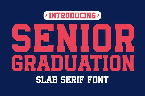
Heavy varsity slab caps
Senior Graduation is a heavy varsity slab in red on navy: very wide caps with block serifs as thick as the stems, flat tops, rectangular counters, and tight even spacing, so the pair reads as a college jersey print at its most emphatic.
Ideas for this font
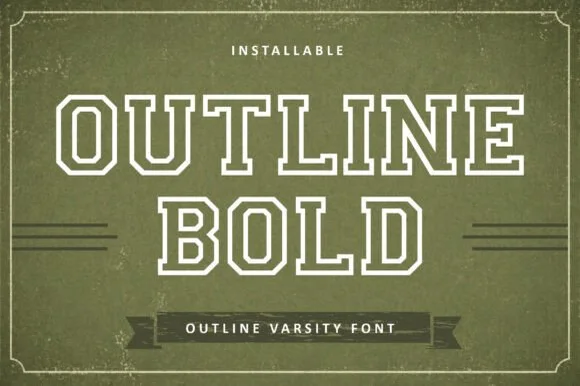
Outline varsity slab display
Outline is a varsity display drawn only as an outline: bold college capitals with square shoulders, a double contour that steps inward, and no fill at all, set white on a textured olive green with a banner rule beneath.
Ideas for this font
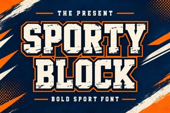
Heavy chamfered collegiate varsity block slab
Sporty Block is a classic heavy collegiate athletic slab serif built for 2- and 3-color layered jersey outlines, banners, and spirit wear.
Ideas for this font
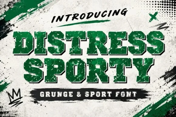
Heavy cracked-plastisol grunge varsity slab serif
Distress Sporty is a rugged collegiate varsity slab serif pre-weathered with cracked plastisol-ink splits and rough turf grit.
Ideas for this font
Same independent foundry
Allow optional Google Analytics to measure visits and catalogue actions. Your search words and notes are not included. Privacy & storage