Neutral Sans Workhorse

Graffiti Bubble + Lemon Milk Pro FTR
Lets Graffiti Bubble own the focal silhouette while handling secondary copy, sizing and subheads cleanly.
Inspect Lemon Milk Pro FTR specimenDisclosure: MakerFileHub may earn a commission from qualifying purchases via paid links on this page. How our links work.
Clean street-throwup cartoon graffiti bubble sans
Graffiti Bubble blends 90s street-art throw-up overlap with clean, cheerful kid-safe cartoon bubble readability.
Paid link
Get this fontProject & layout blueprintsAt-a-glance maker compatibility
Sturdy stroke walls and open counters weed cleanly on adhesive vinyl, HTV apparel film, and cut cardstock.
Visual anatomy & craft review
A clean street-throwup bubble display shown among translucent soap bubbles, in sunny gold and grass green with white-and-black sticker rims: rounded bubble capitals lock together neatly, so the word reads as a cartoon throw-up rather than as a rough spray tag. The rims are what make it feel like a sticker, and the tight fitting is the construction, which is why a short word works better than a long line. Because the shapes are solid and the counters are simple, the face holds at moderate sizes and cuts cleanly. The soap bubbles behind are staging. Uses are kids' apparel, school merch, stickers and playful brand marks.
Kid-graffiti · Clean-bubble · Upbeat
Two-font hierarchy recipes
Tested contrast partners — pairing Graffiti Bubble with grounded secondary typography.
Graffiti Bubble + Lemon Milk Pro FTR
Lets Graffiti Bubble own the focal silhouette while handling secondary copy, sizing and subheads cleanly.
Inspect Lemon Milk Pro FTR specimen
Graffiti Bubble + Mewah
Grounds bold display lettering with classic typographic authority on posters, badges and apparel.
Inspect Mewah specimenPractical applications
Concrete hierarchy, scale and production guidance tailored to Graffiti Bubble’s stroke geometry.
A clean bubble throw-up gives a kid's birthday shirt street credibility without the roughness of a spray tag, and the sticker rims keep the lettering friendly enough that a parent will actually buy it.
Hierarchy & layout recipe
Print a 220 mm chest graphic: the name at 50 mm cap height, the year at 20 mm, and three inks on a light shirt. Keep the rim at 3 mm and place the graphic 70 mm below the collar.
Pre-production check
Check the screen at actual mesh, where a 3 mm rim can fill; widen it to 4 mm. Wash-test one shirt and confirm the rims stay separate after five cycles.
A bubbly sticker-like face names a locker without the formality of a label, which is what a student actually wants, and the tight fitting means a short name fills the magnet rather than floating in the middle of it.
Hierarchy & layout recipe
Print a 60 by 60 mm magnet: the name at 22 mm cap height, the subject at 7 mm, and three colours on a white magnetic sheet. Keep 5 mm inside the die and keep the rim 2 mm clear of the edge.
Pre-production check
Check the die at 22 mm, where the rim can merge with the letter; keep 2 mm of clearance. Confirm the magnet holds on a painted locker and that the ink does not scuff in a bag.
A bubble face prints as summer merch, and the gold and green palette suits a beach or a pool club better than a dark street palette, while the solid shapes survive HTV at the size a water bottle takes.
Hierarchy & layout recipe
Print a 90 mm HTV decal: the club at 30 mm cap height, the year at 10 mm, and two colours on a light ground. Keep 8 mm clear space around the mark and weld toucching joins before cutting.
Pre-production check
Check the cut at 30 mm, where a locked pair can fall out on weeding; weld them. Confirm the decal survives chlorine and sun for a season and that the rims stay crisp after pressing.
Technical & licence verification
Confirm included OTF/TTF/WOFF formats, full glyph tables and licence coverage on the live store page before batch production.
Closest visual alternatives
Matched across letterform anatomy, stroke behaviour and craft applications.
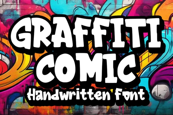
Bold 90s cartoon-street comic graffiti font
Graffiti Comic is a crisp, ultra-readable cartoon-graffiti display font with chunky flared serifs/bars and bouncy comic-book energy.
Ideas for this font
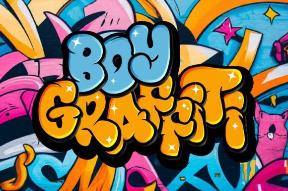
Puffy rounded 90s bubble throw-up graffiti font
Boy Graffiti is a plump, bubbly street-throwup display font with inflated comic-cushion letters and tiny slit counters.
Ideas for this font
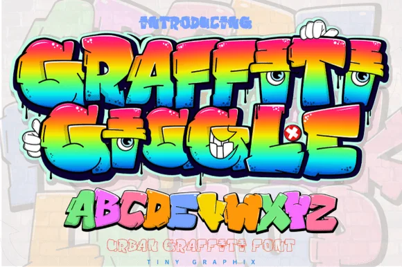
Cartoon character-eye bubble graffiti display
Graffiti Giggle is a playful cartoon street-graffiti font featuring chunky overlapping bubble letters and cheeky character-eye details.
Ideas for this font
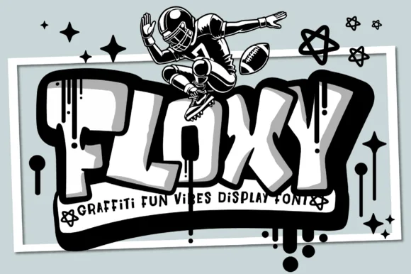
Tubular rounded 3D-block street graffiti with drips
Floxy is a chunky, rounded-rectangle street graffiti font accented with subtle paint drips and heavy cartoon 3D block depth.
Ideas for this font
Same independent foundry
Allow optional Google Analytics to measure visits and catalogue actions. Your search words and notes are not included. Privacy & storage