Neutral Sans Workhorse

Golden Grad + Memoir Slang
Lets Golden Grad own the focal silhouette while handling secondary copy, sizing and subheads cleanly.
Inspect Memoir Slang specimenDisclosure: MakerFileHub may earn a commission from qualifying purchases via paid links on this page. How our links work.
Gold-toned irregular capitals with mixed patterns and graduation accessories
Golden Grad uses uneven gold-toned block capitals with white checks, diamond shapes, botanical-like marks and fine cross-hatching, where black mortarboards sit above selected letters and books with a rolled diploma fill the lower edge.
Paid link
Get this fontProject & layout blueprintsAt-a-glance maker compatibility
Sturdy stroke walls and open counters weed cleanly on adhesive vinyl, HTV apparel film, and cut cardstock.
Visual anatomy & craft review
The blocks stay heavy and uneven, each letter carries a different interior pattern, and the accessories sit above and below the row rather than inside it. That mixed patterning is the character: the word reads as a decorated banner rather than a clean cap face, which is why the sample keeps one congratulatory line. The gold appearance is a palette rather than a verified metallic output, and the hats may need separate assembly, so test a short heading and check whether any accessory actually ships as a glyph.
Patterned · Irregular · Graduation
Two-font hierarchy recipes
Tested contrast partners — pairing Golden Grad with grounded secondary typography.
Golden Grad + Memoir Slang
Lets Golden Grad own the focal silhouette while handling secondary copy, sizing and subheads cleanly.
Inspect Memoir Slang specimen
Golden Grad + Brenco
Grounds bold display lettering with classic typographic authority on posters, badges and apparel.
Inspect Brenco specimenPractical applications
Concrete hierarchy, scale and production guidance tailored to Golden Grad’s stroke geometry.
The patterned caps celebrate a graduation, and the heavy blocks hold a name at 54 pt across an A3 banner, where the mixed interiors read as a decorated banner.
Hierarchy & layout recipe
Print an A3 banner: set the name at 54 pt on one row, keep 24 mm of clear ground above for the mortarboards if you add them, and keep 20 mm of margin all round.
Pre-production check
Patterned interiors print as mud under 30 pt; check the proof and hold the name at 46 pt or above.
The decorated letters mark a milestone, and the uneven blocks hold a short congratulation at 32 pt on an A6 card, where the mixed patterns stay visible on a pale field.
Hierarchy & layout recipe
Print an A6 card: set the greeting at 32 pt on one row, keep 18 mm of clear ground beneath before the name at 11 pt, and leave the patterns on a plain pale field.
Pre-production check
Fine hatching printed at 18 pt disappears; check the card and keep the greeting at 30 pt or above.
The festive caps suit a wrapped gift, and the heavy forms hold a short phrase at 24 pt on a 55 mm tag, big enough that the patterns survive a small print.
Hierarchy & layout recipe
Print a 55 by 40 mm tag: set the phrase at 24 pt on one row, keep 10 mm of clear ground above for an accessory, and keep 6 mm of border so the uneven edges stay whole.
Pre-production check
Accessories placed too close to the punch tear on the string; check the artwork and keep 12 mm clear.
Technical & licence verification
Confirm included OTF/TTF/WOFF formats, full glyph tables and licence coverage on the live store page before batch production.
Closest visual alternatives
Matched across letterform anatomy, stroke behaviour and craft applications.
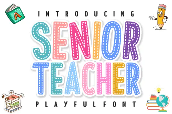
Layered stitched capitals in colour
Senior Teacher is a layered decorative display: fat capitals with a thick white outline and a dashed stitched line inside each letter, each one in a different bright colour, with drawn school objects around them.
Ideas for this font
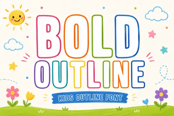
Rounded outline capitals
Bold Outline shows tall rounded capitals traced by a thin coloured contour on a pale field, where the B keeps small narrow counters while the L and D leave broad white interiors, and the letter widths change across the two rows so the second word runs wider than the first.
Ideas for this font
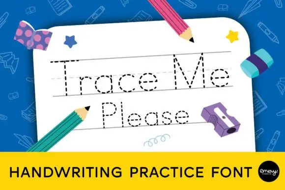
Dashed tracing-letter face
Trace Me Please is a dashed tracing face in grey on a white practice sheet: fine dashed paths in mixed case drawn on ruled guides with a dotted midline, surrounded by flat school illustrations of pencils, crayons and a binder, with a caption bar at the foot.
Ideas for this font
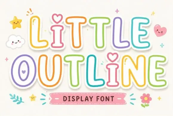
Rounded outline letters with hearts in the counters
Little Outline is a rounded outline display face in soft pastels with white sticker shadows: open letters drawn as a thick rounded line, a heart in place of the i dot and hearts inside several counters, shown with drawn clouds, stars and a flower.
Ideas for this font
Same independent foundry
Allow optional Google Analytics to measure visits and catalogue actions. Your search words and notes are not included. Privacy & storage