Neutral Sans Workhorse

Gold and Silver Glitter Groovy + Bareum
Lets Gold and Silver Glitter Groovy own the focal silhouette while handling secondary copy, sizing and subheads cleanly.
Inspect Bareum specimenDisclosure: MakerFileHub may earn a commission from qualifying purchases via paid links on this page. How our links work.
Swollen sketch-edged capitals and numerals with dense gold-silver sparkle-like fills
Gold and Silver Glitter Groovy sets fat rounded letters and numerals in a hand-drawn outline and fills them with a photographic glitter texture, supplied as a gold alphabet and a silver numeral set.
Paid link
Get this fontProject & layout blueprintsAt-a-glance maker compatibility
Sturdy stroke walls and open counters weed cleanly on adhesive vinyl, HTV apparel film, and cut cardstock.
Visual anatomy & craft review
ABCD fills the upper row in gold and 1234 the lower in silver, and each shape is a soft bubble letter with a heavy black contour, an inner contour and a dark offset shadow that lifts it off the ground. The glitter is busy and uneven, with bright specks and darker patches, and it follows the shape of each letter rather than tiling across the word. A caption at the top names the set, one at the bottom states what is included, and a badge at the right lists the formats. The construction is a colour font with a texture baked into the fill, which is what makes it work for invitations and thumbnails: the shine is already there, and nothing has to be applied in a design programme afterwards.
Swollen sketch-edged capitals and numerals with dense gold-silver sparkle-like fills
Two-font hierarchy recipes
Tested contrast partners — pairing Gold and Silver Glitter Groovy with grounded secondary typography.
Gold and Silver Glitter Groovy + Bareum
Lets Gold and Silver Glitter Groovy own the focal silhouette while handling secondary copy, sizing and subheads cleanly.
Inspect Bareum specimen
Gold and Silver Glitter Groovy + Glofi
Grounds bold display lettering with classic typographic authority on posters, badges and apparel.
Inspect Glofi specimenPractical applications
Concrete hierarchy, scale and production guidance tailored to Gold and Silver Glitter Groovy’s stroke geometry.
The glitter does the celebrating in one word, and a gold set paired with a silver numeral lets a card carry both a greeting and an age without a second face.
Hierarchy & layout recipe
Print a 120 by 170 mm card: set the greeting at 44 pt across two rows and the age at 60 pt beneath, keep 18 mm of clear ground between them, and hold 13 mm from the shadow to the card edge.
Pre-production check
Glitter textures print as mush on uncoated card; print one card on the intended board and check the specks first.
The gold reads as celebration across a dark room, and the heavy contour keeps the word legible where a thin metallic face would disappear against the lights.
Hierarchy & layout recipe
Print a 600 by 400 mm board: set the greeting at 100 pt across two rows, keep 26 mm of clear ground beneath before the time at 16 pt, and hold 24 mm of border so no shadow is cut.
Pre-production check
Metallic effects go grey in dim light; print one board and check it in the room before the set is mounted.
The glitter finish makes a small bottle look like an occasion, and a single word in this style needs no further decoration on the label.
Hierarchy & layout recipe
Print a 50 by 90 mm label: set the brand name at 20 pt on one row, keep 7 mm of clear ground beneath before the volume at 4.5 pt, and hold 5 mm from the outline to the die line.
Pre-production check
The texture closes on a small curved label; print one label and roll it onto the bottle before the order.
Technical & licence verification
Confirm included OTF/TTF/WOFF formats, full glyph tables and licence coverage on the live store page before batch production.
Closest visual alternatives
Matched across letterform anatomy, stroke behaviour and craft applications.
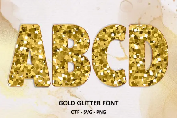
Rounded heavy capitals with faceted gold-like fills
Gold Glitter fills chunky rounded capitals with gold glitter: small irregular flakes in three tones packed edge to edge inside each letter, with a fine dark contour around the shape.
Ideas for this font
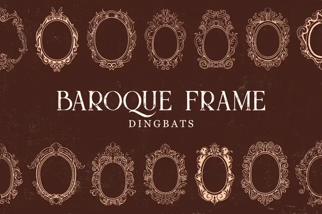
Intricate oval baroque frames with curling crowns and fine inner rings
Baroque Frame Dingbats is a set of oval cartouche frames drawn with acanthus scrolls, shell crests and bead mouldings, each one a typable character that can be dropped around a name.
Ideas for this font
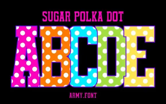
Slab capitals with polka dots
Sugar Polka Dot is a colour display on a black ground: tall slab-like capitals in vivid pink, orange, blue, green and yellow, each covered with large white dots, with a thin outline, a plain name line above and a studio credit beneath.
Ideas for this font
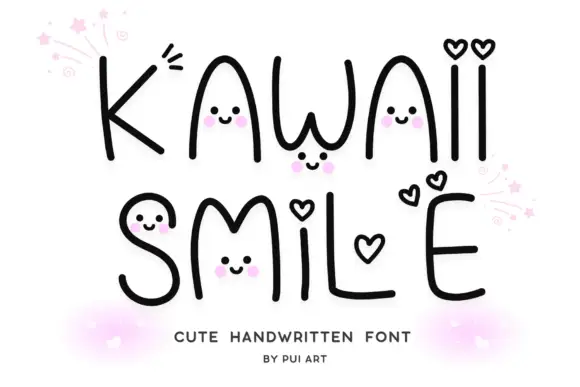
Fine rounded hand-shaped mixed case with small smiling faces and heart-shaped dots
Kawaii Smile draws its letters as one fine rounded stroke, then hides tiny smiling faces inside the shapes and swaps the dots of the i and j for hearts, so a word becomes a row of small characters.
Same independent foundry
Allow optional Google Analytics to measure visits and catalogue actions. Your search words and notes are not included. Privacy & storage