Neutral Sans Workhorse

Kawaii Smile + Helina
Lets Kawaii Smile own the focal silhouette while handling secondary copy, sizing and subheads cleanly.
Inspect Helina specimenDisclosure: MakerFileHub may earn a commission from qualifying purchases via paid links on this page. How our links work.
Fine rounded hand-shaped mixed case with small smiling faces and heart-shaped dots
Kawaii Smile draws its letters as one fine rounded stroke, then hides tiny smiling faces inside the shapes and swaps the dots of the i and j for hearts, so a word becomes a row of small characters.
Paid link
Get this fontProject & layout blueprintsAt-a-glance maker compatibility
Sturdy stroke walls and open counters weed cleanly on adhesive vinyl, HTV apparel film, and cut cardstock.
Visual anatomy & craft review
KAWAII over one line and SMILE under it are drawn with an even monoline that bends into tall narrow arches, the A carrying two eyes and pink cheeks, the W holding a face in its valley and the strokes of L and E ending in drawn hearts. The baseline wanders by design, the counters stay wide open and the only weights are the line itself. Pale pink sparkles and hearts sit loose in the white space, and the two captions below are set in plain small capitals so the illustration keeps the attention. Because the faces belong to specific letters, a different word will show a different set of expressions, and that is worth checking before you build a design around one of them.
Fine rounded hand-shaped mixed case with small smiling faces and heart-shaped dots
Two-font hierarchy recipes
Tested contrast partners — pairing Kawaii Smile with grounded secondary typography.
Kawaii Smile + Helina
Lets Kawaii Smile own the focal silhouette while handling secondary copy, sizing and subheads cleanly.
Inspect Helina specimen
Kawaii Smile + Raffined
Grounds bold display lettering with classic typographic authority on posters, badges and apparel.
Inspect Raffined specimenPractical applications
Concrete hierarchy, scale and production guidance tailored to Kawaii Smile’s stroke geometry.
The faces inside the letters carry the cute brief without an added illustration, and the fine stroke still reads on a card held in the hand.
Hierarchy & layout recipe
Print a 105 by 148 mm invitation: set the name at 34 pt across one row, keep 14 mm of clear ground beneath before the date at 10 pt, and keep 10 mm of margin so the wandering baseline stays inside the card.
Pre-production check
The faces close up below 20 pt; check the proof and keep the name at 28 pt or above on the card.
The heart dots and the smiling letters do the affection for you, which suits a small gift tag too short to hold a long message.
Hierarchy & layout recipe
Print a 40 by 70 mm tag: set the greeting at 18 pt on one row, keep 7 mm of clear ground beneath before the signature at 6 pt, and keep 5 mm from the art to the punch hole at the top.
Pre-production check
Which letters smile depends on the glyphs; check your own word at tag size before cutting a batch.
A gentle hand-drawn heading takes the pressure out of a reading log, and the open counters stay readable for a child copying the page.
Hierarchy & layout recipe
Print an A5 log page: set the heading at 30 pt on one row, keep 12 mm of clear ground beneath before the ruled lines at 14 pt, and keep 12 mm of margin on both sides of the sheet.
Pre-production check
Hearts and faces print as fine detail; check the school copier output before printing a class set.
Technical & licence verification
Confirm included OTF/TTF/WOFF formats, full glyph tables and licence coverage on the live store page before batch production.
Closest visual alternatives
Matched across letterform anatomy, stroke behaviour and craft applications.
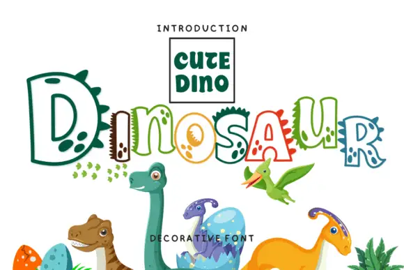
Hollow irregular mixed case with dinosaur-like spikes and rounded footprint-like spots
Dinosaur draws hollow letters with an unsteady hand, gives several of them spikes along the top and fills the neighbours with round footprint spots, so a word looks assembled by a child who likes big reptiles.
Ideas for this font
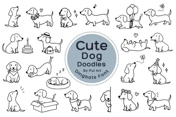
Long-bodied dog outlines with balloons, flowers and playful poses
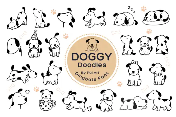
Cute Dog Doodles is a dingbat set of about two dozen line-drawn dachshunds: sitting, sleeping in a bed, standing in a box, wearing a party hat, carrying a cake, holding a balloon, and one draped over a fence.
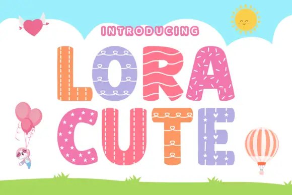
Stitched-pattern block display
Lora Cute is a patterned block display on a sky-blue ground: broad rounded capitals, each filled with a different treatment — stitching, loops, waves, stars — with a pale outline around every letter, plus small balloon, heart and sun illustrations around the edges.
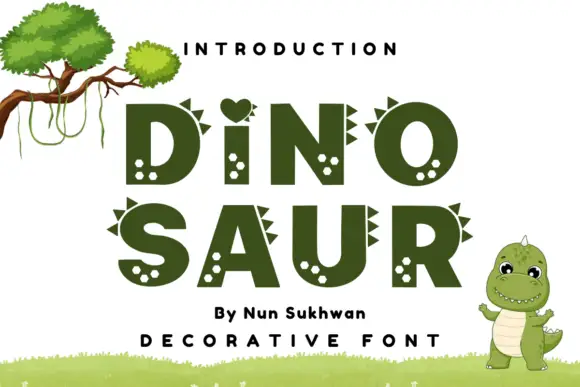
Heavy rounded capitals with small triangular spines and pale spot clusters
Dinosaur Nun Sukhwan sets heavy olive block capitals, gives several letters a row of triangular spikes along the top and fills the counters with pale spots, with a heart standing in for the dot of the i.
Ideas for this font
Same independent foundry
Allow optional Google Analytics to measure visits and catalogue actions. Your search words and notes are not included. Privacy & storage