High-Contrast Display Serif

Gobold + Lumera Editorial
Pairs sculptural editorial warmth with Gobold's clean modern geometry.
Inspect Lumera Editorial specimenDisclosure: MakerFileHub may earn a commission from qualifying purchases via paid links on this page. How our links work.
Tall narrow capitals shown alongside condensed, sloping and hollow labelled samples
Gobold centres pale spaced capitals on burgundy above a larger HIGH sample and several smaller style-labelled words, where the main title has narrow rounded rectangular bowls and the cover carries a banner claiming a twenty-eight-family range while each sample names its own direction.
Paid link
Get this fontProject & layout blueprintsAt-a-glance maker compatibility
Sturdy stroke walls and open counters weed cleanly on adhesive vinyl, HTV apparel film, and cut cardstock.
Visual anatomy & craft review
The main caps stay narrow, the tracking opens, the labelled samples differ in slope and fill and the banner states a number. That comparison is the character: the cover is a shortlist rather than one voice, which is why the samples carry their own labels. The family count is a claim rather than a checked inventory, so identify the actual style you were given, test its bowls at 24 pt and treat the hollow and sloping samples as directions to search rather than files you already hold.
Tall narrow capitals shown alongside condensed, sloping and hollow labelled samples
Two-font hierarchy recipes
Tested contrast partners — pairing Gobold with grounded secondary typography.
Gobold + Lumera Editorial
Pairs sculptural editorial warmth with Gobold's clean modern geometry.
Inspect Lumera Editorial specimen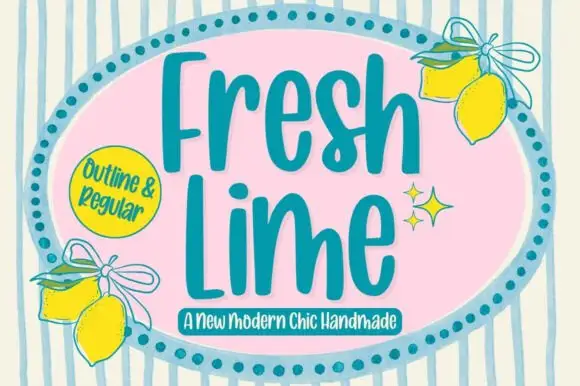
Gobold + Fresh Lime
Introduces organic movement on pull-quotes, signatures and gift tags.
Inspect Fresh Lime specimenPractical applications
Concrete hierarchy, scale and production guidance tailored to Gobold’s stroke geometry.
The narrow spaced caps give a practice restraint, and the rectangular bowls hold a two-word name at 24 pt on a card, where the tracking keeps the row calm.
Hierarchy & layout recipe
Print an 85 by 55 mm card: set the wordmark at 24 pt on one row with wide tracking, keep 16 mm of clear ground beneath before the address at 7 pt, and keep the block flush left against the margin.
Pre-production check
Wide tracking on a short name looks loose; check the card and reduce it to 8 percent of the point size.
The narrow caps suit a running head, and the compact bowls stay crisp at 9 pt across a page, where the spacing keeps a long title readable.
Hierarchy & layout recipe
Print a 210 mm page: set the running head at 9 pt on one line with 10 percent tracking, keep 6 mm of clear ground above the first column, and keep the head in a single colour so it recedes.
Pre-production check
Narrow bowls close at 7 pt; check the printed page and keep the head at 9 pt or above, tracking it slightly wider if the bowls still fill.
The tall caps read on a door, and the narrow forms hold a room name at 40 pt on a printed plate, where the spacing separates the letters from a corridor distance.
Hierarchy & layout recipe
Print a 300 by 120 mm plate: set the room name at 40 pt on one row, keep 14 mm of clear ground beneath before the capacity line at 12 pt, and keep 16 mm of margin for the fixings.
Pre-production check
The file you hold may be a sloping or hollow sample; check the style before the artwork is approved.
Technical & licence verification
Confirm included OTF/TTF/WOFF formats, full glyph tables and licence coverage on the live store page before batch production.
Closest visual alternatives
Matched across letterform anatomy, stroke behaviour and craft applications.
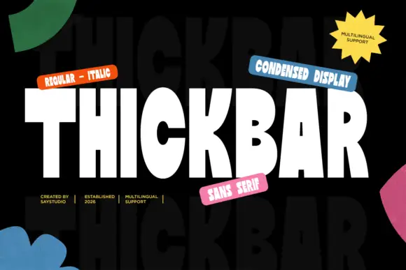
Heavy condensed display sans
Thickbar is a heavy condensed sans in white on black with paper shapes at the edges: capitals with tapered diagonals, pinched curved counters and flat terminals, set as one large word between four coloured labels and four plain credits, with a ghosted repeat of the word in the ground.
Ideas for this font
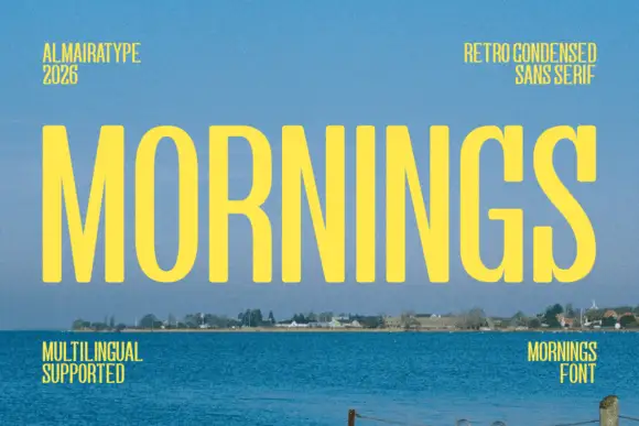
Light condensed capital sans
Mornings is a light condensed sans in yellow on a photograph of a shoreline: tall narrow capitals with oval bowls, a deep M centre and an even fine stroke, set as one large word with four tracked notes in the corners.
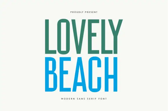
Tall even-stroke capitals
Lovely Beach is a tall narrow sans set in two colours on cream: even-stroke capitals with a rectangular O, a sharp A opening and flat terminals, the first word in sea green and the second in bright blue, with two small tracked lines above and beneath.
Ideas for this font
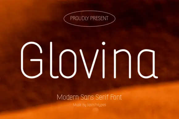
Slender rounded monoline mixed case with a double-storey a and long curved l foot
Glovina is a thin modern sans: light monoline strokes, wide spacing, a single-storey a and a dot on the i drawn as a small teardrop rather than a circle.
Ideas for this font
Same independent foundry
Allow optional Google Analytics to measure visits and catalogue actions. Your search words and notes are not included. Privacy & storage