High-Contrast Display Serif

Glovina + Papillon Serif – Elegant Modern Luxury
Pairs sculptural editorial warmth with Glovina's clean modern geometry.
Inspect Papillon Serif – Elegant Modern Luxury specimenDisclosure: MakerFileHub may earn a commission from qualifying purchases via paid links on this page. How our links work.
Slender rounded monoline mixed case with a double-storey a and long curved l foot
Glovina is a thin modern sans: light monoline strokes, wide spacing, a single-storey a and a dot on the i drawn as a small teardrop rather than a circle.
Paid link
Get this fontProject & layout blueprintsAt-a-glance maker compatibility
Sturdy stroke walls and open counters weed cleanly on adhesive vinyl, HTV apparel film, and cut cardstock.
Visual anatomy & craft review
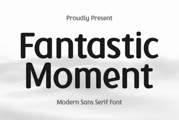
Glovina crosses the middle of the card in white over a blurred orange landscape, drawn at a weight where every stroke is the same thin line and the geometry does the work. The capitals are narrow, the lowercase has a single-storey a with a small tail, the n and the u are open arches, and the dot on the i is a teardrop that tapers upward, which is the one flourish in the whole face. The spacing is generous, so the word reads slowly and looks airy. Above it an oval badge holds a presenting line, and beneath it two light lines name the style and the studio. The face is a light modern sans for interiors, cosmetics and clean editorial layouts, and it belongs at large sizes: at small sizes the hairline stems drop out of a printed page and the airiness becomes weakness.
Slender rounded monoline mixed case with a double-storey a and long curved l foot
Two-font hierarchy recipes
Tested contrast partners — pairing Glovina with grounded secondary typography.
Glovina + Papillon Serif – Elegant Modern Luxury
Pairs sculptural editorial warmth with Glovina's clean modern geometry.
Inspect Papillon Serif – Elegant Modern Luxury specimen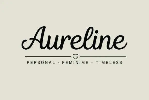
Glovina + Aureline
Introduces organic movement on pull-quotes, signatures and gift tags.
Inspect Aureline specimenPractical applications
Concrete hierarchy, scale and production guidance tailored to Glovina’s stroke geometry.
The thin monoline reads as clean and clinical without a medical edge, and the teardrop dot gives a plain wordmark one detail to be remembered by.
Hierarchy & layout recipe
Print a 60 by 40 mm label: set the range name at 18 pt on one row, keep 6 mm of clear ground beneath before the volume at 4.5 pt, and hold 5 mm from the widest stem to the label edge.
Pre-production check
Hairlines close up in small labels; print one label on the actual stock and check the teardrop dot before the roll.
The thin strokes let a photograph show through the title, and the wide spacing keeps a long room name legible over a bright interior instead of blocking it out.
Hierarchy & layout recipe
Print a 230 by 300 mm opener: set the feature title at 110 pt on one row, keep 32 mm of clear ground beneath before the standfirst at 11 pt, and hold 20 mm from the last letter to the right trim.
Pre-production check
Thin type over a light photograph disappears; print one opener and check the contrast against the brightest area.
The airy spacing suits a light drink, and the thin strokes keep a small bottle label from looking crowded next to heavy competitors on the shelf.
Hierarchy & layout recipe
Print a 50 by 90 mm label: set the product name at 20 pt on one row, keep 8 mm of clear ground beneath before the flavour at 4.5 pt, and hold 5 mm from the label edge on both sides.
Pre-production check
Condensation softens thin type on glass; print one label, chill the bottle and check the line weight before the run.
Technical & licence verification
Confirm included OTF/TTF/WOFF formats, full glyph tables and licence coverage on the live store page before batch production.
Closest visual alternatives
Matched across letterform anatomy, stroke behaviour and craft applications.
Heavy condensed display sans
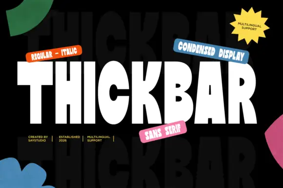
Thickbar is a heavy condensed sans in white on black with paper shapes at the edges: capitals with tapered diagonals, pinched curved counters and flat terminals, set as one large word between four coloured labels and four plain credits, with a ghosted repeat of the word in the ground.
Ideas for this font
Rounded monoline capitals
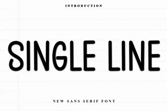
Single Line is a rounded monoline sans in black on a pale ruled sheet: upright capitals with narrow oval bowls, an even stroke, soft terminal ends and wide letter spacing, set as one line between a small tracked line above and a plain line beneath.
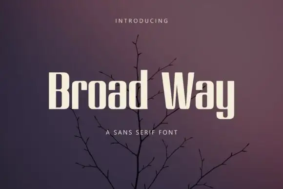
Heavy narrow mixed case with tall rectangular counters and deep W diagonals
Broad Way uses pale heavy lettering against muted purple branches, where tall compact stems enclose narrow rectangular counters in the rounded letters, the r turns with a short shoulder and the W opens deep diagonals that cut into the baseline.
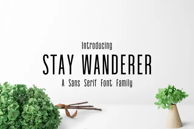
Very narrow upright family
Stay Wanderer is a very narrow upright sans shown in black on a pale studio wall: capitals with small counters, long straight diagonals and an even stroke, with a small line above, a subtitle beneath, and two potted plants and a pair of scissors at the foot of the frame.
Ideas for this font
Same independent foundry
Allow optional Google Analytics to measure visits and catalogue actions. Your search words and notes are not included. Privacy & storage