High-Contrast Display Serif

Giraffearmy + Gorga
Pairs sculptural editorial warmth with Giraffearmy's clean modern geometry.
Inspect Gorga specimenDisclosure: MakerFileHub may earn a commission from qualifying purchases via paid links on this page. How our links work.
Angular varsity blocks displaying several contrasting animal-print fills
Safari Army sets heavy slab capitals and fills each letter with an animal skin: giraffe patch, zebra stripe, cheetah spot and tiger band, with the four patterns available as separate fonts.
Paid link
Get this fontProject & layout blueprintsAt-a-glance maker compatibility
Sturdy stroke walls and open counters weed cleanly on adhesive vinyl, HTV apparel film, and cut cardstock.
Visual anatomy & craft review
SAFARI runs across the preview in wide block letters with small square serifs, every one filled with a different animal print: the S in giraffe patches, the A in zebra stripes, the F in cheetah spots, the second A in a brown leopard, the R in orange tiger bands and the I back in giraffe. A strip of skin pattern runs along the top and bottom of the card as a border, and the letters sit inside a plain white field so the patterns do the work. Each letter has a thin dark keyline that keeps two touching patterns from bleeding into one another, which is the detail that makes the set usable: without it a word would look like a piece of fabric rather than a sign. Captions in a quiet serif name the set, the count of four fonts, and the studio. The patterns are literal and the shapes are plain, so the face suits children's parties, zoo signage and jungle-themed prints, and it holds at large sizes where the prints can be recognised.
Angular varsity blocks displaying several contrasting animal-print fills
Two-font hierarchy recipes
Tested contrast partners — pairing Giraffearmy with grounded secondary typography.
Giraffearmy + Gorga
Pairs sculptural editorial warmth with Giraffearmy's clean modern geometry.
Inspect Gorga specimen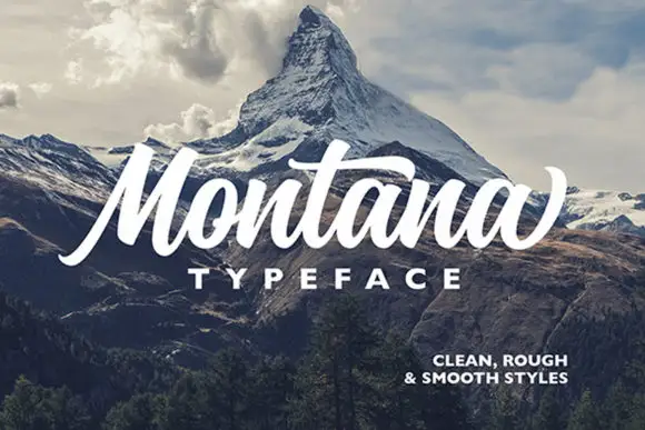
Giraffearmy + Montana
Introduces organic movement on pull-quotes, signatures and gift tags.
Inspect Montana specimenPractical applications
Concrete hierarchy, scale and production guidance tailored to Giraffearmy’s stroke geometry.
The animal prints set the theme without a single drawn animal, and the block shapes carry across a garden where finer letters would disappear.
Hierarchy & layout recipe
Print a 600 by 400 mm sign: set the greeting at 96 pt across two rows, keep 26 mm of clear ground beneath before the time at 16 pt, and hold 30 mm of border so no serif is cropped.
Pre-production check
Small prints blur at banner scale; print one panel at the final size and check that the giraffe patches still read as patches.
The prints give a plain worksheet one strong image, and the plain letterforms keep the heading clear to a child reading it at desk distance.
Hierarchy & layout recipe
Print an A4 worksheet: set the header at 42 pt on one row, keep 16 mm of clear ground beneath before the first question at 11 pt, and hold 18 mm of margin at both sides of the sheet.
Pre-production check
Photocopies flatten the prints into grey; copy one sheet on the school machine and check the letters are still distinguishable.
The skins name the subject immediately, and the four-variant set lets a series of leaflets stay consistent while looking different one from the next.
Hierarchy & layout recipe
Print a 148 by 210 mm leaflet cover: set the cover line at 58 pt across two rows, keep 20 mm of clear ground beneath before the charity mark at 12 pt, and hold 14 mm from the letters to the trim.
Pre-production check
Recycled stock drinks the dark tones; print one cover on the actual paper and compare the tiger orange before the run.
Technical & licence verification
Confirm included OTF/TTF/WOFF formats, full glyph tables and licence coverage on the live store page before batch production.
Closest visual alternatives
Matched across letterform anatomy, stroke behaviour and craft applications.
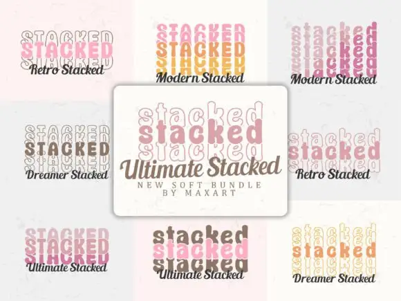
Stacked-word sample bundle
Ultimate Stacked is a bundle sheet on a pale ground: nine panels, each showing a repeated word stacked three times inside a soft rounded outline, in pastel or earth tones, with a script caption beneath naming a variant, and a central plaque naming the bundle and its maker.
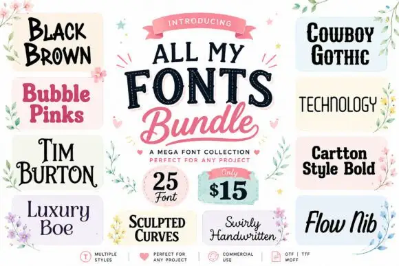
A collage of unrelated display and script directions
All My Fonts is presented as a central title between thirteen sample tiles, from Black Brown and Bubble Pinks through Tim Burton, Luxury Boe, Sculpted Curves and Swirly Handwritten to Cowboy Gothic, Technology, Cartoon Style Bold and Flow Nib, with a corner badge advertising a quantity and a price.
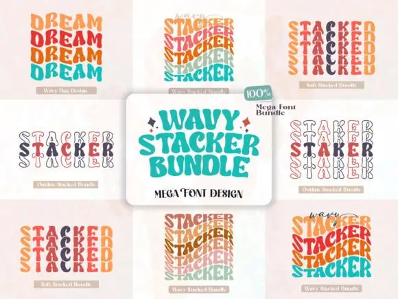
Stacked wavy retro letter bundle
Wavy Stacker is a bundle of retro stacked letter sets: each style repeats a word several times in a wave that bends across the lines, mixes colours line by line, and offers six variants from a filled wave to an outline, a soft pastel and a kraft-paper version, so the sheet reads as a set of ready-made retro lockups.
Ideas for this font
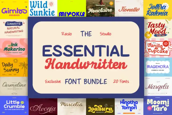
A collage of rounded bold names, thin handwriting and flowing script samples
Essential Handwritten is a bundle of twenty scripts and hand-drawn faces, presented on a cream panel where a serif, a script and a condensed caps face are set together to show the range.
Ideas for this font
Same independent foundry
Allow optional Google Analytics to measure visits and catalogue actions. Your search words and notes are not included. Privacy & storage