Editorial Serif Anchor

Gilded Oath + Bulgary
Anchors Gilded Oath's fluid strokes with crisp Roman proportions on wedding suites, headers and packaging.
Inspect Bulgary specimenDisclosure: MakerFileHub may earn a commission from qualifying purchases via paid links on this page. How our links work.
Broad loose calligraphic lettering with a medieval cast and open bowls
Gilded Oath is broad loose calligraphy with a medieval cast, its bowls open, its weight carried on the downstrokes and its endings finished with flat cut-offs rather than fine points.
Paid link
Get this fontProject & layout blueprintsAt-a-glance maker compatibility
Weld or Unite overlapping script joins into one continuous vector path before sending to the blade.
Visual anatomy & craft review
The capital G opens as a wide crescent with a small inner spur, and the letters after it keep that breadth: the i and the l rise into short plain stems, the d closes an open bowl, the e finishes with a straight cut, and the O of the second word is drawn as a near circle. Weight sits heavily on the downstrokes and thins on the joins, but less than in a formal copperplate, which gives the lettering its hand-written medieval quality rather than a court script look. Ends are cut flat rather than tapered, the baseline stays level and the ascenders stay low, so the phrase reads as a broad banded inscription. The parchment ground, the wax seal, the quill and the small caption are presentation; the lettering is the two words.
Calligraphic · Broad · Medieval
Two-font hierarchy recipes
Tested contrast partners — pairing Gilded Oath with grounded secondary typography.
Gilded Oath + Bulgary
Anchors Gilded Oath's fluid strokes with crisp Roman proportions on wedding suites, headers and packaging.
Inspect Bulgary specimen
Gilded Oath + Corven
Keeps small-scale dates, URLs, nutrition facts and care instructions crisp and legible below script titles.
Inspect Corven specimenPractical applications
Concrete hierarchy, scale and production guidance tailored to Gilded Oath’s stroke geometry.
The medieval cast suits a historic venue, and the broad weight keeps a heavily textured invitation readable where a fine script would vanish into the paper.
Hierarchy & layout recipe
Set both names at 30 pt on a 130 by 190 mm card, set the details in a small caps serif at 8 pt, and hold 18 mm below the lettering so the details have clear air.
Pre-production check
Textured stock breaks flat-cut ends; print a proof on the actual paper and thicken the cut-offs slightly if they begin to fray.
The broad calligraphy sets a period tone on a title page without resorting to blackletter, and the open bowls keep the title legible at 40 pt.
Hierarchy & layout recipe
Set the title at 40 pt on an A5 title page, set the author in a small caps serif at 10 pt, and leave 20 mm between the title line and the imprint line at the foot.
Pre-production check
A period cast can read as a costume on a modern page; check the spread and keep the rest of the page plain so the title carries the tone.
The medieval weight suits a bottle of something brewed slowly, and the broad strokes hold up on a curved label where a fine script disappears.
Hierarchy & layout recipe
Set the brand at 16 pt on a 60 by 90 mm label, keep the volume in a 6 pt caps serif, and leave 7 mm of margin so the flat-cut ends stay inside the label.
Pre-production check
Curved labels squeeze the outer letters; check a printed label on the actual bottle and increase the side margins rather than the point size.
Technical & licence verification
Confirm included OTF/TTF/WOFF formats, full glyph tables and licence coverage on the live store page before batch production.
Closest visual alternatives
Matched across letterform anatomy, stroke behaviour and craft applications.
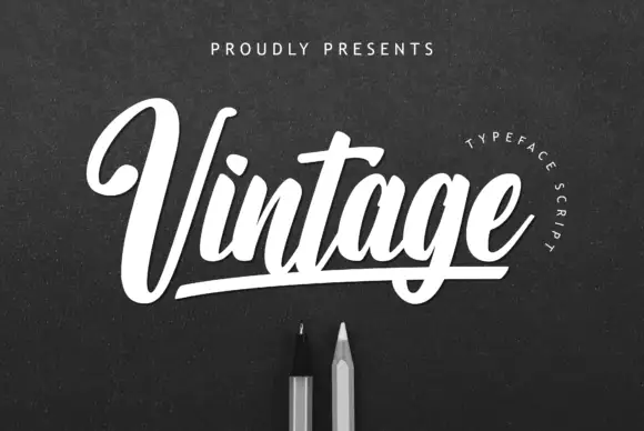
Retro brush script with a baseline rule
Vintage is a fat retro brush script in white on a dark textured board: rounded connected letters, a marked forward lean, and a straight rule that runs beneath the word and turns up at both ends.
Ideas for this font

Neon-style outline script
Sunflower is a tall looping script drawn as a neon tube: a white core inside a golden outline with a soft glow, set over a photograph of a sunflower field at sunset.
Ideas for this font
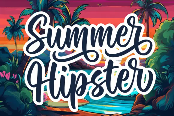
Bold marker script with double outline
Summer Hipster is a bold marker script in navy with a heavy white double outline: fat connected strokes, a long looping flourish under the first word and a second word that spills below the baseline.
Ideas for this font
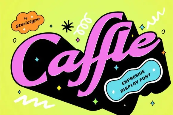
Heavy slanted retro script with flat-cut terminals
Caffle sets a heavy slanted script in solid pink on a black slab, with a wide capital leaning across the word and lowercase letters packed so tight they nearly touch, so the line reads as one painted shape instead of a string of joined letters.
Ideas for this font
Same independent foundry
Allow optional Google Analytics to measure visits and catalogue actions. Your search words and notes are not included. Privacy & storage