Editorial Serif Anchor

Vintage + The Bilstein Editorial
Anchors Vintage's fluid strokes with crisp Roman proportions on wedding suites, headers and packaging.
Inspect The Bilstein Editorial specimenDisclosure: MakerFileHub may earn a commission from qualifying purchases via paid links on this page. How our links work.
Retro brush script with a baseline rule
Vintage is a fat retro brush script in white on a dark textured board: rounded connected letters, a marked forward lean, and a straight rule that runs beneath the word and turns up at both ends.
Paid link
Get this fontProject & layout blueprintsAt-a-glance maker compatibility
Weld or Unite overlapping script joins into one continuous vector path before sending to the blade.
Visual anatomy & craft review
Vintage fills the card in one word, and the lettering is a sign-painter's script: the V opens with a wide curved stroke, the i and the n are fat and round, the t lifts its crossbar into a short flag, the a is a single-storey bowl and the g drops into a loop that rests on the baseline rule. That rule runs beneath the whole word with a small upturn at each end, which is what gives the specimen its signwriting look, and the strokes have the slight wobble of a brush rather than the precision of a vector. The ground is a dark board with two pens standing at the foot, and two captions above and to the side name the style. The face is a retro script for packaging, labels and signage: it wants a large size, one colour, and the baseline rule is a design decision that has to be drawn rather than typed.
A retro script riding a drawn baseline
Two-font hierarchy recipes
Tested contrast partners — pairing Vintage with grounded secondary typography.
Vintage + The Bilstein Editorial
Anchors Vintage's fluid strokes with crisp Roman proportions on wedding suites, headers and packaging.
Inspect The Bilstein Editorial specimen
Vintage + Swaraga
Keeps small-scale dates, URLs, nutrition facts and care instructions crisp and legible below script titles.
Inspect Swaraga specimenPractical applications
Concrete hierarchy, scale and production guidance tailored to Vintage’s stroke geometry.
The signwriting look suits a party with an old-hall venue, and one word with a drawn baseline is all a welcome board needs.
Hierarchy & layout recipe
Print a 500 by 350 mm board: set the word at 120 pt on one row, draw the baseline 12 mm beneath the lowest letter, keep 22 mm of clear ground beneath that rule, and hold 20 mm of border.
Pre-production check
The upturned ends of the rule get clipped on a framed board; print one at the final size and check both ends before the set.
A sign-painter's script places a heritage feature in period, and the white on dark reads from a shelf where a light serif would not.
Hierarchy & layout recipe
Print a 230 by 300 mm cover: set the cover word at 100 pt on one row, keep 28 mm of clear ground beneath before the cover lines at 12 pt, and hold 20 mm of margin on all sides.
Pre-production check
A brush wobble at 100 pt can read as a fault on a clean cover; print one at the final size and check the stroke before the run.
A retro script is the conventional language of a barber, and the drawn baseline gives a narrow label a bottom edge without a rule.
Hierarchy & layout recipe
Print a 45 by 80 mm label: set the name at 16 pt on one row, keep 6 mm of clear ground beneath before the street at 4.5 pt, and hold 4 mm from the baseline rule to the die line.
Pre-production check
The rule and the g loop collide on a narrow label; print one at the real size and check the tail before the order.
Technical & licence verification
Confirm included OTF/TTF/WOFF formats, full glyph tables and licence coverage on the live store page before batch production.
Closest visual alternatives
Matched across letterform anatomy, stroke behaviour and craft applications.

Substantial handwriting script
Simple Handwriting is a substantial handwritten script in deep green on white: connected lowercase with open round bowls, a firm even stroke, tall ascenders and a long entry stroke on the H, set across two lines over a soft brush swipe, with a serif caption beneath and a studio credit at the foot.
Ideas for this font
Fine connected script with a very open P
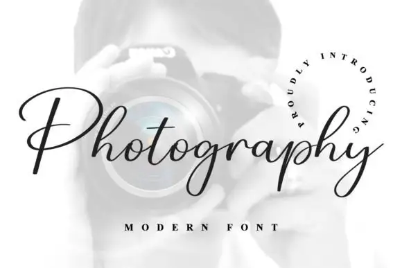
Photography is a fine slanted script in black on a pale photograph: a thin connected hand with a broad open P, hairline joins, a consistent slant and a curled tail on the y, framed by a circular line of tracked capitals.
Ideas for this font
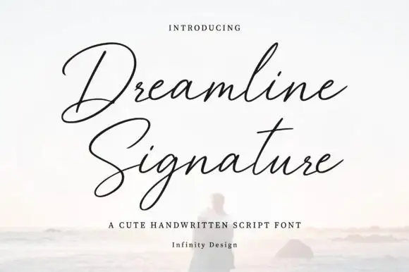
Fine calligraphic signature script with tall capital flourishes
Dreamline Signature is a fine calligraphic script in which the capitals rise into long flourishes, the joins stay hairline and the body sits on a smooth baseline, so a name reads as a signature written with a pointed pen.
Ideas for this font
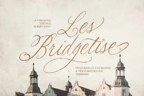
Fine slanted script with expansive capitals
Les Bridgetise is a very fine slanted script whose tall capitals open into long entry loops while the lower-case stays narrow and high-waisted.
Ideas for this font
Same independent foundry
Allow optional Google Analytics to measure visits and catalogue actions. Your search words and notes are not included. Privacy & storage